Showing posts with label dishes. Show all posts

Thursday, January 5, 2023

Festive Fiesta Ware


QUESTION: My aunt had a large collection of Fiesta dinnerware which she left to me. I added a few pieces that I found at flea markets over the last few years, but now I want to sell it. Is this pottery worth much and where would be the best place to sell it?

ANSWER: Depending on what pieces you have, your collection of Fiesta dinnerware could be worth a small fortune. But before you get dollar signs in your eyes, there are a few things you should know about it.

The style and bright colors of Fiesta dinnerware look very 1950s. But actually it appeared during the Great Depression in the mid-1930s. Englishman, Frederick Hurten Rhead, designed the simple Art Deco shapes while chief engineer Victor Albert Bleininger fabricated the colorful signature glazes. Both worked for the Homer Laughlin China Company of Newell, West Virginia.

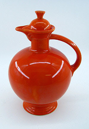
Originally, the company offered 37 different affordable pieces, ranging from candle holders and ashtrays to large serving dishes, each in five bright colors: red-orange, yellow, green, cobalt blue, and ivory. It added turquoise in 1939 for a total of six basic colors.

Homer Laughlin pioneered a whole new concept in dinnerware with Fiesta. When it first introduced the dinnerware at the annual Pottery and Glass Exhibit held in Pittsburgh, Pennsylvania in January 1936, its line was the first widely mass-marketed, solid-color dinnerware in the country. It was also the first dinnerware that consumers could purchase by the piece instead of in complete sets, as was the custom at the time. This allowed customers to mix and match, perhaps choosing a different color for each place setting, or have all their dinner plates one color, their cups and saucers another, and so on. This concept became instantly popular with the public, and soon Fiesta dinnerware became a runaway hit.

At its introduction, Fiesta dinnerware consisted of the usual place settings of dinner plates, salad plates, soup bowls, and cups and saucers, plus occasional pieces such as candle holders in two designs, a bud vase, and an ash tray. A set of seven nested mixing bowls ranged in size from five to twelve inches in diameter. The company also sold basic place settings for four, six and eight persons. But the idea from the start was to create a line of open-stock items from which the consumer could pick and choose based on their personal preference.

The Homer Laughlin Company quickly added several additional items to their line and eliminated several unusual items—a divided 12-inch plate, a turquoise covered onion soup bowl, and the covers for its set of mixing bowls. The Fiesta line eventually consisted of 64 different items, including flower vases in three sizes, water tumblers, carafes, teapots in two sizes, five-part relish trays, and large plates in 13- and 15-inch diameters. 

But with the onset of World War II, the company was forced to reduce the number of items in the Fiesta line as public demand declined and companies cut back non-war related production. By the end of the war, Homer Laughlin had reduced the items in its Fiesta line by one third. 

The design of the original dinnerware pieces remained unchanged from 1936 to 1969. However, the company did change its colored glazes to keep up with home decorating color trends. It introduced four new colors—rose, gray, dark green, and chartreuse, replacing the original blue, green, and ivory. Yellow and turquoise continued in production.

By the end of the 1950s, sales again dropped, so the company reduced its offering of items and changed the glaze colors once again. This time, it introduced a medium green, to distinguish it from other green glazes which the company had produced. This shade of green is in high demand by collectors, and certain pieces in this color command extremely high prices.

Homer Laughlin removed the original red-orange color, the most expensive glaze to produce, before 1944 because it contained uranium oxide which the government needed to construct the atom bombs. Therefore, red pieces also usually command a premium price in today’s collectible market.

By 1969, the company restyled the finials on covers, handles on cups, bowl contours and shapes to give them a more contemporary style. 

Fiesta dinnerware became popular once again as baby boomers began establishing their own homes. Not long after Homer Laughlin discontinued the brightly colored dinnerware line in January 1973,  collectors began buying up what remained at garage sales and second-hand shops. Prices for it hit the roof and by the mid-1980s, prices of Fiesta items reached $100 for scarcer pieces. 

Generally, serving pieces such as casserole dishes, carafes, teapots, and water pitchers almost always have higher values than normal place setting pieces. As mentioned earlier, certain colors are also priced higher, no matter what the piece.

It’s also important to look on the back of each piece for the familiar “Fiesta” backstamp,  followed by 'HLC USA', 'MADE IN USA' or 'H.L. CO. USA.' You may also discover some pieces with the word 'GENUINE' stamped near the Fiesta signature.

To read more articles on antiques, please visit the Antiques Articles section of my Web site.  And to stay up to the minute on antiques and collectibles, please join the over 30,000 readers by following my free online magazine, #TheAntiquesAlmanac. Learn more about old-time winter objects in the 2022/2023 Winter Holiday Edition, with the theme "Winter Memories," online now. And to read daily posts about unique objects from the past and their histories, like the #Antiques and More Collection on Facebook.


Wednesday, June 22, 2022

The Strength of Iron with the Hardness of Stone


QUESTION: My grandmother collected all sorts of odds and ends of antique china. Among all the pieces she had were a half dozen plates and jugs that had a special quality about them. She called them her stoneware and said they were probably from the early 19th century. Three of them had the name “Spode” on the back or bottom. Two were pure white with no decoration while the others had Chinese scenes painted on them. Can you tell me anything about them and when they would have been made?

ANSWER: The pieces your grandmother called “stoneware” are actually “ironstone,” a form of china with the look of porcelain. Ironstone china is a hard earthenware similar to porcelain. Although it has the hardness and fine surface of porcelain, it’s opaque while porcelain is transparent when held up to a light. 

Josiah Spode II first made ironstone in 1805. But before that, Miles Mason had been experimenting with a china formula that reproduced the appearance of Chinese porcelain. In 1813, Mason’s son, Charles, took out a patent, listing it as an improvement on ironstone china. Both Spode’s and Mason’s ironstone were equally fine. The blue-white color of both of their wares, as well as their patterns, were  imitations of Chinese wares.

Spode used his ironstone as a way to copy Lowestoft patterns. Lowestoft was a soft-paste porcelain produced in Lowestoft, Suffolk, England, made from 1757 to 1802. It was mostly used for pots, teapots, and jugs, with shapes copied from silverwork or from Bow and Worcester porcelain. The English nobility had their initialed tableware made in China but getting replacements was a slow process, so they called upon English potters to make them.

While these pieces usually had no marks, they sometimes had the name “Spode” impressed in small letters on their bottoms. These patterns included crests and coats of arms and initials in shields with borders of small floral or leaf patterns or delicate ribbons.

One of Spode’s early ironstone patterns, commonly known as “Tree of Life,” is a design of the famille rose type, painted in blue, green, yellow, brown and pink. The mark appeared in black with the name “Spode” set on a rectangle of fretwork.

Patterns on Spode’s Lowestoft also included Queen Charlotte’s pattern, selected for Her Majesty’s visit to the Spode factory in 1817. Decorated in blue, it featured a butterfly border and a Chinese landscape in the center. It was a version of the old willow pattern that was popular on Chinese wares.

Though Spode copied many of his patterns from imported Chinese wares, he adapted others by making them more elaborate than their Chinese originals. Two types of old Chinese porcelain influenced Spode. The first was the old blue-and-white Nankin designs with pagoda and landscape and the butterfly border. The second was the famille rose design of the Yung Cheng period 1734. These patterns were in polychrome with gold and had floral and bird motifs. However, Spode didn’t use these patterns exclusively on his ironstone.

Spode marked the pattern numbers in red on his ironstone in addition to the factory mark. Lower numbers indicate an early production date, enabling pieces to be placed within certain years even if the exact date cannot be identified.

Eventually, Spode’s ironstone came in a variety of patterns. The Cabbage pattern featured a large leaf and flowers. Printed in blue, workers then filled it in by hand in blue, gold, rose, and Chinese red. Another early pattern, Peacock, features birds and peonies in gold and other colors in the famille rose style with a border known as India edge.

Landscape was Spode’s most Chinese looking pattern. It featured Chinese figures in blue and gold in the border with a landscape of water and buildings painted in colors in the center. Bang-up, first produced in polychrome, was a pattern of Chinese flowers. Ship and Star featured a pattern of a ship, buildings and figures set in a center cartouche and has a star border printed in brown.

The pattern known as George IV, was first made for the Coronation of George IV on July 29, 1821. The center of the plate has a design of Chinese still-life motifs with flowers and vases in blue, Chinese red, and gold with a heavy border.  

To read more articles on antiques, please visit the Antiques Articles section of my Web site.  And to stay up to the minute on antiques and collectibles, please join the over 30,000 readers by following my free online magazine, #TheAntiquesAlmanac. Learn more about the "The World of Art Nouveau" in the 2022 Spring Edition, online now. And to read daily posts about unique objects from the past and their histories, like the #Antiques and More Collection on Facebook.


Friday, July 2, 2021

It's All About the Patterns


QUESTION: When I was a little girl, I used to sleep over at my grandmother’s house. While there, I used to stand in front of her china cabinet looking at all the beautiful china. Each piece had some sort of scene, usually a landscape with people. Most of the dishes were blue but some were pink and one or two were lavender. After my grandmother passed, I got her china collection. I just love it but don’t know much as these beautiful pieces. The name Spode is either stamped or impressed on the bottom of most of the pieces. Can you tell me who made them and where they got the ideas for the scenes on them?

ANSWER: What your grandmother collected and you now have is Spode china. All those with scenes and borders are what’s known as transferware, a technique for transferring prints to pottery.

During the early years of the 18th century, Spode achieved success because of  his mastery of transfer printing.  An Irish engraver named Brooks invented the process. It involved first, engraving a copper plate, then inking it and applying to it to thin tissue paper. The impression on the paper could then be transferred to wares of any shape.

Spode produced a variety of pottery wares, often imitating those of Wedgwood, including creamwares, basalts, stonewares, redwares, Jasperwares, and of course blue-printed pearlwares and early experimental porcelains.

In 1784, Spode began printing under the final glaze in blue on earthenware. He copied the early patterns from Chinese porcelain imported wares. By that time, London customers who had originally purchased Chinese porcelain dishes needed replacements. The engraver Thomas Lucas brought with him to Spode’s pottery the knowledge of designs from his previous employer, Thomas Turner at Caughley. 

Most of the early blue transfer-printed patterns were Chinese in style.  As Spode's production advanced and its customers' tastes evolved, the variety of patterns grew. Interest in Chinoiserie patterns later gave way to patterns that depicted rural scenes, exotic places, literary themes, as well as floral and botanical examples.

The earliest pattern produced by Spode around1790, was “Willow,” now known as “Blue Willow,” printed examples of the Willow pattern, commissioned by Josiah Spode and made around 1790, and its copperplate, engraved for Spode by Thomas Minton. 

In June 1805, there appeared the first of 20 monthly issues of a publication called Oriental Held Sports, Wild Spurts of the East, published by Edward Orme of Bond Street, London.  Each issue included a printed story and two large aquatint prints engraved from drawings by Samuel Howitt, a distinguished animal painter. Spode adapted the prints to his dinnerware depicting various hunting scenes with animals and birds. Some views show mounted hunters carrying spears with native bearers on foot. The ’Indian Sporting’ series alone had 21 different hunting scenes.

Another popular series formed a travelogue of views in the Eastern Mediterranean. Spode based these on engravings in Mayer's Views in Asia Minor, Mainly in Caramania, published in 1803. "The Castle of Boudron;" The City of Corinth" and “Antique Fragments at Lissimo” were all part of this series. 

From around 1800, most of the patterns painted by Spode's artists were recorded in Pattern books.  These books contained watercolor paintings of tens of thousands of patterns made from about 1800 up to the end of production. Many are beautiful works of art in their own right, but they also acted as a historic document of changing design styles over two centuries. Georgian simplicity, Regency opulence, Victorian Naturalism, sentimentality, Pre-Raphaelite styles, Japanese Revival, Arts and Crafts, Art Deco, and 1950s Modernism.

Spode introduced his more famous pattern, “Blue Italian,” around 1816. It became immediately popular and remained a best seller. Over the years, the company produced it on a wide variety of earthenware shapes. One Spode catalog from the 1920s and 1930s records over 700 different shapes available. 

Unlike many of the other classical scene patterns on Spode wares of the early 19th century, the origin of the view for the Italian pattern isn’t certain. Some experts believe Italian artist G.P. Pannini, well known for his painting style, inspired pictures of ruins and quiet pastoral Italian scenery fpor Spode pieces. The Spode engravers derived many of their pictorial subjects from scenes which had appeared as prints. Publications of prints of scenes associated with the Grand Tour became the inspiration for many patterns. Merigot's Views Of Rome and Its Vicinity, published in 1798, was the source for several Spode patterns, including Tower and Castle, but experts agree that none of these views inspired the Italian pattern.

Furthermore, there is no one location in Italy that seems to correspond to all the features included in the original “Blue Italian” scene. It seems to be a composition made up of several elements. The ruin on the left, although architecturally incorrect, might have been based on the Great Bath at Tivoli, near Rome. The row of houses along the left bank of the river is similar to those of the Latium area near Umbria, north of Rome. The castle in the distance is of a type which occurs only in Northern Italy in the regions of Piedmont and Lombardy.

Could it be that a traveling artist from Northern Europe made sketches of the scenes he encountered as he made his way through Italy? Upon returning home, did he combine his sketches into an attractive scene which, later, Spode used and chose to call the Italian Pattern? Unfortunately, there is no proof of this. The inspiration for the Italian scene may have even come from a print of a painting and then another painting taken from the print by a different artist.

In the early 19th century, most of the pieces Spode produced in the “Blue Italian” pattern were on dinnerware items used by the rich---asparagus servers, huge meat dishes, enormous soup tureens with ladles, cruet sets, foot baths, and more. Wealthy households set their dinner tables with Spode’s Italian. And there were many variations of the pattern. 

“Blue Italian” was an immediate success from its introduction. Though it’s impossible to say what created this strong appeal, it’s perhaps due to the unique combination of a classical scene with a Chinese border which had been directly copied from pieces of Chinese export porcelain, dating from around 1785.

By 1822, Spode had developed other colors, in addition to blue, that could withstand high-temperature firing.  The production of these additional printed colors enabled Spode to expand his line of wares.  While not nearly as popular as Spode's various blues, these new colors included green, brown, manganese purple, Payne's grey, and black.  

Soon afterwards,  in 1824, two-color underglaze printing began.  Spode also employed other methods to add color.  One method was to transfer print outline patterns and then paint in or between the lines of the pattern in other colors. Other methods included enameling with additional colors and gilded decoration over the glaze to further expand the variety of offerings.  Near the end of the early Spode period, the pottery also began producing wares in pink.

Spode introduced about 150 patterns a year.  By 1833 Spode, they numbered nearly 4,000. Most Spode wares bear a pattern number, as well as the name Spode printed, painted, or impressed on the bottom or reverse side.

Some Spode collectors collect just the “Blue Italian” pattern while others specialize in collecting only the oldest pieces dating from 1816 to 1833. Since Spode china continues to be made, newer pieces are often passed off as older ones. It’s important to check the provenance if possible. 

To read more articles on antiques, please visit the Antiques Articles section of my Web site.  And to stay up to the minute on antiques and collectibles, please join the over 30,000 readers by following my free online magazine, #TheAntiquesAlmanac. Learn more about "The Ancients" in the 2021 Spring Edition, online now. And to read daily posts about unique objects from the past and their histories, like the #Antiques and More Collection on Facebook.

Thursday, February 4, 2021

The Art of Knokhloma


QUESTION: For years I’ve been collecting decorative wooden bowls and utensils that someone told me were Ukranian. They look to be some type folk art but I’m not sure how old the pieces I have actually are.  I’ve never seen or read anything about them, but their bright colors and attractive designs  really attracted me. I found most of the pieces in my collection at garage sales and fleamarkets. What can you tell me about the pieces in my collection?

ANSWER: The pieces in your collection aren’t Ukrainian but Russian—there’s a difference. In fact, they originated in the Kovernino District of the Nizhni Novgorod province north of Moscow. The painting style became to be known as Khokhloma. 


, which first appeared in the second half of the 17th century, is known for its curved and vivid mostly flower, berry and leaf patterns. The Firebird, a figure from the Russian fairytale, can also be used.

A combination of red, black, and gold are typical colors for Khokhloma. When artisans paint on wood, they use mostly red, black, green, yellow and orange  over a gold background. This makes the wooden tableware look heavier and metallic.

The production of painted dishes in Khokhloma is first mentioned in 1659 in the letter of a boyar called Morozov to his bailiff, containing an order for 100 painted dishes and 40 painted wine bowls.

The handicraft owes its origin to the Old Believers, who, fleeing from persecutions of officials, took refuge in the local woods. Even earlier, however, local craftsmen had experience in making tableware from soft woods. But it was icon-painters who taught them the special technique of painting wood in a golden color without the use of real gold.

The craftsmen carved utensils and dishes out of wood, then primed them with clay mortar, raw linseed oil, and tin powder. They then painted a floral pattern on top of this coating. After that, they coated the pieces with linseed oil and hardened them in a kiln at high temperatures. 

Artisans used two principal wood painting techniques on the Khokhloma—the  "superficial technique," red and black colors over a goldish one, and the "background technique," a goldish silhouette-like design over a colored background.

One of the villages where the art of Khokhloma painting had originally been practiced in ancient times grew to become a trading post to which the local craftsmen brought their wares for sale starting from the 18th century.

But it wasn’t until the end of the 19th century that Westerners first learned of the Khokhloma painting style through an exhibition in Paris. But by the early 20th century, the style seemed to be fading away, only to be revitalized during the Soviet times. 

The Khokhloma craftsmen united into artels in the 1920s to early 1930s. In the 1960s, the Soviets built a factory called the Khokhloma Painter near the Khokhloma village and another one in the town of Semyonov. These two factories have become the Khokhloma centers of Russia and still produce tableware, utensils,, furniture, and souvenirs.

The three colors—red, black, and gold—used in Khokhloma painting had a profound symbolism for decorating the sacred church vessels and the dishes and cups used in the monasteries and nunneries, as well as in icon ornaments. The red color represented beauty, the gold color symbolized the spiritual heavenly light, while the black color signified the cleansing of the human soul. The religious symbolism of colors has long been lost in the Khokhloma art but the precise and solemn scheme of colors inherent in the festive design of the "gilded" dishes grew to be traditionally used for decorating all wooden Khokhloma articles and made them especially favored by collectors.

There are families in the region famous for Khokhloma art who have been keeping secret formulas of painting materials and techniques, transferring them from one generation to the next for more than three centuries. 

To read more articles on antiques, please visit the Antiques Articles section of my Web site.  And to stay up to the minute on antiques and collectibles, please join the over 30,000 readers by following my free online magazine, #TheAntiquesAlmanac. Learn more about "Celebrating an Olde Fashioned Holiday" in the 2020 Holiday Edition, online now. And to read daily posts about unique objects from the past and their histories, like the #Antiques and More Collection on Facebook.


Thursday, September 17, 2020

Pottery Marks and What They Tell Us


Mark showing pottery name, factory,
country, date, and pattern.
QUESTION:
I go antiquing with a long-time friend. Inevitably, whether we’re browsing the tables at a local fleamarket or browsing in an antique shop or show, he always picks up a piece of pottery or porcelain and turns it over to see the mark. What do these marks say about the pieces besides who possibly made them? And are there any other marks from the making of the piece and what do they tell him?

ANSWER: An experienced collector of pottery can tell a lot about a piece’s origin by reading the manufacturers' marks on the bottom of each piece. These marks tell the pottery's name, its location, its company symbol, and often the pattern name or the name given to the body shape of the piece. 

Stamped mark
But there may also be other, less obvious, marks that indicate the method of production or factory flaws that show the level of quality control used by the firm. Collectors familiar with these signs can quickly distinguish between factory flaws and more serious indicators of damage and wear inflicted upon that same piece once it has left the  factory. Knowing the difference allows the experienced collector to purchase pottery with confidence.

While most manufacturer’s marks, which may he printed, incised, impressed, stamped, or applied as paper labels, usually contain the pottery’s name, initials, symbol and location---or some combination of these—some are rather sparse and may only contain a letter within a geometric shape or a crest. 

In the case of the larger firms, a pottery mark also has publicity value and shows the buyer that  a long-established company with a reputation to uphold has made a piece. Such clear name- marks include Wedgwood, Minton, Royal Crown Derby, Royal Doulton, and Royal Worcester in Britain and Bennington, McCoy, and Hull in the U.S.

Though these marks are one of the best and easiest ways to identify ceramics, the shear number of them makes it impossible to every mark. Additionally, many small firms either saw no reason to use marks or sometimes used marks that haven’t been identified because of the short life span and limited production of the company.
Metal stamped mark into clay

To the collector a pottery mark can also identify the manufacturer and help establish the approximate date of manufacture and in several cases the exact year of production, particularly in the case of 19th and 20th century wares from the leading firms which employed private dating systems. With the increasing use of ceramic marks in the 19th century, a large proportion of English and American pottery and porcelain can be accurately identified and often dated.

Pottery’s added marks to their wares in several ways. They could incise them into the soft clay before the piece air dried, in which the mark will show a slight ploughed-up effect. Potters often do this to handmade pieces. Some manufacturers of quantity pieces, such as Wedgwood, impressed a mark into the soft clay using a metal or clay stamp or seal. 

Many pottery manufacturers used painted marks—usually containing their name or initial—added over the glaze at the time of decoration. Some used stencils.

Engraved transfer printed mark
Lastly, most 19th-century pottery makers used printed marks transferred from engraved copper plates at the time of decoration, often in blue under the glaze when the main design is also underglaze blue.


Pottery marks weren’t always universally used. In 1890, President William McKinley introduced the McKinley Tariff Act that imposed tariffs on many imports, including pottery, so that American manufacturers could more easily sell their products. The Act required that all such imports show the name of country of manufacture, such as “England,” “Germany,” “Nippon,” or “France.” In 1921, an amendment to the Act required that the phrase “Made in” precede the country of origin, such as “Made in England” or “Made in Japan.” However, some foreign companies began using the phrase as early as 1898. This is a great way for collectors to date foreign-made pieces.

Underglaze marks

Beginning pottery collectors often miss marks or flaws from manufacturing and instead focus only on the maker’s mark. These marks give clues to the quality of the ceramic bodies each maker used. Potteries used different firing techniques for different grades of ceramics and the distinctive marks each technique left behind, once known, help to establish the quality of a piece.

To read more articles on antiques, please visit the Antiques Articles section of my Web site.  And to stay up to the minute on antiques and collectibles, please join the over 30,000 readers by following my free online magazine, #TheAntiquesAlmanac. Learn more about  world's fairs in the 2020 Summer Edition, online now. And to read daily posts about unique objects from the past and their histories, like the #Antiques and More Collection on Facebook.


Thursday, September 3, 2020

Just Who Was Josiah Spode?


QUESTION: My mother collected English Staffordshire transferware dinnerware. She passed away recently and now I have her collection which consists of plates, cups and saucers, gravy boats, sugars and creamers, and assorted other items. On the bottoms of some of these are marks saying “Spode and a number,” “Spode Stone-China,” and “Copeland Spode England.” I realize they refer to the pottery that made them, but who was Spode and what did he have to do with Copeland?

Spode Stone China

ANSWER: The name Spode on your pottery pieces refers to English potter Josiah Spode while the name Copeland refers to William Copeland, who was in the tea trade.

Josiah Spode
While English transferware is a common antique/collectible, coming in a wide variety of forms and styles, it was Josiah Spode who started it all by perfecting two techniques that made this form of pottery such a worldwide success—the technique of transfer printing in 1783 and the formula for fine bone china around 1790.

At the beginning of the 18th century, the cluster of towns in North Staffordshire, now know as the Potteries, was a series of villages, hamlets and farms. Forty or so potteries, concentrated around Burslem produced all the Staffordshire wares.

On April 9, 1749, Thomas Whieldon, a potter who was already producing early Staffordshire wares, including agate wares in variegated colors, tortoiseshell table-wares, creamwares, black basaltes and black-glazed wares, hired Josiah Spode at age 16. Spode stayed with Whieldon as a journeyman potter until about 1762, when he took the job of manager of a pottery at Stoke which produced mostly creamware and white stoneware.

Spode Creamware
By 1776 Spode had purchased his own pottery works. His first produced pottery, then porcelain, and finally a superior kind of ironstone china which was almost porcelain, which Spode invented in 1805. After some early trials, he perfected a stoneware that came closer to porcelain than any previously and introduced his "Stone-China" in 1813. It was light in body, greyish-white and gritty where it wasnt glazed and approached translucence in the early wares. Later stoneware became opaque.

Spode plate from Indian Sporting Series
By 1785 Spode had a London warehouse and showroom_He met William Copeland who was in the tea trade. Copeland opened a warehouse where the Spode wares could be displayed and offered for sale to the London "China men."

Spode’s mastery of the transfer printing process contributed to the firm’s success in the early years of the 19th century. The process, which appears to have been invented by an Irish engraver named Brooks, involved first, engraving a copper plate, then inking it and applying to it a thin tissue of paper, the impression on the paper could then he transferred to articles of any shape.

Spode Oriental Field Sports Wolf Trap
Contemporary book illustrations often inspired the decorations Spode used on his pottery. China experts consider one of Spode’s  most interesting patterns, the Indian Sporting Series, to be one of the most original in its use as a design for tableware.

In June 1805, there appeared the first of 20 monthly issues of a publication called Oriental Field Sports, Wild Sports of the East. Each included a printed story and two large aquatint prints engraved from drawings by Samuel Howitt, a distinguished animal painter. Spode adapted the engravings to his dinnerware, which depicted hunting scenes with animals and birds. Some views showed mounted hunters carrying spears with native bearers on foot.

Another popular series formed a travelogue of views in the Eastern Mediterranean. Spode based these on engravings in Mayer’s Views in Asia Minor; Mainly in Caramania, published in 1803.

Spode platter "City of Corinth" from Eastern Mediterranean Series

Spode also used illustrations from “The Castle of Boudron;" "The City of Corinth" and "Antique fragments at Lissima" in this series. He based another series on views in Italy, usually of ruins or classical landscapes, from Merigot's Views of Rome and its Vicinity,  published in 1798.

Spode's most popular series, Blue Italian
The most famous pattern was the "Blue Italian," described as Spode's masterpiece in his Blue and White series. Spode took his inspiration for this from the painting of ruins and quiet pastoral scenery by 18th-century Italian artist H.P. Pannini.

From 1800 to 1827 the mark consisted of the name Spode in printed letters, impressed, and the name of the pattern in blue, purple or red. On the stoneware the mark was "Spode, Feldspar Porcelain" or "Spode, Stone China." After this date, if the name Spode was used, it appeared as "Late Spode."

In addition to tea wares, Spode produced a variety of useful and ornamental pieces in bone china, from miniature ewers and basins and toy tea sets to richly decorated, sometimes flower-encrusted vases.

Early Spode blue and white serving platter

The factory pattern books which still exist show that Spode introduced new patterns at the average rate of about 150 year. By 1833 the pottery’s patterns numbered in the 4,000 range. Over its lifetime, the Spode Pottery produced about 75,000 patterns. Most Spode wares carry a pattern number along with the name Spode.

To read more articles on antiques, please visit the Antiques Articles section of my Web site.  And to stay up to the minute on antiques and collectibles, please join the over 30,000 readers by following my free online magazine, #TheAntiquesAlmanac. Learn more about  world's fairs in the 2020 Summer Edition, online now. And to read daily posts about unique objects from the past and their histories, like the #Antiques and More Collection on Facebook.