
 QUESTION: I love collecting older works of art—not the type found in galleries and museums, but those found in flea markets, antique shops and shows. While some come with frames, many don’t. And those that do have frames often don’t look right in them. How can I tell what type of frame should go with a particular work of art? How have frames changed over the centuries? How does the age of a frame relate to the art work?
ANSWER: Most people who purchase older art works don’t bother to change the frames that come with them, even if they aren’t the best for the art works they surround.
Most two-dimensional antique and vintage art works----paintings, posters, and prints---had frames, but it’s not unusual for them to be sold without them. Often the existing frame is an inappropriate replacement, or isn’t in perfect condition. While restoring a frame is often a simple procedure, finding the right one can be as time-consuming and challenging as discovering the work of art, itself.

 An overwhelming frame on a delicate painting robs it completely of the experience of the delicacy, and conversely, a painting that’s strong and powerful, for example, will be short-changed by a thin, delicate, fancy frame.
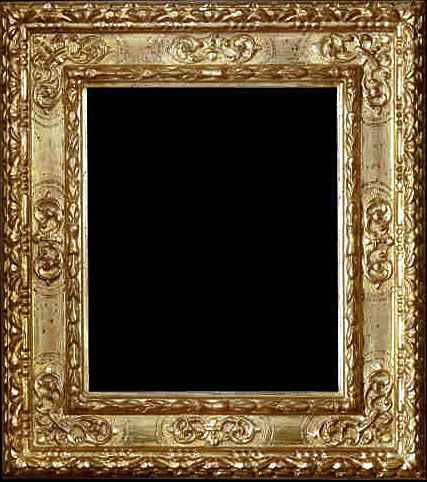
Quilts, tapestries, murals, wood and paper panels seldom need a frame. A frame is, however, an essential for any other art form which existed since the Middle Ages when the frame was integral to the art. Cabinetmakers, architects, gilders, and wood carvers made the first frames in 15th-century Italy. From Italy the craft of frame making spread throughout Europe.
 Some early settlers to America brought with them framed works of art, introducing the craft and frame designs of 16th- and 17th-century France, England, Holland, Spain and Portugal to the Colonies. The earliest frames were not only decorative, but also reflected the tastes and fashions of the time and often the artist's concept of what was right for his work.
During the American Federal Period from the late 18th- and early 19th-century, wealth increased for many who then sought the better things in life. The larger pictures that people hung singly and the groupings of smaller works were frequently completed with simply ornamented gilt frames that mirrored the understated furniture of the period.

Few homes were without pictures through the classically dominated Empire period from 1810 to 1830. Despite frequently being hung high above eye level, the paintings boasted elegant frames of gilt moldings, later in the period, when Empire furniture had become more elaborate and less graceful, frames, too, became extravagant featuring ornately carved plaster and lots of gilding. The exceptions were the narrow black frames used for prints. As the Victorian period embraced the American scene and became ever more ornate, frames followed suit.
 By the middle of the 19th century, frame making had become a well-established industry in America. Most were mass-produced and lacked the fine quality and individual creativity of handcrafted ones.
For those seeking to collect works of two-dimensional art, a knowledge of frames— their history, styles, makers, design and material details—is very important. This can be accomplished by learning from dealers in fine frames, frames restorers, and museum curators, as well as doing a lot of reading and studying the art works in museums to see how and which frames have been used.
 While choosing the wrong frame doesn’t physically damage a work of art, it damages it aesthetically. To ensure that a particular art work has the right frame, the date of the painting should match the date of the frame. During the late Victorian era, the preferred frames were wide and heavily embellished. During the years of the late 19th-century Aesthetic Movement, decorative frames continued to be used but were flatter. Another consideration should be the color of the frame appropriate to the date of the art work.
The frame’s width depends on whether a work of art has a busy or a simple composition. Fancier frames complement busy art works while simple ones do the same for simple works of art.
 The frame should always complement or enhance the work of art it surrounds. It should never go with the style of the room that it’s in.. If the art work doesn’t fit in that room, it doesn’t belong there.
To read more articles on antiques, please visit the Antiques Articles section of my Web site. And to stay up to the minute on antiques and collectibles, please join the over 30,000 readers by following my free online magazine, #TheAntiquesAlmanac. Learn more about the "Pottery Through the Ages" in the 2022 Winter Edition, online now. And to read daily posts about unique objects from the past and their histories, like the #Antiques and More Collection on Facebook.

