Wednesday, April 13, 2022

Frame It!


QUESTION: I love collecting older works of art—not the type found in galleries and museums, but those found in flea markets, antique shops and shows. While some come with frames, many don’t. And those that do have frames often don’t look right in them. How can I tell what type of frame should go with a particular work of art? How have frames changed over the centuries? How does the age of a frame relate to the art work?

ANSWER: Most people who purchase older art works don’t bother to change the frames that come with them, even if they aren’t the best for the art works they surround. 

Most two-dimensional antique and vintage art works----paintings, posters, and prints---had frames, but it’s not unusual for them to be sold without them. Often the existing frame is an inappropriate replacement, or isn’t in perfect condition. While restoring a frame is often a simple procedure, finding the right one can be as time-consuming and challenging as discovering the work of art, itself.

An overwhelming frame on a delicate painting robs it completely of the experience of the delicacy, and conversely, a painting that’s strong and powerful, for example, will be  short-changed by a thin, delicate, fancy frame.

Quilts, tapestries, murals, wood and paper panels seldom need a frame. A frame is, however, an essential for any other art form which existed since the Middle Ages when the frame was integral to the art. Cabinetmakers, architects, gilders, and wood carvers made the first frames in 15th-century Italy. From Italy the craft of frame making spread throughout Europe. 

Some early settlers to America brought with them framed works of art, introducing the craft and frame designs of 16th- and 17th-century France, England, Holland, Spain and Portugal to the Colonies. The earliest frames were not only decorative, but also reflected the tastes and fashions of the time and often the artist's concept of what was right for his work.

During the American Federal Period from the late 18th- and early 19th-century, wealth increased for many who then sought the better things in life. The larger pictures that people hung singly and the groupings of smaller works were frequently completed with simply ornamented gilt frames that mirrored the understated furniture of the period.

Few homes were without pictures through the classically dominated Empire period from 1810 to 1830. Despite frequently being hung high above eye level, the paintings boasted elegant frames of gilt moldings, later in the period, when Empire furniture had become more elaborate and less graceful, frames, too, became extravagant featuring ornately carved plaster and lots of gilding. The exceptions were the narrow black frames used for prints. As the Victorian period embraced the American scene and became ever more ornate, frames followed suit.

By the middle of the 19th century, frame making had become a well-established industry in America. Most were mass-produced and lacked the fine quality and individual creativity of handcrafted ones.

For those seeking to collect works of two-dimensional art, a knowledge of frames— their history, styles, makers, design and material details—is very important. This can be accomplished by learning from dealers in fine frames, frames restorers, and museum curators, as well as doing a lot of reading and studying the art works in museums to see how and which frames have been used.

While choosing the wrong frame doesn’t physically damage a work of art, it damages it aesthetically. To ensure that a particular art work has the right frame, the date of the painting should match the date of the frame. During the late Victorian era, the preferred frames were wide and heavily embellished. During the years of the late 19th-century Aesthetic Movement, decorative frames continued to be used but were flatter. Another consideration should be the color of the frame appropriate to the date of the art work. 

The frame’s width depends on whether a work of art has a busy or a simple composition. Fancier frames complement busy art works while simple ones do the same for simple works of art. 

The frame should always complement or enhance the work of art it surrounds. It should never go with the style of the room that it’s in.. If the art work doesn’t fit in that room, it doesn’t belong there. 

To read more articles on antiques, please visit the Antiques Articles section of my Web site.  And to stay up to the minute on antiques and collectibles, please join the over 30,000 readers by following my free online magazine, #TheAntiquesAlmanac. Learn more about the "Pottery Through the Ages" in the 2022 Winter Edition, online now. And to read daily posts about unique objects from the past and their histories, like the #Antiques and More Collection on Facebook.

Tuesday, April 5, 2022

More Than Roses, Apples, and Ivy


QUESTION:  My mother was living by herself and, as she was getting older, decided to move into a retirement community. So she needed to downsize. She gave me quite a few pieces of mid 20th-century, solid colored dinnerware that looked a lot like Fiesta Ware. But the pieces had a stamp on the back that said “Franciscan Ware.” I’ve always liked these dishes and would love to find pieces to make up a complete set. What can you tell me about Franciscan Ware? Is it possible to find additional pieces?

ANSWER: The dishes your mother gave you were the first pattern of Franciscan dinnerware, called El Patio, designed by Mary K. Grant in 1934. First introduced by Gladding, McBean and Company, it was available in six solid colors, accompanied by mixing bowls and casserole dishes.

For the next 50 years, Gladding, McBean and Company produced nearly 150 patterns of colorful dinnerware, kitchenware, and decorative pieces of earthenware in Glendale, California. The most popular patterns in the Franciscan line—known as Apple, Desert Rose, and Ivy— featured embossed, hand-painted designs created in the 1940s.

The name 'Franciscan^ was a tribute to the Franciscan Friars who had established missions in California in the 17th century. In 1936, the company changed the name of the line from Franciscan Pottery to Franciscan Ware to convey a sense of quality..

Glassing, McBean produced its Franciscan ware in three distinct types of body material. The first was "malinite,^ a cream-colored durable earthenware. Next high quality vitrified china wares, known as Masterpiece China in 1940 and Franciscan China in 1942.  And lastly, the firm also made Franciscan Ware in a whitestone ware, a white earthenware first used by Gladding, McBean in 1959.

Just as Franciscan body materials came in three categories, so did the patterns used to decorate them. The three were solid-color patterns, embossed, hand-painted patterns, and decided patterns, some of which came in either a glossy or a matt glaze Potters based the earlier patterns on Mexican and early American designs.

Solid-color patterns generally come in a single color, although the company also produced two-tone ones. The very first Franciscan dinnerware, El Patio, made from 1934 to 1953, came in 20 different solid colors and over 103 shapes. Cups and bowl handles had a distinctive, pretzel-like shape. A short-lived variation on this pattern, El Patio Nuevo, was manufactured in a two-tone pattern from 1935 to 1936. The interiors  and exteriors of all pieces came in different solid colors.

Another well known solid-color pattern produced around 1936 was Coronado, finished  in satin, matt, and glossy glazes. Also called Swirl for the swirling, spiraling shape molded into the pottery.

Gladding McBean's designer Morris Sanders created the Metropolitan pattern, originally produced in Ivory, Ivory and Coral, Ivory and Grey, and Ivory and Turquoise satin finish colors. for a New York industrial design exhibition at the Metropolitan Museum of Art. In color combinations, potters used Ivory for lids and handles and as a liner. They also made Plum and Chocolate Brown patterns, each with Ivory liners. All of the vessel forms in Metropolitan were either square or rectangular.

The embossed, hand-painted patterns had decorative shapes embossed into the pieces. Decorators then hand-painted these raised shapes prior to glazing. Among these were the most beautiful and sought-after Franciscan patterns, including Apple, Desert Rose, and Ivy. The producers of both the Donna Reed and I Love Lucy T.V. shows used Apple and Desert Rose on their sets.

Introduced on January 1, 1940, Apple was Gladding, McBean’s first embossed, hand-painted pattern. It was popular for its bright red fruit, sturdy brown branches. By early 1942, Desert Rose, a pattern with pink wild roses, light brown thorny branches and green leaves, also became popular. Gladding, McBean then applied the Desert Rose pattern to previously existing vessel shapes. The finials on the lids, shaped like rose buds, were distinctive.

The company introduced Ivy in 1948, rounding out the trio of most popular Franciscan patterns. Ivy was originally offered with 27 shapes. Gladding, McBean added additional vessel shapes, including comports, a covered butter dish, a 12-ounce mug, a relish dish with three sections, a side salad, sherbet dishes and a TV tray, in the 1950s.

Besides its three main patterns, the firm produced decaled patterns—underglazed transfer printed patterns produced from the late 1930s right on through to the 1980s. The most popular of these patterns was the Starburst pattern. Introduced in 1954, Starburst featured large and small blue and yellow dots through which black lines radiated. The Eclipse vessel shape upon which Starburst appears was also distinctive.

Because of the volume of pieces produced by Gladding, McBean and Company, it’s possible to find many of them online at eBay and other sellers of antiques and collectibles. 

To read more articles on antiques, please visit the Antiques Articles section of my Web site.  And to stay up to the minute on antiques and collectibles, please join the over 30,000 readers by following my free online magazine, #TheAntiquesAlmanac. Learn more about the "Pottery Through the Ages" in the 2022 Winter Edition, online now. And to read daily posts about unique objects from the past and their histories, like the #Antiques and More Collection on Facebook.

Friday, March 25, 2022

At Sea in a Bottle


QUESTION: My grandfather was a merchant seaman for most of his life. From his work, he developed a passion for historic ships and out of that for models of historic ships in bottles. Sadly, he’s recently passed on but before he died, he gave me the ships in bottles, about a dozen of them, that he had collected. I’m curious to learn how long people have been building models of historic ships in bottles. And exactly how did they do that?

ANSWER: Historically, the first mention of objects placed in bottles dates back to 1719. A German artist, musician and magician, Matthias Buchinger, built models, although not necessarily of ships, inside bottles. This was remarkable since he was born without arms or legs.

The oldest surviving ship in a bottle, a Turkish or a Portuguese three-masted warship, dates to 1784. Instead of laying on its side as most do, the maker placed it in an egg--shaped bottle, which hes placed upside down over a wooden stand. 

The idea of putting a model of a ship in a bottle became very popular after the fast sailing ships like the clipper came into service. So most of the antique ships in bottles found today appeared after 1840.

Ships in bottles became more popular as folk art in the second half of the 19th century, after the introduction of cheap, mass-produced bottles made with clear glass. They also became a very popular nautical gift during the late 18th and the early and mid-19th centuries in both Europe and the Americas.

Historians believe that monks living in monasteries spent tireless hours working on the earliest examples of these intricately carved models. The emergence of putting ships inside bottles can be followed back to the mid to late 19th century.

Ships in bottles were a unique way for anyone to connect with maritime history even if they weren't a sailor. By the 20th century, with the creation of new, faster ships on the seas, so ships in bottles became more diverse in design. 

Antiques experts classify a ship in a bottle as an impossible bottle—a bottle containing an object that does not appear as if it would fit through the bottle's mouth. It’s the most iconic type of impossible bottle. Other common objects often inserted into bottles include fruits, matchboxes, decks of cards, tennis balls, racketballs, Rubik's Cubes, padlocks, knots, and scissors. These may be placed inside the bottle using various mechanisms, including constructing an object inside the bottle from smaller parts, using a small object that expands or grows inside the bottle, or molding the glass around the object.

Over the centuries, many people probably asked themselves just how the model ships got into the bottles. There are two ways to place a model ship inside a bottle. The simpler way is to rig the masts of the ship and raise it up when the ship is inside the bottle. The maker built the masts, spars, and sails separately and then attached them to the hull of the ship with strings and hinges so the masts could lay flat against the deck of the ship. He then placed the ship inside the bottle and pulled the masts up using the strings attached to the masts. However, the hull of the ship must have still been able to fit through the neck of the bottle. Ships bottle makers often chose bottles with minor distortions and soft tints to hide the small details of erecting the ship inside the bottle, such as hinges on the masts. Some used specialized long-handled tools to build the entire ship inside the bottle.

Since ships of the past came in different shapes and sizes, the size of the bottle and the extent of its flat-base shape when placed horizontally mattered immensely to the makers. 

To read more articles on antiques, please visit the Antiques Articles section of my Web site.  And to stay up to the minute on antiques and collectibles, please join the over 30,000 readers by following my free online magazine, #TheAntiquesAlmanac. Learn more about the "Pottery Through the Ages" in the 2022 Winter Edition, online now. And to read daily posts about unique objects from the past and their histories, like the #Antiques and More Collection on Facebook.


Monday, March 14, 2022

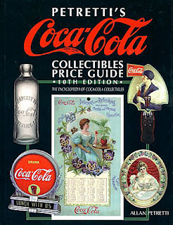
When It Comes to Coca Cola Collectibles—Buyer Beware


QUESTION: Several years ago, I began collecting advertising items made for Coca Cola. I have several calendars, stuffed animals, and matchbooks. They seem to be everywhere, so it wasn’t hard to begin collecting them. Recently, I purchased a serving  tray, supposedly dating from the 1930s, with a woman in a yellow swimsuit holding a bottle of Coca Cola at a local antique show which features mostly lower to middle priced late antiques and collectibles for sale. This was the most expensive Coca Cola piece I had yet purchased, so I was a bit hesitant at first. But the dealer assured me that it was authentic. Considering its age, I was surprised how bright and crisp the colors were, but I just assumed it had been used very little. How can I tell if the tray is authentic?

ANSWER: Because Coca Cola has been around for over 130 years, there’s a huge number of collectible items on the market. And with the launching of online auction and sales sites, the number has steadily grown. But this means there’s an even greater chance that some of these items are reproductions or outright fakes. 


John Pemberton, a pharmacist, created Coke syrup in 1886. He convinced a nearby soda fountain in Atlanta to add carbonated water and give it a try. At first the drink was only a modest success, Pemberton and his partner, Frank Robertson, came up with the  name Coca-Cola, scripted in a flowing hand by Robertson. That, plus a series of hand-painted banners encouraged passers-by to "Drink Coca-Cola," was the beginning of a successful marketing campaign that lives on to this day.

Coca-Cola has used its particular shade of red in its merchandising for more than a century, and its distinctive trademark has remained virtually unchanged from the original. 

Coca-Cola collectibles can be found at a variety of prices all over the Internet. EBay alone lists over 200,000 collectibles for sale, ranging from original 6.5-ounce glass bottles for 99 cents each to lifetime assortments well into six figures. Restored and working vending machines can cost $10,000 or more. Early porcelain signs and those with original neon enhancements frequently sell for thousands as well. And because of the huge variety of merchandise, many collectors tend to specialize by era, type or size.

Even though Pemberton and Robertson founded the company in the late 1890s, collecting Coca-Cola advertising items---beautiful models printed on trays, calendars, signs, and even tiny pocket mirrors—didn’t begin to get popular until the early 20th century. Coca-Cola print advertising onto just about anything and gave these items out at state fairs and schools in towns all across the country.

Coke’s advertising department placed many of the large, gorgeous cardboards and metal advertisements with store owners and gas stations as temporary promotional displays intended for seasonal use. Many ended in the trash just like those of today. People used signs to patch holes in roofs, line attic walls, or for target practice.

The overwhelming number of reproductions in this category makes it imperative that collectors learn as much as possible Coca-Cola items. Beginners can learn a lot from price guides and online forums.

Collectors typically like items produced from the late 1800s to the 1960s. But with so many items on the market, it’s only natural that some will be fake. The difference between a reproduction and a fake is that there never was an original item like the fake. At first, the Coca-Cola Company made it easy to make their reproductions look like the originals produced 50 to 100 years before. For example, the reproduction trays from 1974 had only a small written notice on the rim of the trays to say they were recently made. But savvy sellers could easily remove the notice by scraping it off with a pocket knife. 

Reproduction serving trays from the 1930s have a note on the back saying so. The original had sharper lithography with a dark-colored back while the reproduction trays had less-than-sharp lithography and a light colored back.

The location of the trademark notification has also varied throughout the years. Early on, the trademark appeared inside the long trailing C in “Coca.” Starting in the 1940s, The company moved it to a position under the entire word “Coca-Cola.” That happened because the Coca-Cola Company lost a court case. The result was the loss of the trademark control over of “Cola” since the trademark notification was only under “Coca,” not under both parts of the logo.

This change was great for collectors who want to date Coca-Cola items as being before 1940 but can lead to many problems for dating items made after 1940. Naturally many novice collectors don’t know the difference and end up paying way too much for items produced more recently.

It’s a good idea for beginning collectors to do research before making an expensive purchase and to consult more than one source for information.

To read more articles on antiques, please visit the Antiques Articles section of my Web site.  And to stay up to the minute on antiques and collectibles, please join the over 30,000 readers by following my free online magazine, #TheAntiquesAlmanac. Learn more about the "Pottery Through the Ages" in the 2022 Winter Edition, online now. And to read daily posts about unique objects from the past and their histories, like the #Antiques and More Collection on Facebook.


Thursday, March 3, 2022

Pottery with a New Orleans Flavor


QUESTION: I’ve always liked Arts and Crafts pottery. I understand that women made and decorated some of the different types of that pottery. One particular type that I’ve admired is Newcomb pottery. What can you tell me about it and the women who created it?

ANSWER: The years from the mid-1890s to just before World War I witnessed a progressive movement that affected not only the arts but the way people viewed how things were made.  During the second half of the 19th century, mass production of many products, including pottery, became common. This gave rise to a movement that looked back to when people made it by hand. At the same time, women began to look beyond the home to fulfill their lives. 

Newcomb Pottery was produced from 1895 to 1940. The company grew out of the pottery program at H. Sophie Newcomb Memorial College, the women's college now associated with Tulane University in New Orleans, Louisiana. The Pottery was a contemporary of other Arts and Crafts potteries, such as Rookwood, North Dakota, Teco, and Grueby.

Pottery decoration was one of the programs offered at the College since other Arts and Crafts potteries, such as the Rookwood Pottery in Cincinnati had begun employing women to decorate their pots This was one field where women could earn money in a respectable manner.

Under the tutelage of Professor William Woodward, advanced Newcomb art students participated in the Tulane Decorative Art League, which combined with the New Orleans Art League Pottery Club to take over the old New Orleans Art Pottery facility in 1890. Students employed their pottery decorating skills here until the Newcomb Pottery was organized in 1895. The Pottery Club encouraged Newcomb students with decorating experience to focus their artistic efforts on wares produced at the school facility. The plan was to establish a pottery program by converting a former chemistry laboratory into a pottery studio so that students could sell their wares and make the program self sufficient.

Two art professors, Ellsworth and William Woodward, who had been members of the faculty since the opening of Newcomb College became the driving forces behind the College’s art school. Ellsworth Woodward developed a curriculum in which women could be trained to earn money in a field other than the already acceptable vocation of teaching.

The first people the Woodwards hired to assist with the new pottery program were the potters. Unlike the artists who created and carved the designs for the Newcomb Pottery, the potters were all men. Even though the College was progressive for its day, the administration believed that only men could work the clay, throw the pots, fire the kiln, and handle the glazing. So they hired men to throw the pots, a task the school considered unladylike, beyond the abilities of the female students, and beneath their dignity  The first potter they hired in 1895 was a Frenchman named Jules Garby 1895. Joseph Meyer, one of Newcomb Pottery's most recognized potters, followed him in 1896, About the same time, the Woodwards hired the eccentric potter George Ohr. His tenure lasted for less than two years, at which time they fired him because they said he was unfit to instruct young ladies. Ohr went on to establish his own pottery in Biloxi, Mississippi in 1897.  

Jonathan Hunt replaced Meyer in 1927 and later Kenneth Smith in 1929. After Hunt left the Pottery in 1933, Francis Ford replaced him. Both Smith and Ford stayed with the Newcomb Pottery program through its termination in 1940.

Eventually, the Pottery designated women who worked regularly in it as craftsmen with a preference given to those who had completed an undergraduate degree and a later graduate studies program with the school’s art department.

The women were responsible for creating and carving designs for each piece of pottery the program produced. During the Pottery’s existence, they created and carved over 70,000 unique pieces.

Early pieces at the Pottery closely reflected the Arts and Crafts style. The pottery often depicted Louisiana's local flora, done in blue, yellow and green high glazes. Newcomb Pottery was at its peak from 1897 to 1917. During that time, the women experimented with various glazes and designs, winning many awards at exhibitions throughout the country and in Europe. 

As the school entered the 1920s, new professors arrived and began to introduce influences from the 1913 International Exhibition of Modern Art. Highly carved pieces done in matt glazes of blue, green and pink marked this period. The Pottery introduced one of its most famous designs, the "Moon & Moss" style, during this time.

Newcomb Pottery also recruited pottery experts to help improve its product. Among them was Mary Given Sheerer from the Cincinnati area, originally hired to train the students in the slip-decorating techniques popularized at that time by the Rookwood Pottery.

Though training genteel young women was the Pottery’s main goal, the potters and students attempted a number of styles, as they sought to best use the raw materials available in the vicinity of New Orleans. The had originally planned to replicate the contemporary style of the Rookwood Pottery but that failed because slip-painting was unreliable in the hot and humid New Orleans climate. By 1900, Sheerer had to adapt her style, first to biscuit-painted designs and later to incised decorations, both under a high-gloss transparent glaze.

The potters also experimented with the types of clays they used to form the pots. The first clays they used fired either red or buff. A few years later, they used only clays from St. Tammany Parish, Louisiana. They mixed these clays with loam gathered from the banks of the Mississippi River to produce white bodies.

With the end of the First World War, the popularity of the Arts and Crafts Movement waned. What had once seemed attractive and desirable because of its handmade qualities now looked rustic, old-fashioned and amateurish.

To read more articles on antiques, please visit the Antiques Articles section of my Web site.  And to stay up to the minute on antiques and collectibles, please join the over 30,000 readers by following my free online magazine, #TheAntiquesAlmanac. Learn more about the "Pottery Through the Ages" in the 2022 Winter Edition, online now. And to read daily posts about unique objects from the past and their histories, like the #Antiques and More Collection on Facebook.


Thursday, February 24, 2022

The Ultimate in Danish Design


QUESTION: When I was a kid, I remember sitting on my grandfather’s lap in a very comfortable chair. It was designed like a big glove and swiveled on a chrome base with four legs. I don’t know what it was called, but I remember him referring to it as Danish modern. Can you tell me anything about this type of chair?

ANSWER: You were very lucky indeed, for you got to experience the ultimate in Danish design, the Egg Chair, designed by Arne Jacobsen in 1957. But before we explore this chair further, it’s important to know how this design style came into existence.

In 1924,. Danish architect Kaare Klint was asked to teach a newly class in furniture design at the Royal Academy's School of Architecture in Copenhagen. Considered the originator of the modern Scandinavian style of furnishing and furniture design which thrived from the 1940s to the 60s, Klint’s influence on even today’s designs is great. 

Using teak, which was plentiful in Denmark, the Danish Modern style began to emerge in the 1920s and soon gained popularity with cabinetmakers in Copenhagen.


After 1945, this unique style achieved worldwide recognition and by the mid-20th century, Danish modern had officially arrived.

The son of Peder Vilhelp Jensen-Klint, the leading Danish architect of the early 20th century, Kaare Klint studied painting and apprenticed to several architects, including his father, before opening an independent furniture design studio in 1917.

He became the first Danish designer to combine function with Danish hand-craftsmanship. His drawings revealed an attention to the needs of the human body, long before the science of ergonomics came into being.

For instance, in order that his sideboards would be the most efficient, he determined the average dimensions of the cutlery and crockery used in a Danish home. Klint then created a case containing the smallest space required for the maximum amount of cutlery needed by a household. Aesthetically, he allowed the unvarnished teak to speak for itself, maximizing its clean beauty by waxing and polishing. And so Danish designers began using natural finishes for their pieces.

Klint is known as the grandfather of modern Danish design. He, more than any other Danish furniture designer, felt that it was important to understand the craftsmanship of the furniture of the past.

He pioneered in anthropometrics, which correlates measurements of the human body to make furniture better suited to man’s physical characteristics, essentially the essence of today’s ergonomics. In 1933, he created a deck lounge chair, which he outfitted with a removable upholstered mat and pillow. 

America's initial fascination with Danish modern furniture was largely the result of Edgar Kaufmann Jr. of the Museum of Modern Art in New York. He returned from Europe in 1948 with photographs of chairs designed by another Danish  architect, Finn Juhl. The interest in Juhl's furniture led to a collection designed by him for the Barker Co.

Presented in 1951, the collection introduced American designers to the structural and decorative combining of woods of various colors and grains. Highlights included a teak armchair.

Fruitful collaboration between designers and cabinetmakers led to more industrialized production. By 1950, a few factories in Denmark began producing furniture using purely industrialized methods. The new generation of designers included Arne Jacobsen, whose creations, while organic in nature, used materials such as light metals, synthetic resins, plywood, and upholstered plastics.

Graduating from the Royal Academy in 1924, Jacobsen soon demonstrated his mastery of both architecture and furniture design. With the completion of his Royal Hotel in Copenhagen with all its fittings and furniture in 1960, his talents became widely recognized.

Jacobsen's most commercial success was the Ant Chair, which was available in a number of materials, including natural oak, teak and rosewood veneers, colored finishes or upholstery. Inspired by American legends Charles and Ray Eames, this unique chair was considered revolutionary in 1952, having only three spindly legs, no arms, and a one-piece plywood seat and back. The design of this chair became the basis for the stackable chairs used in hotels and conference centers today. Jacobsen followed the Ant with Series 7, a chair that had four legs and optional arms. Initially designed in 1955, and still being produced today.

Most of Jacobsen’s designs were the direct result of his belief that architecture and furnishings should be totally integrated. Two of his commissions—the Scandinavian Airlines Terminal and the Royal Hotel in Copenhagen—resulted from the creation of the uniquely shaped chairs, the “Egg” and the “Swan.” Designed in 1957, these modernistic chairs featured hi-density, rigid polyurethane foam, upholstered on single-seat shell construction. Both are extremely comfortable while being ergonomically sound and pleasing to look at.

There was a period of time in the middle of the 20th century when Danish designers were the world's most admired. Some of the most talented earned prizes at major competitions, and their works were quickly acquired by top European interior designers and collectors. Today, American designers see them suited to many different kinds of interiors.

To read more articles on antiques, please visit the Antiques Articles section of my Web site.  And to stay up to the minute on antiques and collectibles, please join the over 30,000 readers by following my free online magazine, #TheAntiquesAlmanac. Learn more about the "Antiques of Christmas" in the 2021 Holiday Edition, online now. And to read daily posts about unique objects from the past and their histories, like the #Antiques and More Collection on Facebook.


Sunday, February 13, 2022

A Bookmark for My Love


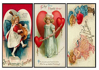
QUESTION: I love to read, so I have quite a few bookmarks. Most are newer. But at several recent antique shows, I noticed quite a few older bookmarks, many of them featured hearts in some way. Were they given as Valentine’s gifts? I think I’d like to start a collection of some of these older bookmarks. How collectible are they?

ANSWER: Bookmarks have been around in some form or another for hundreds of years, ever since the first printed book rolled off the press in 1455. What a lot of people don’t know was that bookmarks were popular gifts, especially during Victorian times. And many people gave them as small Valentine gifts.

Over the years, Valentine gifts have taken many forms—cards, chocolates, even bookmarks. But whatever form they have taken, these expressions of love often displayed a heart of some sort.

People often gave bookmarks as gifts and as souvenirs or to commemorate a number of events. The heart shape in bookmarks often served to convey expressions of emotions, religious sentiments, or as a way to advertise products of the day.

Also called bookmarkers, these were important instruments for people to use to keep their place while reading. Surprisingly, a great many bookmarks are in the shape of a heart or contain some kind of heart motif.

At first, they were probably nothing more than a scrap of parchment. But as time went on people used a variety of objects as bookmarks. Eventually, printers created actual bookmarks with the primary purpose of marking a place in a book. Someone presented Queen Elizabeth I of England with a silk fringed bookmarker by Christopher Barker in 1584. 

Bookmarks became more common by the post Industrial Revolution. By the mid-19th century there was a convergence of improved methods in the book binding process and an overall increase in literacy. With improved book printing techniques, books became less expensive to produce, and more available to a lot of people. But no one usually read an entire book in one sitting, so bookmarks became a necessary way to mark the place where the reader stopped. 

Silk bookmarks were the most common from around the 1850s and were primarily intended for use in Bibles and prayer books. During the 1860s in Coventry, England, Thomas Stevens was experimenting with his looms and developed a jacquard technique for manufacturing colored silk pictures. He demonstrated these at the 1876 Centennial Exposition in Philadelphia, and the World's Fair Columbia Exposition in Chicago in 1893. Silk bookmarks, generically called "Stevengraphs," are typically 2 by 6 inches long. These machine embroidered silks became so popular that Stevens began producing them with American themes. Other companies also produced these  desirable and highly prized silk bookmarks. They were especially popular with the women in Victorian book clubs. 

Between 1850 and 1900, home-crafted bookmarks of needlework on perforated cards became quite common. Printing techniques dramatically changed from 1860 through 1900 and ushered in the “Era of Lithography." Names such as Currier & Ives and Prang were to the best known associated with lithography and chromolithography. 

Silver bookmarks became quite popular from about 1380. People still give them as gifts today. In addition to silver, bookmarks have also been made in brass, copper, nickel steel and Britannia white metals. With the turn of the century came bookmarks made of aluminum, celluloid and lighter weight paper. The heart motif can be found on bookmarks made of all these materials.

Because the shape of the heart has long been a symbol of love, affection, deeply felt sentiments, caring, concern and earnestness, its easy to see why makers of bookmarks often turned to the heart as a theme.

The intertwined cross, anchor and heart were often meant to represent faith, hope and charity. Was this bookmark a symbolic religious expression of late Victorian or turn of the century sentiments? Or was this possibly the bookmark of a tea captain? Or was it designed to be given by a sailor to his sweetheart or wife as a gift, a gift that would remind the recipient of the giver whenever a book was read? 

While hearts represent love, or positive feelings such as warmth and charity, they also were very useful marketing tools. A celluloid heart bookmark with a surround of blue and green forget-me-nots on the outside border advertised "Cunningham Pianos." 

Embossed aluminum bookmarkers fashioned in the shape of hearts were quite popular during the 20th century, especially for souvenirs. A 1901 heart bookmark with embossing read "Pan American Exposition, 1901, Souvenir" around the raised raging bull symbol. Another example features an embossed aluminum bookmark that bears + the Bunker Hill Monument.

To read more articles on antiques, please visit the Antiques Articles section of my Web site.  And to stay up to the minute on antiques and collectibles, please join the over 30,000 readers by following my free online magazine, #TheAntiquesAlmanac. Learn more about the "Antiques of Christmas" in the 2021 Holiday Edition, online now. And to read daily posts about unique objects from the past and their histories, like the #Antiques and More Collection on Facebook.