Showing posts with label artist. Show all posts

Thursday, August 3, 2023

The Devil with a Hammer in His Hand


QUESTION: I’ve always been fascinated with decorative ironwork. Seeing it on my first trip to New Orleans got me hooked. Ever since, I’ve sought out decorative gates, window grills, and railings. Most of this ironwork is unsigned, thus the creators remain anonymous. Recently, I heard of a especially talented metalworker named Samuel Yellin. What can you tell me about this artful metalworker?

ANSWER: Few people think of hand-wrought iron as being an art form, but metalworker Samuel Yellin produced an incredible amount of forged ironwork he designed and executed along with talented craftsmen trained by him. His designs followed the concepts of the Arts and Crafts Movement in the first quarter of the 20th century. Although he was knowledgeable about traditional craftsmanship and design, he championed creativity and the development of new designs for both intimate or monumental scale, for private homes or large institutions. .

Born in Russia in Mohyliv-Podilskyi, Ukraine in the Russian Empire in 1884, he apprenticed to a master ironsmith at age 11.  In 1900, at the age of 16, he completed his apprenticeship. Shortly afterwards he left the Ukraine and traveled through Europe before emigrating to America in 1900. He headed to Philadelphia where his mother and two sisters were already living. Yellin took classes at the Pennsylvania Museum School of Industrial Art and within several months began teaching a class in wrought iron work, a position he maintained until 1919. 

He opened his first shop in 1909 with three assistants. Through recommendations by architects with whom he worked, Yellin built an appreciative clientele. He soon received the first of many major commissions, the palatial gates of J.P. Morgan's Long Island estate. To keep up with burgeoning business, the firm of Mellor & Meigs Architects, for whom Yellin had designed and created many commissions, designed a new studio for him on Arch Street in Philadelphia in 1915.

As a material, iron lacks intrinsic value and has little aesthetic appeal. The color is coarse, and it’s often used for the most utilitarian items.. Yellin's ironwork is endowed with a great deal of character and appeal based largely on the visual evidence of its having been crafted by hand. 

Yellin believed there was only one way to make good decorative metalwork and that was with the hammer at the anvil. He was adamant about working from traditional designs. He saw the poetry and rhythm in iron.

He also believed his ironworks should harmonize with their environment. Iron window grilles naturally restrict access and provide security, but Yellin insisted that ironwork must not be seen as a barrier. Ironwork should instead create a visual bridge between people and buildings, and to the space beyond it.

Yellin's gates, railings, lanterns, doors, grilles and numerous other creations not only adorned and decorated the buildings and rooms for which they were created, but also are among the finest in artistic achievement in ironwork.

His decorative ironwork is reminiscent of that in the Middle Ages. Yellin preferred to be called a blacksmith, not an artist or metalworker. He believed a metalworker needed to be both designer and smith, for every hammer stroke became an integral part of the design. His railings were tactile as well as visually appealing. He turned,, twisted, and pulled the iron, demonstrating the physical process involved in manipulating the challenging material. Tenons were important in Yellin's work. He used them to show how he joined the pieces together. These were part of the design, providing texture and dimension to the tops of the handrails or edges of the gates. 

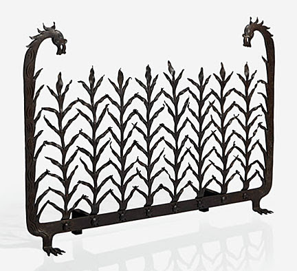
Forging is the process of shaping metals by hammering or pressing them after making them pliant by the application of heat. Forging improves the structure of the metal by refining the grain size thus making it stronger, more ductile, and more resistant to fatigue and impact. Hand-forged iron reached its peak during the 13th and 14th centuries in Italy where ironworkers used it in many chapel screens and window and door grills. 

French and Spanish artisans were responsible for much of the early ironwork in New Orleans, while early ironwork in the northeast U.S. is due to English and American metalworkers: By the Industrial Revolution, cast ironwork replaced hand wrought iron.

From 1921 to 1924, Yellin worked on what was probably the largest commission of wrought iron work: 200 tons of wrought iron for the Federal Reserve Bank in New York City. This massive project required expansion of the shop to 60 forges and 250 workers.

At the firm's peak in 1928, Yellin employed 268 men. The studio received over 1,200 commissions in the 1930s alone. 

Although a heart attack in 1930 slowed his pace and he concentrated on experimental techniques. He died suddenly in 1940 at the age of 55. 

To read more articles on antiques, please visit the Antiques Articles section of my Web site.  And to stay up to the minute on antiques and collectibles, please join the over 30,000 readers by following my free online magazine, #TheAntiquesAlmanac. Learn more about "Coffee--The Brew of Life" in the 2023 Summer Edition, online now. And to read daily posts about unique objects from the past and their histories, like the #Antiques and More Collection on Facebook.


Wednesday, April 13, 2022

Frame It!


QUESTION: I love collecting older works of art—not the type found in galleries and museums, but those found in flea markets, antique shops and shows. While some come with frames, many don’t. And those that do have frames often don’t look right in them. How can I tell what type of frame should go with a particular work of art? How have frames changed over the centuries? How does the age of a frame relate to the art work?

ANSWER: Most people who purchase older art works don’t bother to change the frames that come with them, even if they aren’t the best for the art works they surround. 

Most two-dimensional antique and vintage art works----paintings, posters, and prints---had frames, but it’s not unusual for them to be sold without them. Often the existing frame is an inappropriate replacement, or isn’t in perfect condition. While restoring a frame is often a simple procedure, finding the right one can be as time-consuming and challenging as discovering the work of art, itself.

An overwhelming frame on a delicate painting robs it completely of the experience of the delicacy, and conversely, a painting that’s strong and powerful, for example, will be  short-changed by a thin, delicate, fancy frame.

Quilts, tapestries, murals, wood and paper panels seldom need a frame. A frame is, however, an essential for any other art form which existed since the Middle Ages when the frame was integral to the art. Cabinetmakers, architects, gilders, and wood carvers made the first frames in 15th-century Italy. From Italy the craft of frame making spread throughout Europe. 

Some early settlers to America brought with them framed works of art, introducing the craft and frame designs of 16th- and 17th-century France, England, Holland, Spain and Portugal to the Colonies. The earliest frames were not only decorative, but also reflected the tastes and fashions of the time and often the artist's concept of what was right for his work.

During the American Federal Period from the late 18th- and early 19th-century, wealth increased for many who then sought the better things in life. The larger pictures that people hung singly and the groupings of smaller works were frequently completed with simply ornamented gilt frames that mirrored the understated furniture of the period.

Few homes were without pictures through the classically dominated Empire period from 1810 to 1830. Despite frequently being hung high above eye level, the paintings boasted elegant frames of gilt moldings, later in the period, when Empire furniture had become more elaborate and less graceful, frames, too, became extravagant featuring ornately carved plaster and lots of gilding. The exceptions were the narrow black frames used for prints. As the Victorian period embraced the American scene and became ever more ornate, frames followed suit.

By the middle of the 19th century, frame making had become a well-established industry in America. Most were mass-produced and lacked the fine quality and individual creativity of handcrafted ones.

For those seeking to collect works of two-dimensional art, a knowledge of frames— their history, styles, makers, design and material details—is very important. This can be accomplished by learning from dealers in fine frames, frames restorers, and museum curators, as well as doing a lot of reading and studying the art works in museums to see how and which frames have been used.

While choosing the wrong frame doesn’t physically damage a work of art, it damages it aesthetically. To ensure that a particular art work has the right frame, the date of the painting should match the date of the frame. During the late Victorian era, the preferred frames were wide and heavily embellished. During the years of the late 19th-century Aesthetic Movement, decorative frames continued to be used but were flatter. Another consideration should be the color of the frame appropriate to the date of the art work. 

The frame’s width depends on whether a work of art has a busy or a simple composition. Fancier frames complement busy art works while simple ones do the same for simple works of art. 

The frame should always complement or enhance the work of art it surrounds. It should never go with the style of the room that it’s in.. If the art work doesn’t fit in that room, it doesn’t belong there. 

To read more articles on antiques, please visit the Antiques Articles section of my Web site.  And to stay up to the minute on antiques and collectibles, please join the over 30,000 readers by following my free online magazine, #TheAntiquesAlmanac. Learn more about the "Pottery Through the Ages" in the 2022 Winter Edition, online now. And to read daily posts about unique objects from the past and their histories, like the #Antiques and More Collection on Facebook.

Thursday, September 30, 2021

Symbols of Worldliness


QUESTION: Back in the late 1960s, I made a road trip across the United States, stopping at numerous national parks and monuments. Early on, I noticed that on the desk in the visitor centers was a display of travel stickers for various national parks. So I decided to purchase one for each park and monument I visited, as well as other places like cities and museums. By the time my trip was over I had amassed quite a collection. Are these travel stickers collectible? 

ANSWER: While you collected travel stickers, their original use was to affix to luggage as a way of telling the world where a traveler had been. During the Golden Age of Travel during the second half of the 19th century, sticker labels like these appeared on  steamer trunks. Colorful mementos of foreign locales, luggage labels can take us back to a time of grand hotels, luxury trains, and elegant ships.

Originally, they were a way of identifying a guest’s luggage when they arrived at one of those posh resorts. Forerunners of baggage tags, travel labels became the hallmark of a world traveler—a symbol of worldliness.

Often designed in the artistic style of the time, many of luggage labels are exquisite examples of the Art Nouveau and Art Deco styles. However, even the best artists didn’t take such work too seriously. Prominent poster and graphic artists who affixed their name to larger works frequently left their luggage label commissions unsigned, but those which had been signed by the artist are the most valuable. 

By the mid-19th century, the Industrial Revolution's creation of wealth and more reliable modes of transportation, such as steamships, railroads, and passenger planes inaugurated an explosion in travel. A growing middle class, with access to more leisure time, joined businessmen, diplomats, explorers, and the rich on their travels to locales around the globe.

The earliest examples of hotel luggage labels date to the 1860s when printers produced them in small batches. But production really took off by the end of the 19th century. By that time, many more people were traveling, making the need to identify the hotel that would serve as the final destination for luggage coming off ships and trains a necessity.

To encourage this increased traffic, hotels and transportation companies turned to advertising. Newspaper and magazine ads increased in size and number. Many companies commissioned posters and luggage labels by noted graphic artists. Steamship companies, railroads, airlines, and bellhops at hotels around the world affixed labels to all sorts of luggage from small cases to trunks, proclaiming to all that the luggage’s owner was an adventurer at a time when travel was still not that fast, easy, or inexpensive. In those days, suitcases were rigid, making it easy for bellboys or concierges to stick their labels on.


Besides hotels, other businesses and organizations also employed luggage labels to promote themselves. Airlines like Pan Am began using them as soon as air travel became accessible to travelers around the 1920s. Even restaurants and national parks used them. 

Many of these labels simulated small travel posters but weren’t meant to be permanently preserved. Affixed with gum, it was extremely difficult to remove labels without damaging them, so some travelers would ask for an extra label or two to be tucked into their wallet or journal as a memento of their trip, and it is these specimens that most often turn up in the collectibles markets today. In fact, a piece of antique or vintage luggage covered with labels is often worth more than a comparable piece without.

Regarded by many as miniature works of art, most early labels were actually lithographed, and many bear the printer's imprint. Some travel companies commissioned important illustrators to produce their luggage labels. Dan Sweeney for instance was an American illustrator who contributed illustrations for books, posters, magazines, and luggage labels for the Hong Kong & Shanghai Hotel Group. Italian graphic designer Mario Borgoni was also renowned for his Art Nouveau labels and posters.

Nostalgia is one reason collectors love luggage labels. But even more so because they’re small, easy to store and display, and relatively inexpensive. Collectors have such a variety of designs to choose from that most focus on a particular style like Art Nouveau or Art Deco; a country or transportation company, hotels, a printer like Richter & Company, or a designer like Mario Borgoni. Original luggage labels can be found at flea markets and antique shows, and of course, online. 

The majority of labels sell for under $25, and depending on their rarity, condition, style, and the renown of the illustrator or the hotel or airline, can sell for several hundred. But with such reasonable prices, it pays to be aware of reproductions. A good jeweler's loupe will help distinguish the solid colors of an original lithographed label from the dots of a four-color-process reproduction or the lines of a scanned image. 


Travel stickers slowly started to lose their popularity by the 1960s as soft suitcases began to replace hard luggage, making it harder to stick labels on them.

To read more articles on antiques, please visit the Antiques Articles section of my Web site.  And to stay up to the minute on antiques and collectibles, please join the over 30,000 readers by following my free online magazine, #TheAntiquesAlmanac. Learn more about railroad antiques in "All Aboard!" in the 2021 Summer Edition, online now. And to read daily posts about unique objects from the past and their histories, like the #Antiques and More Collection on Facebook.


Thursday, September 2, 2021

Stuck on Beauty


18th-century paper 

QUESTION: While touring some historic houses, I’ve often marveled at the beautiful wallpapers on their interior walls. I’ve always loved wallpaper. In fact, every room in the house I grew up in had wallpaper on the walls. But getting it off was such a chore that many people turned to painted walls instead. I’d love to know how wallpaper originated and some of the history behind its use. Can you help me?

ANSWER: People have adorned their walls for centuries. During the Middle Ages, the wealthy hung woolen tapestries to help keep out the cold. Later, painted cloths came into fashion. And through the evolution of interior decoration—wallpaper. 

Early on, makers of wallpaper used the same wooden printing blocks used on textiles on heavy paper. Most likely its introduction to Europe occurred in the 16th century, following the Dutch trade with China and Japan. Dutch ships returned from the Far East with exotic decorated papers when they then exported to England and France. 

Hanging wallpaper sheet

The first wallpapers to appear in Europe were small, approximately 12 to 18 inches square and very expensive. Merchants used the earliest wallpapers to decorate the insides of cupboards and smaller rooms in their houses. 

Up until the late 18th century, creators of these small squares of wallpaper hand painted them. That made hanging the paper difficult because many times those smaller pieces didn’t join together very well. As a result, there were gaps, and designs and patterns didn’t meld together that well.

Others attached pieces to frames and let them hang freely. The dark, damp halls of chateaus and manor houses were usually drafty, so people placed these hanging papers where they might cut down on drafts that blew through the large open areas and hallways.

Ancient Roman scene in frame

Many early wallpapers featured stylized floral motifs and simple pictorial scenes copied from contemporary embroideries and other textiles. Makers printed them in monochrome, in black ink on small sheets of paper. It wasn’t until the mid-17th century that wallpaper makers joined the single sheets together to form long rolls, a development that also encouraged the production of larger repeats and the introduction of block-printing. In this process, printers engraved onto the surface of a rectangular wooden block. Then they inked the block with paint and placed it face down on the paper for printing. Polychrome patterns required the use of several blocks----one for every color. They printed each color separately along the length of the roll, which they then hung up to dry before the next color could be applied. “Pitch” pins on the corners of the blocks helped the printer to line up the design. The process was laborious and required considerable skill.

French wallpapers

A number of fine French wallpapers offered different themes than those of the classic English papers. Often, the French papers displayed floral patterns, and many rendered figures from history and literature, whereas the English wallpapers favored landscape and bucolic compositions.

When wallpaper arrived in Colonial America, it was much too expensive for many to afford. Rather than pay the expensive costs for the wallpaper, many continued to paint or stencil their walls. However, some people found the imitation French papers affordable and applied them to their walls in small pieces instead.

Out of proportion design

The floral designs and landscape scenes commonly found were sometimes primitive, with houses and trees out of proportion. The skill of the artist or paperhanger directly affected the appearance of wallpaper. The progression leading to those long rolls of wallpaper allowed people to decorate large expanses of wall space without dividing the areas into those small panels.

By the early 19th century, expensive, imported wallpapers decorated the walls of prominent New England homes. Those papers were of various designs and patterns, and some of them depicted scenes from Greek and Roman mythology. American historical scenes were also popular.

Block printing wallpaper

Up until 1840 all wallpaper makers employed the slow, labor intensive block printing process. So manufacturers wanted to find ways to speed up production. Potters & Ross, a cotton printing firm based in Darwen, Lancashire, England, patented the first wallpaper printing machine in 1839. Adapting the methods used in the printing of calico fabric, the paper passed over the surface of a large cylindrical drum and received an impression of the pattern from a number of rollers arranged around its base. Troughs beneath each one simultaneously inked the rollers with colors. The first machine-printed papers appeared thin and colorless beside the richer and more complex effects of block-printing and most had simple floral and geometric designs with small repeats.

Wallpaper evolved into an art form. One example depicted the Scottish Highlands, complete with sportsmen stalking deer. Another showed a scene of Italian peasants dancing and harvesting grapes. And yet another depicted riders leaping fences.

Historic panorama scene wallpaper
Victorian wallpaper floral

The frieze-filling-dado wallpaper scheme highlights the popularity of wallpaper in Victorian homes. In 1868 as a way of breaking up the monotony of a single pattern on the wall, and by 1880 it was a standard feature in many fashionable interiors. The dado paper covered the lower part of the wall, between the skirting board and chair rail; above this hung the filling, and above this the frieze. And as if three different wallpapers weren’t enough decoration for any room, the scheme was often combined with ceiling papers to complete the densely-patterned effects. Ideally, the frieze should have been light and lively, the filling, a retiring, all-over pattern, and the dado should be darker to withstand dirt and wear and tear. Co-ordinating papers, printed in muted greens, reds, yellows and golds, could be extremely attractive but the frieze-filling-dado-ceiling combination often led to visual overload. Hallways and stairs benefitted best from this wallpaper treatment. But by 1900 ceiling papers had disappeared and, in artistic interiors, wide friezes hung above plain or simple paneled walls.

Antique wallpapers are of interest to several kinds of collectors. Some might be interested in specific themes or designs, such as papers depicting historical scenes, or those displaying floral patterns; wallpapers from England or France or some other country might engage the attention of others; still, some individuals like to collect papers produced by certain manufacturers, such as Cole & Son or William Morris. And some of  those assembling a collection might be interested in a certain time period such as wallpapers manufactured in the 17th or 18th century.

To read more articles on antiques, please visit the Antiques Articles section of my Web site.  And to stay up to the minute on antiques and collectibles, please join the over 30,000 readers by following my free online magazine, #TheAntiquesAlmanac. Learn more about railroad antiques in "All Aboard!" in the 2021 Summer Edition, online now. And to read daily posts about unique objects from the past and their histories, like the #Antiques and More Collection on Facebook.