Showing posts with label design. Show all posts

Friday, February 2, 2024

Inside Out


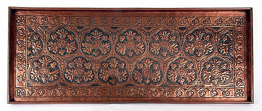
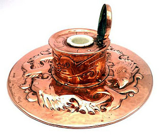
QUESTION: While browsing a recent antique show, I discovered a delightful little copper box with what looked like an embossed design. The dealer told me it was probably made around the turn of the 20th century or at least before World War I. She said the design was repoussé on copper. I’d like to know more about this repousse technique. Can you give me a bit of history and an explanation of how it’s done?

ANSWER: There are two techniques for hammering copper—chasing and repousse. The difference between the two is that chasing pushes the metal in from the front side while repousse pushes the metal out from the backside.  Both techniques frequently employ a backing to support the work material and confine the movement of the metal to the immediate area around the tool.

While the word repoussé comes from the French word repoussage, meaning "pushed up," the word chasing, which also derives from the French word chasser, meaning ”to drive out.” Repousse is a metalworking technique in which an artisan shaped a malleable metal by hammering from the reverse side to create a design in low relief. Chasing is a similar technique in which the piece is hammered on the front side, sinking the metal. The two techniques are often used in conjunction. Many metals can be used for chasing and repoussé work, including gold, silver, copper, and alloys such as steel, bronze, and pewter. Tool marks are often intentionally left visible.

With the simplest technique, sheet gold could be pressed into designs carved in intaglio in stone, bone, metal or even materials such as jet. The gold could be worked into the designs with wood tools or, more commonly, by hammering a wax or lead "force" over it.

Both techniques date from antiquity and have been used widely with gold and silver for fine detailed work, such as the burial mask of King Tutankhamun, and copper, tin, and bronze for larger sculptures, such as the Statue of Liberty. Both methods require only the simplest tools and materials, and yet allow great diversity of expression. They’re also more affordable, since there’s no loss or waste of metal, which mostly retains its original size and thickness.

Before the use of repousse, ancient artisans pressed gold sheet into a die to work it over a design in cameo relief. Here the detail would be greater on the back of the final design, so some final chasing from the front was often carried out to sharpen the detail.

In 1400 BCE, ancient Egyptians used resin and mud as a softer backing for repoussé. The use of patterned punches dates back to the first half of the 2nd millennium BCE  Craftsman made the simplest patterned punches using loops or scrolls of wire.

By 400 BCE., the ancient Greeks had begun using a combination of punches and dies on a beeswax backing to produce repousse on their bronze armor plates.

The resurgence of repousse and chasing first occurred in England during the late 19th century as part of the British Arts & Crafts Movement. Most notably was the work produced at the Keswick School of Industrial Arts, founded in 1884 by Canon Hardwicke and his wife, Edith Rawnsley, as an evening class in woodwork and repoussé metalwork at the Crosthwaite Parish Rooms, in Keswick, Cumbria. Hardwicke designed the curriculum to alleviate unemployment. The school  prospered, and within 10 years more than 100 men had attended classes. 

The school prospered and swiftly developed a reputation for high quality copper and silver decorative metalwork. By 1888 nearly 70 men were attending the classes. By 1890 the school was exhibiting nationally and winning prizes; Its students numbering over 100,  it had outgrown its cramped home in the parish rooms, forcing Rawnsley to raise funds for a purpose-built school nearby.

The Newlyn Industrial Class, later renamed the Newlyn Art Metal Industry, established in 1890 by John D. Mackensie, was similar to Keswick and shared a common purpose with it. Inspired by the teachings of John Ruskin, they aimed to provide a source of employment in small communities where work came and went with the seasons. At the Newlyn classes, held in a net loft above a fish-curing yard, the pupils were mainly fishermen, while at Keswick students were pencil makers, laborers, gardeners, shepherds, and tailors.

Both metal workshops specialized in the production of repoussé copper work, This technique and material was popular with amateur craftsmen and women across the country because it was easy to learn. A student placed a flat piece of copper face down on a bed of pitch, or, as in the Newlyn workshops, lead. These materials were chosen because they would yield to the force of the blows of the punch but would still support the metal. Once a student had punched the design out from the reverse, he or she turned the metal over and chased finer details on the front.

To read more articles on antiques, please visit the Antiques Articles section of my Web site.  And to stay up to the minute on antiques and collectibles, please join the over 30,000 readers by following my free online magazine, #TheAntiquesAlmanac. Learn more about "The Age of Photography" in the 2023 Holiday Edition, online now. And to read daily posts about unique objects from the past and their histories, like the #Antiques and More Collection on Facebook.


Thursday, February 24, 2022

The Ultimate in Danish Design


QUESTION: When I was a kid, I remember sitting on my grandfather’s lap in a very comfortable chair. It was designed like a big glove and swiveled on a chrome base with four legs. I don’t know what it was called, but I remember him referring to it as Danish modern. Can you tell me anything about this type of chair?

ANSWER: You were very lucky indeed, for you got to experience the ultimate in Danish design, the Egg Chair, designed by Arne Jacobsen in 1957. But before we explore this chair further, it’s important to know how this design style came into existence.

In 1924,. Danish architect Kaare Klint was asked to teach a newly class in furniture design at the Royal Academy's School of Architecture in Copenhagen. Considered the originator of the modern Scandinavian style of furnishing and furniture design which thrived from the 1940s to the 60s, Klint’s influence on even today’s designs is great. 

Using teak, which was plentiful in Denmark, the Danish Modern style began to emerge in the 1920s and soon gained popularity with cabinetmakers in Copenhagen.


After 1945, this unique style achieved worldwide recognition and by the mid-20th century, Danish modern had officially arrived.

The son of Peder Vilhelp Jensen-Klint, the leading Danish architect of the early 20th century, Kaare Klint studied painting and apprenticed to several architects, including his father, before opening an independent furniture design studio in 1917.

He became the first Danish designer to combine function with Danish hand-craftsmanship. His drawings revealed an attention to the needs of the human body, long before the science of ergonomics came into being.

For instance, in order that his sideboards would be the most efficient, he determined the average dimensions of the cutlery and crockery used in a Danish home. Klint then created a case containing the smallest space required for the maximum amount of cutlery needed by a household. Aesthetically, he allowed the unvarnished teak to speak for itself, maximizing its clean beauty by waxing and polishing. And so Danish designers began using natural finishes for their pieces.

Klint is known as the grandfather of modern Danish design. He, more than any other Danish furniture designer, felt that it was important to understand the craftsmanship of the furniture of the past.

He pioneered in anthropometrics, which correlates measurements of the human body to make furniture better suited to man’s physical characteristics, essentially the essence of today’s ergonomics. In 1933, he created a deck lounge chair, which he outfitted with a removable upholstered mat and pillow. 

America's initial fascination with Danish modern furniture was largely the result of Edgar Kaufmann Jr. of the Museum of Modern Art in New York. He returned from Europe in 1948 with photographs of chairs designed by another Danish  architect, Finn Juhl. The interest in Juhl's furniture led to a collection designed by him for the Barker Co.

Presented in 1951, the collection introduced American designers to the structural and decorative combining of woods of various colors and grains. Highlights included a teak armchair.

Fruitful collaboration between designers and cabinetmakers led to more industrialized production. By 1950, a few factories in Denmark began producing furniture using purely industrialized methods. The new generation of designers included Arne Jacobsen, whose creations, while organic in nature, used materials such as light metals, synthetic resins, plywood, and upholstered plastics.

Graduating from the Royal Academy in 1924, Jacobsen soon demonstrated his mastery of both architecture and furniture design. With the completion of his Royal Hotel in Copenhagen with all its fittings and furniture in 1960, his talents became widely recognized.

Jacobsen's most commercial success was the Ant Chair, which was available in a number of materials, including natural oak, teak and rosewood veneers, colored finishes or upholstery. Inspired by American legends Charles and Ray Eames, this unique chair was considered revolutionary in 1952, having only three spindly legs, no arms, and a one-piece plywood seat and back. The design of this chair became the basis for the stackable chairs used in hotels and conference centers today. Jacobsen followed the Ant with Series 7, a chair that had four legs and optional arms. Initially designed in 1955, and still being produced today.

Most of Jacobsen’s designs were the direct result of his belief that architecture and furnishings should be totally integrated. Two of his commissions—the Scandinavian Airlines Terminal and the Royal Hotel in Copenhagen—resulted from the creation of the uniquely shaped chairs, the “Egg” and the “Swan.” Designed in 1957, these modernistic chairs featured hi-density, rigid polyurethane foam, upholstered on single-seat shell construction. Both are extremely comfortable while being ergonomically sound and pleasing to look at.

There was a period of time in the middle of the 20th century when Danish designers were the world's most admired. Some of the most talented earned prizes at major competitions, and their works were quickly acquired by top European interior designers and collectors. Today, American designers see them suited to many different kinds of interiors.

To read more articles on antiques, please visit the Antiques Articles section of my Web site.  And to stay up to the minute on antiques and collectibles, please join the over 30,000 readers by following my free online magazine, #TheAntiquesAlmanac. Learn more about the "Antiques of Christmas" in the 2021 Holiday Edition, online now. And to read daily posts about unique objects from the past and their histories, like the #Antiques and More Collection on Facebook.


Tuesday, October 8, 2019

A Taste of Elegance


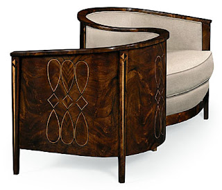
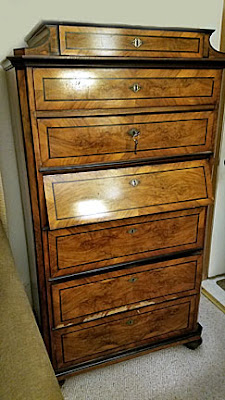
QUESTION: From what period does this chair originate? The legs look quite modern. Is it a modern interpretation of an antique design?

ANSWER: This chair is a fine example of French Art Deco. As one of six of a set of dining chairs, it would have been placed under an equally simple, but elegant dining table.

Art Deco emerged in Paris just before World War I as a luxurious design style. But it wasn’t until after the war in the 1920s that Modernism appeared throughout Europe. Until the art world coined the name Art Deco later on in the 1960s, designers referred to the style as Arte Moderne which is French for Modern Art.

Art Nouveau furniture became a commercial failure. The intricate inlays and carvings made it too expensive for all except the very rich.  Concerned by competitive advances in design and manufacturing made in Germany and Austria in the early 20th century, French designers realized they could rejuvenate a their French furniture industry by producing luxurious pieces that a greater number of people could afford.

The founding in 1900 of the Société des Artistes Décorateurs (the Society of Artist-Decorators), a professional designers' association, marked the appearance of new standards for French design and production. Each year the association held exhibitions in which their members exhibited their work. In 1912, the French Government decided to sponsor an international exhibition of decorative arts to promote French design. However, they had to postpone the exhibition, originally scheduled for 1915, until after World War I.

Set at the Trocadero in Paris, near the Eiffel Tower, La Exposition Internationale des Arts Décoratifs et Industriels Modernes (International Exhibition of Modern and Industrial Decorative Arts), held finally in 1925, was a massive trade fair that dazzled more than 16 million visitors during its seven-month run. On exhibit was everything from architecture and interior design to jewelry and perfumes, all intended to promote French luxury items. With such a long name, visitors began referring to the exhibition, and subsequently the design movement, as Art Deco. On display were a wide range of decorative arts, created between the two world wars.


The French Government invited over 20 countries to participate. All works on display had to be modern, no copying of historical styles of the past would be permitted. The stylistic unity of exhibits at the fair indicated that Art Deco had already become an international style by 1925.The great commercial success of Art  ensured that designers and manufacturers throughout Europe would continue to produce furniture in this style until well into the 1930s.


In France, Art Deco combined the traditional quality and luxury of French furniture with the good taste of Classicism and the exoticism of far-off lands. Many designers used sumptuous, expensive materials like exotic hardwoods, ivory, and lacquer combined with geometric forms and luxurious fabrics to provide plush comfort. Motifs like Chinese fretwork, African textile patterns, and Central American ziggurats provided designers with the exotic designs to play with to create a fresh, modern look. They depicted natural motifs as graceful and highly stylized. The use of animal skins, horn, and ivory accents from French colonies in Africa gave pieces exotic appeal.


French Art Deco furniture featured elegant lines and often had ornamentation applied to its surface. It could be utilitarian or purely ornamental, conceived only for its decorative value. It was the look that was important to many French designers, not the use or comfort of the piece. Even today, some pieces look as if their designers intended them to remain on display in a store window and not be used at all. At times it seemed as though the designers and their patrons were trying to escape the dismal reality of daily life at that time.

In 1937, the French government sponsored another trade fair, La Exposition Internationale des Arts et Techniques dans la Vie Moderne (The International Exhibition of Arts and Techniques in Modern Life). Less ambitious than the 1925 exhibition, this fair focused more on France's place in the modern world rather than on its production of luxury goods, thus marking the end of the French Art Deco Era.

To read more articles on antiques, please visit the Antiques Article section of my Web site.  And to stay up to the minute on antiques and collectibles, please join the other 18,000 readers by following my free online magazine, #TheAntiquesAlmanac. Learn more about western antiques in the special 2019 Summer Edition, "That's Entertainment," online now. And to read daily posts about unique objects from the past and their histories, like the #Antiques & More Collection on Facebook.


Monday, February 5, 2018

To Restore or Not—That is the Question


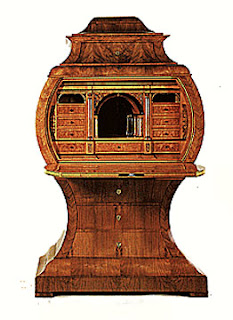
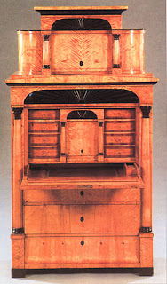
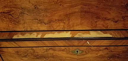
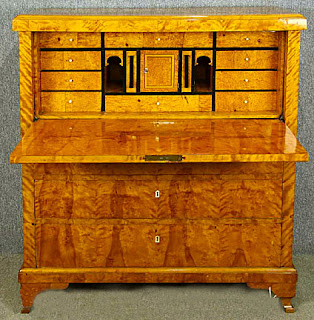
QUESTION:  Hi, my father, who is 93, has a chest his grandfather brought over from Sweden. I'm pretty sure its a Biedermeier. It has some wood damage, and the desk flap needs repair,. If we have it repaired, will it lessen the value? I have always loved it and don't have plans to sell it, but don't want to take away from its worth either. Can you help me?

ANSWER:  Yes, definitely get your Biedermeier secretary restored. For the most part, it’s in excellent condition. Restoring it will only increase its value. Unlike what experts say about antiques produced before 1830, those made after that can often benefit from restoration. In this case, just make sure you use the best restorer you can find. I can’t emphasize this enough. Your secretary is worth a lot of money and will appreciate even more. This is because a lot of Biedermeier pieces got damaged from dampness and such when the style went out of favor. Many sat in barns for years until the veneer literally fell off of them. So there aren’t very pieces that have survived.

So why are Biedermeier pieces so valuable? Next to the Bauhaus, the Biedermeier style movement had perhaps the most influence on modern styles to come. This Neoclassic style  originated in Germany in the early 19th century and played a major role in furniture design. It spread throughout Europe from 1815 to 1848.

The style’s name derived from Ludwig Eichrodt and Adolf Kussmaul, who depicted the typical bourgeois of the period under the name "Gottfried Biedermeier"—from "Gott" meaning "God," fried" meaning "peace," "Bieder" meaning "commonplace," and meier" meaning "steward"—in their Fliegende Blatter, a Viennese journal of the day. However, people didn’t call it Biedermeier until 1886, when Georg Hirth wrote a book about 19th-century interior design, and used the word "Biedermeier" to describe domestic German furniture of the 1820s and 1830s.
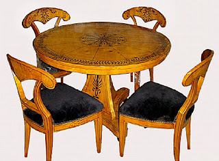
Biedermeier furniture suited the modest size and unostentatious needs of comfortable bourgeois houses. And the secretary was the most popular piece.

The less severe appearance of Biedermeier furniture led to a less formal arrangement of rooms as a whole. Flowers, screens, worktables and knick-knacks of all sorts helped to give a sense of family life. The bourgeoisie began to form a personal style, thus creating what’s now known as interior design, making Biedermeier one of the first design movements to reflect it.

People arranged suites of furniture in the corners of rooms. They created areas for eating, chatting, reading, and doing embroidery. Each had a sofa, table and chairs, and some sort of storage cabinet. Biedermeier comfort emphasized family life and private activities, especially letter writing—giving prominence to secretary desks. These featured a central niche, a mirror, and secret drawers.

Most Biedermeier furniture is extremely geometric in appearance. As the popularity of the style grew, some pieces took on new roles—the table became the family table, around which family members could site  for evening activities. Or table tops could be placed against the wall in a vertical position. A portable piano had a drawer for sewing things, while the upper drawer of a chest of drawers might be converted into a writing desk.


Prior to 1830, mahogany appeared in Viennese furniture and gradually replaced walnut. The adoption of this imported wood, which was often given a light finish, caused some craftsmen to apply matching stains and finishes to pieces made in walnut, pear wood, and Hungarian "watered" ash.

Attention to economy meant that local timber was mostly used, especially walnut veneers over a soft wood frame. Inlay served as the main decorative element, featuring the patterned graining of walnut and often reduced to a light-colored border. Sometimes, craftsmen used black poplar or bird's eye maple and colored woods such as cherry and pear became popular.

Cabinetmakers decorated their furniture with black or gold paint, and often employed less expensive stamped brass wreaths and festoons rather than bronze for decorative effect and gilded wooden stars instead of the elaborate metal ornaments of the Empire style. They designed furniture to be seen from the front and concentrated most of the decoration there.

With pieces of furniture as valuable as Biedermeier ones, it’s important to get them appraised by a certified antiques appraiser who specializes in European furniture. While getting an appraisal may appear costly, the cost is well worth it if the piece is damaged or sold. It’s also important to research former owners of the piece to create a provenance.

 To read more articles on antiques, please visit my Web site.  And to stay up to the minute on antiques and collectibles, please join the other 18,000 readers by following my free online magazine, #TheAntiquesAlmanac. Learn more about the Victorians in the Winter 2018 Edition, "All Things Victorian," coming this week.

Monday, December 12, 2016

Unraveling Antique American Samplers

QUESTION: I love to do cross-stitch needlework. I’ve been admiring antique samplers and would love to start collecting them. But I’ve heard there are a lot of fakes out there. How can I be sure I’m buying the real thing?

ANSWER:
That’s a reasonable question in light of today’s antique market. Samplers in particular fetch high prices, especially at Americana shows. There’s a good chance that the unsuspecting buyer discovering a single one in an antique shop will be taken, through no fault of the dealer. Most antique dealers can’t tell real samplers from fake ones. It’s only those who specialize in such things that can truly tell the difference.

According to the Smithsonian's National Museum of American History, the earliest known American sampler was made in Plymouth Colony around 1645. Over the next two centuries, women created samplers as a way to save different types of stitches or designs they might want to use sometime in the future.

An example of a 19th-century young girl's needlework could show the extent and quality of her education as well as her religious and moral convictions. Schoolgirls from wealthier families used more expensive threads and learned more complicated designs or stitches while those from poor families used samplers almost as resumes of their abilities in an effort to gain employment in doing sewing.

Today, collectors consider samplers works of art, as well as insights into the past.  Subject matter ranges from a simple alphabet to complex landscapes, Biblical scenes and passages, as well as birth/death/ marriage records offering valuable genealogical information. In the past, collectors overlooked samplers as ordinary exercises in needlework, but today, they’re highly collectible and can command extremely high prices. For example, a sampler, sewn by New Jersey schoolgirl Mary Antrim sold at Sotheby’s for a over $1 million in 2012, while another fetched over $611,000 in 2003. Some sampler makers used only thread and needlework to create them while others used watercolors and paper and added  embellishments like seed pearls or beads.

There are plenty of samplers being made today specifically intended to deceive unwary collectors in this lucrative tens-of-thousands to hundreds-of-thousands-of-dollars market. The safest way to buy a sampler, of course, is through a reputable dealer who has a well-established reputation in sampler authentication. On the other hand, the riskiest way to purchase one is through an online auction site or an unknown online seller. Without being able to closely examine the fabric used and other details, there's no way to know for sure if a sampler is real or a fake.

So what are some ways to tell a fake or reproduction sampler from the real thing? One of the first thing to check is fabric discoloration. Old fabrics can darken in spots or brown to some degree in general, but much of this depends on what type of fabric the woman used and where it has been stored over time.

There are no hard-and-fast rules when it comes to sampler age. However, there are a couple of basic things to look for to make sure the browning is authentic. Many times, fakers will add browning to fabric by staining or darkening the fabric with tea or coffee. If a sampler browns, it tends to do so naturally around the edges near the frame, but blotchy browning should raise a cautionary flag. Also, if the fabric is wrinkled as if it were twisted or bunched up and the brown spots seem to follow that pattern, there's a good chance the browning has been added deliberately.

There have been a few cases where the actual date sewn onto a sampler has been altered to make the piece appear older—a "9" changed to an "8" or a "6" changed to a "0."  If there's no evidence of stitches having been removed from the fabric and the piece is important enough, a genealogical search can be done to determine the dates of the needleworker's' life. If the sampler includes her age, would she have been of the correct age during the year sewn into the sampler.

Collectors interested in samplers from a particular region or school will find it easier to use style and thread type to authenticate them. By studying designs and types of thread used in a particular region or school throughout the years, when they came into use and  when they stopped being used, it’s easy to date just about any sampler. Certain designs or stitching styles may also be more prevalent in a particular region, a certain school, or during a specific time period. On the other hand, some designs or stitch styles may not have been used at all by a particular school.

As with any antiques or collectibles in today’s market, it’s buyer beware. Being educated about samplers is the best defense to being taken.

Tuesday, March 17, 2015

The First Home Improvement Companion


QUESTION: At a community book sale recently, I was going through a box of old magazines and discovered a copy of The Craftsman, a magazine from the early 1900s. It looked interesting, so I put it with the rest of the items I intended to purchase and bought it. As I was going through the books and such I bought a few days later, I noticed that the publisher was Gustav Stickley. Is this the same person who made Mission furniture? Also, what can you tell me about The Craftsman?

ANSWER: It is indeed the one and the same person. And The Craftsman magazine was Stickley’s pride and joy and the first of its kind to discuss home improvement and design.

Gustav Stickley was one of the most important figures in the Arts and Crafts Movement in the United States. He was a furniture maker who became a leader in the philosophy of the Arts and Crafts Movement as well as in the production of objects suitable for use that followed its principles. And although he wasn’t a craftsman himself, he successfully inspired craftsmen to carry out his concepts.

Also, he knew the value of publicity in selling his products and his ideas. He used his magazine, entitled The Craftsman, which he edited and published during the 15 years he was active in the Movement, as his main means of promotion.  At its peak, The Craftsman reached 60,000 subscribers and featured articles and essays on Stickley's many interests and concerns.

Gustav Stickley often referred to himself as "the craftsman" and used the term "craftsman" in many ways. The furniture he sold was Craftsman—not "mission"—furniture, his version of the Arts and Crafts movement was the Craftsman Movement, and his monthly magazine was The Craftsman.

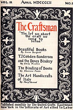
He published the first issue of his magazine in October 1901 in  Eastwood, New.York, where he had located his furniture factory. Later he moved The Craftsman to Syracuse and finally to New York City. The premier issue emphasized the work and ideas of William Morris through an article entitled “William Morris, Some Thoughts Upon His Life.”

Irene Sargent, professor of art history at the University of Syracuse, served as Stickley's principal editor. She wrote many of the articles in the magazine’s early years. A very persuasive person, Stickley was able to obtain contributions from such notables as Louis Sullivan, Jacob Riis, Leopold Stokowski, John Burroughs, and Jane Addams. They covered a wide variety of subject matter, from architecture to art and nature, as well as the concepts of social reform prevalent at the time.

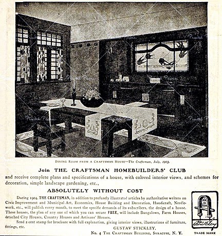
Though he was an idealist, Gustav Stickley had to eat. The Craftsman offered him lots of advertising  space for his growing furniture business. Thirteen pictures of furniture made by Stickley's company, United Crafts, included a round table, an armchair, and a settle, followed an article entitled “An Argument for Simplicity in Household Furnishings” in the first issue. The Craftsman also showed readers how to use the furniture in its many illustrations of room settings. Over the years, Stickley added metalwork, lighting fixtures, textiles and other items to his product line, and also to The Craftsman.

He often commented on the Craftsman ideal. Stickley believed an ideal kind of life encompassed beauty, economy, reason, comfort, and progress. It didn’t satisfy him to merely achieve this ideal in furniture but he felt that consumers must also have the right kind of houses in which to place the furniture. He no sooner began  designing Craftsman houses than he realized that people wanted Craftsman fabrics and accessories of all kinds. In other words, he believed in the concept of total interior design.

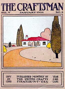
While early issues had somewhat smaller covers, ones beginning in 1913 had larger ones measuring 8 by 11 inches. Stickley printed all of them on brown or tan stock and usually featured a wood block decoration in two or more colors, initialed by the artist. Each issue consisted of 100-140 white and glossy pages, and later ones had as many as 175 pages.

Plans for Craftsman houses, some small and simple, others more elaborate, attributed to Stickley as the architect, although he had no architectural training. People built many of these houses using Stickley’s plans.  The Craftsman also featured short fiction and poetry, as well as the work of famous photographers.

Besides articles about Stickley’s products, The Craftsman often included ones about other makers of Arts and Crafts objects. For example, a 1903 article, “An Art Industry of the Bayous: The Pottery of Newcomb College” by Irene Sargent, documents the early history of Newcomb pottery. Photographs of the pottery school and examples of early high glaze pieces accompanied it. There were also essays devoted to philosophical, political and social commentary, usually promoting the simple life

The magazine also offered all kinds of practical and how-to advice, from gardening to leather tooling to embroidery to purchasing household appliances.

It also included advertisements by manufacturers whose products are now greatly valued by collectors, for example, Rookwood pottery, Heisey glassware, Handel lamps, and Homer Laughlin china.

Unfortunately, Stickley overextended himself and in 1915 had to file for bankruptcy. But The Craftsman was the first periodical to emphasize the importance of harmony in a home’s interior, harmony which was to be created through attention paid to walls, floors, windows, textiles, small objects and furniture.

Tuesday, January 27, 2015

The Other Arts and Crafts Designer


QUESTION: I have a Mission chair that has been in my family for decades. I never paid much attention to it. But recently when I was cleaning it, I turned it over and noticed a label under the arm of the chair which reads, "Limberts Arts and Crafts Furniture/Trademark/Made in Grand Rapids and Holland.” I know that Grand Rapids is in Michigan, but did this company also make furniture in the Netherlands? And just who is Limbert?

ANSWER: Charles Limbert made what you call “Mission” furniture in Grand Rapids and Holland, Michigan. In fact, his furniture wasn’t constructed in the Mission Oak style, which actually was a style of Arts and Crafts furniture that developed just before the turn-of-the-20th century.  This wasn’t as much of a style as what manufacturers called furniture made of oak that featured simple horizontal and vertical lines and flat panels that accentuate the grain of the wood. It was supposed to emulate furniture of the Spanish missions in California and Texas. What Charles Limbert made was furniture in the pure Arts and Crafts style.

The Arts and Crafts Movement in America originated in mid-19th-century England where the teachings of John Ruskin and William Morris popularized social reform. The movement began as a revolt against the Industrial Revolution and the dehumanization of the workers being replaced by machines. Americans learned about this movement through Gustav Stickley's magazine The Craftsman. Hand craftsmanship and a return to simplicity became hallmarks of the movement. These ideals applied not only to the lifestyle of the follower, but also to furniture and accessories in the home.

Hailed as the beginning of Modernism in the United States, Arts and Crafts interiors were in direct contrast to the preceding Victorian period of ornate decorative arts. Rectilinear forms of quartersawn oak replaced ornately carved rosewood and mahogany Victorian furniture. Mortise and tenon joints, butterfly keys, and the grain of the wood, itself, became the ornamentation on Arts and Crafts pieces.

While Gustav Stickley is best known as the leader of Arts and Crafts Movement in America, other designers also achieved recognition for their contribution to Arts and Crafts design. One of them was Charles Limbert. His company produced high quality Arts and Crafts furniture, but didn’t attempt to influence consumers about the idealized harmony of the Arts and Crafts lifestyle.

In the early 1880s, Charles Linbert began his furniture manufacturing career at the John A. Colby and Co.. in Chicago. He learned all sides of the furniture business— design, production, and marketing. An 1889 partnership with Philip Klingman established the Limbert and Klingman Chair in Grand Rapids, Michigan. Limbert and Klingman manufactured period reproduction chairs for only two years. In 1894, Limbert formed the C.P. Limbert and Company to produce Arts and Crafts furniture.

By 1906, the company had grown and moved to Holland, Michigan. Limbert called his line of furniture "Holland Dutch Arts and Crafts," most likely in reference to the local Dutch population.

Limbert's early furniture shows influences ranging from Japanese to Gothic. Some of his early china cabinets and bookcases have doors with stained glass in an Art Nouveau style.

His peak of design achievement came during 1904 to 1906 when he introduced many of his cut-out designs. Many of his de-signs were internationally inspired by the Vienna Secessionist School and designers such as Scotsman Charles Rennie Mackintosh and Austrian Josef Hoffmann. Limbert employed designers such as Hungarian architect Paul Horti and father and son Austrian designers, Louis and William J. Gohlke.

Limbert promoted his furniture as being "essentially the result of hand labor, with machinery being used where it can be employed to the advantage of the finished article." Like Stickley, he didn’t let machinery control production and emphasized the contribution of skilled craftsmen in his furniture promotions.

He constructed his furniture of quartersawn white oak, with well-executed doweled joints, keyed tenons and splined tabletops. Long, tapering corbels under arms characterize Limbert chairs. Unfortunately, Limbert didn’t extend his wood working quality to the hardware used on his pieces, most of which came from the Grand Rapids Brass Company.

Compared with Stickley's work, Limbert's designs were typically less severe and more visually interesting, usually achieved through the use of cut-outs and other elements inspired by the as English Arts and Crafts Movement and Dutch folk furniture.

His pieces were among the original furnishings of the Old Faithful Inn in Yellowstone National Park. Today, several wash stands remain in the Old House section of the Inn.

Tuesday, April 22, 2014

A Clock With Balls

QUESTION: When I was growing up in the 1950s, my parents had a colorful clock hanging on our living room wall. It had colored balls for the hours and stood out against the white wall. I had forgotten about it until recently when I discovered it, covered with dust, in the attic of my parents’ house as I was cleaning it out after my mother died. What can you tell me about this clock, and does it have any value or should I just give it the old heave ho?

ANSWER: Believe it or not, that dusty old clock is an icon of 1950s modern design. Often listed as being designed by George Nelson, the clock is shrouded in controversy. Yes, George Nelson did indeed play a part in its creation, but historians now believe that its actual designer was Irving Harper, who worked for George Nelson in his design studio.

The Ball Clock was the first of more than 150 clocks designed by George Nelson Associates for the Howard Miller Clock Company, which sold them from 1949 into the 1980s. Nelson Associates, first launched as a studio by George Nelson in 1947 in New York City, employed some of the most celebrated designers of the time, including Irving Harper, Don Chadwick and John Pile, all of whom contributed to the clocks.

George Nelson Associates, Inc., a leading home furnishings and accessories design studio, made modernism the most important driving force during the 1950s.  From his start in the mid-1940s until the mid-1980s,  George Nelson partnered with most of the modern designers of the time. His skill as a writer helped legitimize and stimulate the field of industrial design by contributing to the creation of Industrial Design Magazine in 1953.

Nelson became the Director of Design for Herman Miller, a leading industrial design firm, in 1947 and held the position until 1972. He used the money he earned in this position to open his own design studio in New York City. On October 26, 1955 he incorporated it into George Nelson Associates, Inc. and moved to 251 Park Avenue South. The studio brought together many of the top designers of the time, who were soon designing for Herman Miller under the George Nelson label. Among the noted designers who worked for George Nelson Associates were Irving Harper, George Mulhauser, designer of the Coconut Chair, Robert Brownjohn, designer of the sets for the James Bond film Goldfinger, Don Chadwick, Bill Renwick, Suzanne Sekey, John Svezia, Ernest Farmer, Tobias O'Mara, George Tscherney, who designed the Herman Miller advertisements, Lance Wyman, and John Pile.

But controversy was to cloud George Nelson’s success. In recent years, it has come out that many of the designs for which Nelson accepted credit were actually the work of other designers employed at his studios. Examples of this include the Marshmallow sofa, designed by Irving Harper, and the Action Office, the forerunner of the office cubicle and for which Nelson won the prestigious Alcoa Award, neglecting to mention that it was Robert Propst who actually created it.

It seems that Nelson believed that it was okay for individual designers to be given credit in trade publications, but for the consumer world, the credit should always be to the firm, not the individual.

Nelson’s company designed many wall and table clocks for the Howard Miller Clock Company, including the Ball, Kite, Eye, Turbine, Spindle, Petal and Spike clocks, as well as a handful of desk clocks. However, Irving Harper designed most of them. Howard Miller assigned numbers to all the original clock designs. The most famous, the Ball Clock, became Clock 4755. It was available in six color variations.

According to legend, the Ball Clock was designed by George Nelson, Irving Harper, Buckminster Fuller and Isamu Noguchi during a night of drinking in 1947. Its Space Age atomic look supposedly came from the an abstraction of the atom with its nucleus and particles.


Tuesday, February 18, 2014

The Red Carpet Treatment

QUESTION: My great grandmother left me a beautiful Oriental carpet runner. My grandmother said it is quite old, but I’m not sure by how much.  What can you tell me about antique Oriental carpets? I have no idea about its origins, pattern, and such.

ANSWER: What most people classify as Oriental carpets are actually Persian (now Iranian) or Turkish carpets. Originally made to cover the sand in the tents of nomads and to kneel on when saying daily prayers, these beautiful floor coverings have a long history.

Oriental carpets have been highly prized in the West since their first appearance in Venice in the 13th century. By the 18th century they were common in wealthier households. But relative demand was fairly small, so the production of carpets declined. During the 19th century, trade routes improved, contact with the Orient increased, and the Western obsession with the exotic grew. So Persian weavers produced great quantities of carpets for export.

Carpet-weaving is an integral part of Iranian culture and art and dates back to ancient Persia. Weavers from other countries copied the designs of Persian carpets, but Persia produced 75 percent of the world's woven carpets.

Generally, Persian carpets can be divided into three groups—Farsh/Qa-li, any carpet greater than 6×4 feet, Qa-licheh, sized 6×4 feet and smaller), and nomadic carpets known as Gelim including Zilu, meaning "rough carpet," mostly for use in tents.

Wool is the most common material for carpets but cotton is frequently used for the foundation of city and workshop carpets. There are a wide variety in types of wool used for weaving Oriental carpets, including . Kork wool, Manchester wool, and in some cases even camel hair wool.

Persian rugs have both a layout and a design which in general include one or more motifs, so it’s not unusual to find more than one motif in a single rug. The original designs act as the main pattern and the derivatives as the sub patterns. Rug experts have identified 19 pattern groups---historic monuments and Islamic buildings, Shah Abbassi patterns, spiral patterns, all-over patterns, derivative patterns, interconnected patterns, paisley patterns, tree patterns, Turkoman patterns, hunting ground patterns, panel patterns, European flower patterns, vase patterns, intertwined fish patterns, Mehrab patterns, striped patterns, geometric patterns, tribal patterns, and composites. The most common motifs include Boteh, Gul, Herati, Mina-Khani, Rosette, Shah Abbasi, Azari Kharchang, and Islimi Floral.

Persian rugs are typically laid out using one of four patterns—all-over, central medallion, compartment and one-sided. So a rug’s design can be described in terms of the manner in which it organizes the field of the rug. One basic design may serve the entire field, or the surface may be covered by a pattern of repeating figures. In areas using long-established local designs. the weaver often works from memory, with the patterns passed on within the family.

Weavers often tailored the dimensions of their carpets to suit Western needs. They produced a disproportionate number of runners—long narrow rugs originally designed to cover the sides of rooms or tents since these had special appeal to Westerners. Even so, the standards remained the same. The major carpet-weaving centers—Persia, Turkey and the Caucasus—continued to use traditional motifs and techniques, maintaining the carpets’ regional integrity and originality.

While carpets made before 1800 are extremely expensive, the antique carpet market offers some excellent buys for the beginning collector. High quality runners generally cost between $1,500 and $15,000, depending on overall design, pliability, date, and type and number of knots.

Edgar Allan Poe once said, “A judge at common law may be an ordinary man; a good judge of carpets must be a genius.” And as hard as they are to judge, they’re certainly easy to enjoy.

Monday, July 30, 2012

A Taste for Eastlake


QUESTION: I recently discovered two chairs and a settee at my grandmother’s house. Unfortunately, there are no markings of any kind as she apparently planned to refinish them and sanded everything off! What can you tell me about them? After hours and hours of searching on Google, the best I could come up with is that they're possibly Victorian.

ANSWER: You’re half way there as far as your chairs and settee are concerned. Yes, they are Victorian—Eastlake Victorian, as a matter of fact. This style was popular from 1870 to 1885 and is one of seven different furniture styles popular during the Victorian Age.

Charles Locke Eastlake, an English critic of taste, did more to affect a change in American taste in the late 19th Century than anyone before or since. More than any other individual, he was responsible for introducing the principles of the English design reform movement to the American public.

Eastlake considered simplicity the key to beauty. He thought the objects in people's homes should be attractive and well made by workers who took pride in their work. He published a book, Hints on Household Taste in Furniture, Upholstery and Other Details, a runaway bestseller from 1870 and 1890. The book became the decorating bible for upper middle class American housewives.

Though Eastlake included some of his own sketches among the illustrations of well-designed furniture chosen for his book, he was primarily a critic of taste, not a furniture designer. The furniture illustrated in Hints had ornamental features including shallow carving, marquetry, incised or pierced geometric designs, rows of turned spindles, chamfered edges, brass strap hinges, bail handles, and keyhole hardware inspired by Gothic forms. Every decorative device, according to Eastlake, also had to fulfill a useful function.

To relieve the simplicity of rectilinear forms, Eastlake advised using turned legs or spindle supports. When a homeowner desired an "effect of richness,” he suggested restrained, conventionalized carving, inlay, and sometimes even veneer. Ornament, he felt, should be stylized rather than naturalistic, for it’s "this difference between artistic abstraction and pseudo-realism which separates good and noble design from that which is commonplace and bad." A functionalist, Eastlake cautioned that carved decoration should always be shallow and never "inconveniently" located, as were the "knotted lumps" of grapes or roses decorating rococo-revival chairs that often stabbed the sitter between his or her shoulder blades. His book further suggested that furniture be made of such solid, strongly grained woods as oak, walnut, or mahogany. He preferred oil-rubbed finishes to "French-polished" ones, and varnish was taboo.

By 1876, homeowners of the nation's most elegant homes decorated them in subdued "artistic" tones, set off by rectilinear furniture of rich bird's eye maple or elegantly ebonized cherry wood. Critics broadly categorized the new designs as "art furniture," but also called them "modern Gothic," "Queen Anne Revival," or "Eastlake" in honor of the man who brought a sense of taste to America.

To the modern eye, such furniture with its intricately stylized marquetry, gilded incised designs, spindled galleries, inset tiles, richly grained woods, and decorative turned elements hardly seems "simple." But in contrast to the heavily carved furniture of preceding decades, embellished with naturalistic roses and bunches of grapes imposed on the elaborate rococo shapes that we now regard as the embodiment of Victorian design, Eastlake-inspired furniture was remarkably functional and clean-lined.

The Eastlake style was quickly taken up by the manufacturers of cheaper furniture, who until then had given very little attention to artistic form. The furniture produced in these factories ranged from excellent to shoddy, depending on the grade of lumber used, how well it was seasoned in the drying kilns appended to the larger factories, and upon the skill of each machine operator throughout the manufacturing process. At its worst, factory furniture was poorly designed and rickety. However, there was a middle range of
moderately priced but well-constructed factory furniture produced in the Midwest for wholesale shipment to Eastern retail outlets. These chairs and settee fit into this group.

Eastlake-style furniture often featured tables and chests with marble tops, some the traditional white, others in rich Italian pinks and browns. Tables and chairs had aprons and legs incised with horizontal or vertical lines called reeding and chamfered corners. Round legs on chairs also featured ring-like annulets. Quatrefoils were another popular addition, since flat cutouts often graced the more elegant pieces. Lastly, acanthus-leaf designs could be found incised into even the cheapest versions.

Pieces of furniture in this style had low relief carvings, moldings, incised lines, geometric ornaments, and flat surfaces that were easy to keep clean. Also called Cottage Furniture, the mass-produced pieces were much more affordable than the fancy revival pieces. Unfortunately, while Eastlake-style furniture may have looked refined, most chairs and sofas weren’t very comfortable and were meant to be used in formal parlors for guests only.