![]() QUESTION: I have some dishes that belonged to my grandmother. I believe they’re over 100 years old. Each has a scene in the center in light blue on a white background. From research I’ve done, I know they’re called Staffordshire, but I still haven’t been able to find much about them. Could you tell me something about them, especially the decorative scenes?
QUESTION: I have some dishes that belonged to my grandmother. I believe they’re over 100 years old. Each has a scene in the center in light blue on a white background. From research I’ve done, I know they’re called Staffordshire, but I still haven’t been able to find much about them. Could you tell me something about them, especially the decorative scenes?
ANSWER: Wedgwood & Co., Unicorn & Pinnox,Works, Staffordshire Potteries, not to be confused with Josiah Wedgwood & Sons, made your dishes. They specialized in making earthenware and stoneware pieces for everyday table use from 1860 to1965. Your particular dishes date somewhere from 1860 to 1890.
![]()
![]() Many people think Staffordshire is a company, but it’s actually an English county. Many English potters established themselves there because they found the clays superior to those found elsewhere in England.
Many people think Staffordshire is a company, but it’s actually an English county. Many English potters established themselves there because they found the clays superior to those found elsewhere in England.
In the late 18th century there were as many as 80 different potteries in the Staffordshire district. By 1802, the number had increased to 149. No single company was responsible for manufacturing Staffordshire dishes. Each potter produced his own wares using a different decorative border, featuring medallions, scrolls, lace, shells, flowers, or trees.
![]()
![]() Staffordshire potters made their wares from white earthenware pottery found nearby. Workers applied decoration using a method called transfer printing, developed around 1755. They accomplished this inexpensive method by engraving a design onto a copper plate, which they then inked with special ceramic paint and applied to thin paper. Pressing the paper onto the surface left ink behind.
Staffordshire potters made their wares from white earthenware pottery found nearby. Workers applied decoration using a method called transfer printing, developed around 1755. They accomplished this inexpensive method by engraving a design onto a copper plate, which they then inked with special ceramic paint and applied to thin paper. Pressing the paper onto the surface left ink behind.
The production of a blue print began with a design on paper. The engraver traced the outline onto thin tissue paper and then reproduced it on a sheet of copper using homemade carbon paper. He engraved over this outline with a V-shaped groove and added the details and areas of shading using lines or dots. The idea of using dots, or stipple punching, rather than lines came later in the 18th century. The engraver found the right depth by trial and error, so he took a first print or proof before he reworked the lines and dots to deepen them if necessary. The deeper the engraving, the deeper the deposits of color, thus the darker the result.
![]() The next step was printing. A circular iron plate or backstone kept the color—a mixture of metallic oxides and fluxes with printing oils—warm. The printer applied this to the copper plate, which he kept hot on the hot plate, making sure to rub color into every dot and line. The surplus was then scraped off. He removed any film of color by bossing the surface with a corduroy-faced pad. After the copper plate was clean, he laid the tissue paper coated with a mixture of soft soap and water and passed it through the press’s rollers. He then passed the printed image, now in reverse—unlike regular engravings that begin in reverse and appear correct on printing—on to the transfer team, consisting of the transferrer, apprentice, and cutter.
The next step was printing. A circular iron plate or backstone kept the color—a mixture of metallic oxides and fluxes with printing oils—warm. The printer applied this to the copper plate, which he kept hot on the hot plate, making sure to rub color into every dot and line. The surplus was then scraped off. He removed any film of color by bossing the surface with a corduroy-faced pad. After the copper plate was clean, he laid the tissue paper coated with a mixture of soft soap and water and passed it through the press’s rollers. He then passed the printed image, now in reverse—unlike regular engravings that begin in reverse and appear correct on printing—on to the transfer team, consisting of the transferrer, apprentice, and cutter.
![]() The cutter removed the excess paper leaving only the design pieces. The transferrer laid these pieces, colored by cobalt oxide, on to the ware after its first or biscuit firing, then dipped it in glaze and refired it, where the silica in the glaze helped to convert black cobalt oxide to blue cobalt silicate. A design with an overall pattern would have the center applied first and the border around the rim afterwards. The tackiness of the oily print held it in place while the apprentice rubbed it down vigorously with a stiff-bristled brush using a little soft soap as lubricant.
The cutter removed the excess paper leaving only the design pieces. The transferrer laid these pieces, colored by cobalt oxide, on to the ware after its first or biscuit firing, then dipped it in glaze and refired it, where the silica in the glaze helped to convert black cobalt oxide to blue cobalt silicate. A design with an overall pattern would have the center applied first and the border around the rim afterwards. The tackiness of the oily print held it in place while the apprentice rubbed it down vigorously with a stiff-bristled brush using a little soft soap as lubricant.
The apprentice then soaked the earthenware in a tub of water to soften the paper which was removed by sponging, the oil-based color being unaffected by the water. After drying, an assistant placed the ware into the hardening kiln to fire at 1,250-1,290 F. to remove the oils and secure the color.
![]()
After inking each piece, another worker placed the object into a low-temperature kiln to fix the pattern. The printing could be done either under or over the glaze on a ceramic piece, but since the ink tended to wear off on overprinted pieces, potteries switched to glazing the inked surface after the initial firing.
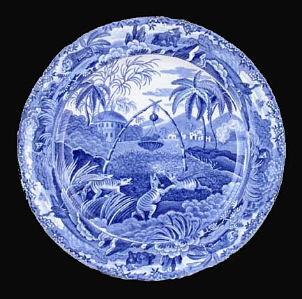
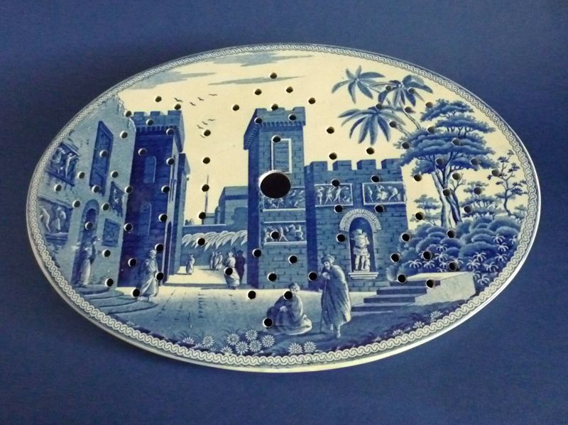
![]() Scenic views of the Orient and of romantic European destinations with castles and towns became popular transfer motifs. The inspiration for these came from classical literature which was popular at the time. The most valuable plates,. however, are those with American scenes, produced between1800 and 1848. Enterprising English potters arranged with artists traveling in America to sketch the sites for their ware. Leading Staffordshire potters like Adams, Clews, Meigh, Ridgway, Stevens, and Wood, plus those from hundreds of small companies created American views.
Scenic views of the Orient and of romantic European destinations with castles and towns became popular transfer motifs. The inspiration for these came from classical literature which was popular at the time. The most valuable plates,. however, are those with American scenes, produced between1800 and 1848. Enterprising English potters arranged with artists traveling in America to sketch the sites for their ware. Leading Staffordshire potters like Adams, Clews, Meigh, Ridgway, Stevens, and Wood, plus those from hundreds of small companies created American views.
The firms manufacturing these wares included Ridgway, Johnson Brothers, Spode and Wedgwood along with many others. Josiah Wedgwood eventually used the transfer process to decorate his familiar ivory Creamware.
![]()
![]() Stamps on the back of each piece often indicated the pattern with or without the maker's trademark. Since several companies employed the same patterns, identifying some pieces can be difficult. At first potters used deep cobalt blue and white designs to simulate wares made in China. These remain sentimental favorites in the United States and England. As technology improved, the shade lightened. By 1850, potteries began using other colors, such as pink, red, black, green, brown and purple.
Stamps on the back of each piece often indicated the pattern with or without the maker's trademark. Since several companies employed the same patterns, identifying some pieces can be difficult. At first potters used deep cobalt blue and white designs to simulate wares made in China. These remain sentimental favorites in the United States and England. As technology improved, the shade lightened. By 1850, potteries began using other colors, such as pink, red, black, green, brown and purple.
![]() Most transferware patterns sought by collectors today are two-tone. Blue and white, red and white, and brown and white are the most common combinations. Transferware has become increasingly pricey in the last 20 years, mostly due to articles about using it for decoration to liven up today’s bland home interiors.
Most transferware patterns sought by collectors today are two-tone. Blue and white, red and white, and brown and white are the most common combinations. Transferware has become increasingly pricey in the last 20 years, mostly due to articles about using it for decoration to liven up today’s bland home interiors.