Friday, July 2, 2021

It's All About the Patterns


QUESTION: When I was a little girl, I used to sleep over at my grandmother’s house. While there, I used to stand in front of her china cabinet looking at all the beautiful china. Each piece had some sort of scene, usually a landscape with people. Most of the dishes were blue but some were pink and one or two were lavender. After my grandmother passed, I got her china collection. I just love it but don’t know much as these beautiful pieces. The name Spode is either stamped or impressed on the bottom of most of the pieces. Can you tell me who made them and where they got the ideas for the scenes on them?

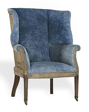
ANSWER: What your grandmother collected and you now have is Spode china. All those with scenes and borders are what’s known as transferware, a technique for transferring prints to pottery.

During the early years of the 18th century, Spode achieved success because of  his mastery of transfer printing.  An Irish engraver named Brooks invented the process. It involved first, engraving a copper plate, then inking it and applying to it to thin tissue paper. The impression on the paper could then be transferred to wares of any shape.

Spode produced a variety of pottery wares, often imitating those of Wedgwood, including creamwares, basalts, stonewares, redwares, Jasperwares, and of course blue-printed pearlwares and early experimental porcelains.

In 1784, Spode began printing under the final glaze in blue on earthenware. He copied the early patterns from Chinese porcelain imported wares. By that time, London customers who had originally purchased Chinese porcelain dishes needed replacements. The engraver Thomas Lucas brought with him to Spode’s pottery the knowledge of designs from his previous employer, Thomas Turner at Caughley. 

Most of the early blue transfer-printed patterns were Chinese in style.  As Spode's production advanced and its customers' tastes evolved, the variety of patterns grew. Interest in Chinoiserie patterns later gave way to patterns that depicted rural scenes, exotic places, literary themes, as well as floral and botanical examples.

The earliest pattern produced by Spode around1790, was “Willow,” now known as “Blue Willow,” printed examples of the Willow pattern, commissioned by Josiah Spode and made around 1790, and its copperplate, engraved for Spode by Thomas Minton. 

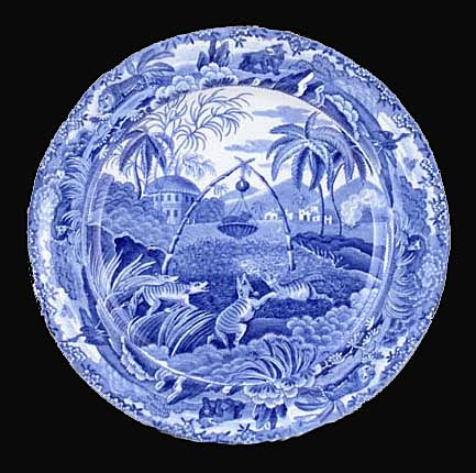
In June 1805, there appeared the first of 20 monthly issues of a publication called Oriental Held Sports, Wild Spurts of the East, published by Edward Orme of Bond Street, London.  Each issue included a printed story and two large aquatint prints engraved from drawings by Samuel Howitt, a distinguished animal painter. Spode adapted the prints to his dinnerware depicting various hunting scenes with animals and birds. Some views show mounted hunters carrying spears with native bearers on foot. The ’Indian Sporting’ series alone had 21 different hunting scenes.

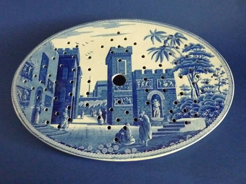
Another popular series formed a travelogue of views in the Eastern Mediterranean. Spode based these on engravings in Mayer's Views in Asia Minor, Mainly in Caramania, published in 1803. "The Castle of Boudron;" The City of Corinth" and “Antique Fragments at Lissimo” were all part of this series. 

From around 1800, most of the patterns painted by Spode's artists were recorded in Pattern books.  These books contained watercolor paintings of tens of thousands of patterns made from about 1800 up to the end of production. Many are beautiful works of art in their own right, but they also acted as a historic document of changing design styles over two centuries. Georgian simplicity, Regency opulence, Victorian Naturalism, sentimentality, Pre-Raphaelite styles, Japanese Revival, Arts and Crafts, Art Deco, and 1950s Modernism.

Spode introduced his more famous pattern, “Blue Italian,” around 1816. It became immediately popular and remained a best seller. Over the years, the company produced it on a wide variety of earthenware shapes. One Spode catalog from the 1920s and 1930s records over 700 different shapes available. 

Unlike many of the other classical scene patterns on Spode wares of the early 19th century, the origin of the view for the Italian pattern isn’t certain. Some experts believe Italian artist G.P. Pannini, well known for his painting style, inspired pictures of ruins and quiet pastoral Italian scenery fpor Spode pieces. The Spode engravers derived many of their pictorial subjects from scenes which had appeared as prints. Publications of prints of scenes associated with the Grand Tour became the inspiration for many patterns. Merigot's Views Of Rome and Its Vicinity, published in 1798, was the source for several Spode patterns, including Tower and Castle, but experts agree that none of these views inspired the Italian pattern.

Furthermore, there is no one location in Italy that seems to correspond to all the features included in the original “Blue Italian” scene. It seems to be a composition made up of several elements. The ruin on the left, although architecturally incorrect, might have been based on the Great Bath at Tivoli, near Rome. The row of houses along the left bank of the river is similar to those of the Latium area near Umbria, north of Rome. The castle in the distance is of a type which occurs only in Northern Italy in the regions of Piedmont and Lombardy.

Could it be that a traveling artist from Northern Europe made sketches of the scenes he encountered as he made his way through Italy? Upon returning home, did he combine his sketches into an attractive scene which, later, Spode used and chose to call the Italian Pattern? Unfortunately, there is no proof of this. The inspiration for the Italian scene may have even come from a print of a painting and then another painting taken from the print by a different artist.

In the early 19th century, most of the pieces Spode produced in the “Blue Italian” pattern were on dinnerware items used by the rich---asparagus servers, huge meat dishes, enormous soup tureens with ladles, cruet sets, foot baths, and more. Wealthy households set their dinner tables with Spode’s Italian. And there were many variations of the pattern. 

“Blue Italian” was an immediate success from its introduction. Though it’s impossible to say what created this strong appeal, it’s perhaps due to the unique combination of a classical scene with a Chinese border which had been directly copied from pieces of Chinese export porcelain, dating from around 1785.

By 1822, Spode had developed other colors, in addition to blue, that could withstand high-temperature firing.  The production of these additional printed colors enabled Spode to expand his line of wares.  While not nearly as popular as Spode's various blues, these new colors included green, brown, manganese purple, Payne's grey, and black.  

Soon afterwards,  in 1824, two-color underglaze printing began.  Spode also employed other methods to add color.  One method was to transfer print outline patterns and then paint in or between the lines of the pattern in other colors. Other methods included enameling with additional colors and gilded decoration over the glaze to further expand the variety of offerings.  Near the end of the early Spode period, the pottery also began producing wares in pink.

Spode introduced about 150 patterns a year.  By 1833 Spode, they numbered nearly 4,000. Most Spode wares bear a pattern number, as well as the name Spode printed, painted, or impressed on the bottom or reverse side.

Some Spode collectors collect just the “Blue Italian” pattern while others specialize in collecting only the oldest pieces dating from 1816 to 1833. Since Spode china continues to be made, newer pieces are often passed off as older ones. It’s important to check the provenance if possible. 

To read more articles on antiques, please visit the Antiques Articles section of my Web site.  And to stay up to the minute on antiques and collectibles, please join the over 30,000 readers by following my free online magazine, #TheAntiquesAlmanac. Learn more about "The Ancients" in the 2021 Spring Edition, online now. And to read daily posts about unique objects from the past and their histories, like the #Antiques and More Collection on Facebook.

Thursday, June 24, 2021

Potting Up Some Beauty


QUESTION: I love plants and for the last few years I’ve been buying a variety of colorful vintage ceramic flower pots at local flea markets and garage sales. Few of them have any makers’ marks. I’d like to have some idea who made some of the pots I have. Can you help me?

ANSWER: Unfortunately, many of the potteries that produced these pots didn’t mark them. But I should be able to give you some clues to their makers through descriptions of their patterns. Some things never go out of style. And so it is with vintage ceramic flower pots. 

Gardening furniture and accessories have become one of the hottest vintage collectibles. For the last several decades, decorating magazines have shown them in rooms adorned with vintage garden ware. Produced in many styles and colors, there’s a flowerpot available to harmonize with almost any decor.

Many American potteries, such as McCoy, Shawnee, Roseville, and Camark produced flowerpots from the 1930s to the 1950s. And people are still using many of them today to display their houseplants. Some even collect them.

The Nelson McCoy Pottery Company, which operated in Roseville, Ohio, from 1920 to 1967, made over 10 different patterns of flowerpots with attached saucers. Some of the most common patterns, available in three sizes and glazes including aqua, green, dark green, white, yellow, rust, plum and pink, were Basketweave, Beaded Tower Patch, Greek Key, and Stonewall. These are quite common and can still be found at garage sales, although prices have risen to $5 to $45 in the past few years. 


Roseville Pottery operated several potteries in Roseville and Zanesville, Ohio, from 1892 to 1954. Early on, they made utilitarian ware, but by 1902, the company had begun to produce art pottery, such as Rozane, Fuji, and Della Robbia. Talented designers such as Frederick H. Rhead and Frank Ferrell contributed to the success of these   lines. Roseville later produced molded flowerpots in a variety of glazes and patterns, including Apple Blossom, Bittersweet, Bleeding Heart, Bushberry, Clematis, Columbine, Corinthian, Cosmos, Donatello, Ferella, Foxglove, Freesia, Iris, Ivory II, Ixia, Jonquil, La Rose, Magnolia, Moss, Pine Cone, Poppy, Primrose, Rosecraft, Snowberry, Water Lily, White Rose and Zephyr Lily. These had separate, not attached, saucers and were usually available in several glaze colors. Most were 5 inches tall, although the Donatello and Rosecraft patterns came in three sizes—4, 5 and 6 inches. Roseville flowerpots cost more than others and are usually hard to find than those of other manufacturers. Most sell for $75 to $200.

Shawnee Pottery Company of Zanesville, Ohio, produced not only kitchenware but inexpensive flower pots from 1937to 196 for Samuel Henry Kress,  F.W. Woolworth, and Sears Roebuck. Patterns included burlap surface, diamond quilted, square, three-footed with embossed flower, scalloped rim, and five-petal flower around rim. Their flowerpots sell for under $15.  

The Vernon Kilns Pottery of Los Angeles, operating between 1931 and 1958, produced flower pots with separate saucers in several of their handpainted dinnerware patterns, such as Brown-Eyed Susan, Homespun, Organdie, and Gingham in three sizes—3, 4 and 5 inches. Though highly sought after by collectors, all are hard to find, especially the saucers, and prices range from $40 to $60.

Founded in 1926, Camden Art Tile and Pottery Company was the third and last producer of art pottery in Arkansas. By the end of its first year, its name had changed to Camark to include both the city of Camden and the state of Arkansas. The firm produced flowerpots that were similar to, if not exact copies of, those of other manufacturers. The bottom line for Camark was to keep abreast of market trends and either meet them or anticipate new ones as was the case with flowerpots. By the mid-1930s, Camark had introduced a line of flowerpots with attached saucers. Camark realized the potential for flowerpot sales and predicted that growing plants will be sold in very large quantities and flower pots will become a necessity—a prediction which definitely came true. To cut costs, Camark changed the types of clays it used for its flowerpots. Previously, the company relied on Arkansas clays but began to use clays from outside the state.

With flowerpots, it’s really not whether they’re worth anything as collectibles— although some are—but whether they appeal to you.

To read more articles on antiques, please visit the Antiques Articles section of my Web site.  And to stay up to the minute on antiques and collectibles, please join the over 30,000 readers by following my free online magazine, #TheAntiquesAlmanac. Learn more about "The Ancients" in the 2021 Spring Edition, online now. And to read daily posts about unique objects from the past and their histories, like the #Antiques and More Collection on Facebook.


Thursday, June 17, 2021

On a Wing and a Chair


QUESTION: Recently I purchased an old wingback chair at a local antique shop. It seems very old to me since it has ball and claw feet, plus it’s upholstery looks good but older in style, leading me to believe it had been done long ago. But I’m puzzled about the springs supporting the upper pillow. Perhaps they were also added at a later time. Can you tell me more about this type of chair and how old this one might be?

ANSWER: Unfortunately, your wing chair isn’t as old as you think. It dates from the Great Depression of the 1930s and would be considered a Colonial Revival piece. What led you to believe the chair was older were its ball and claw feet, made popular by Thomas Chippendale in the mid-18th century in England.

The Chippendale style of furniture remained popular until the end of the 18th century. Interest in it disappeared until the Centennial Exposition in Philadelphia in 1876. The fair inspired furniture makers to re-create the styles of the American Colonial Period until all such furniture became known as Colonial Revival or just “period” furniture. Chippendale created chair designs for comfort, unlike the still, but stylish designs of Federal ones. His wingback chair offered the ultimate in comfort.

But where did the idea for a chair with wings originate? As early as the 17th century, people living in cold weather areas of Northern Europe gathered by their fireplaces on crude wooden benches to keep warm. As the century progressed cabinetmakers added high backs with small wings to these benches. While they were functional, they were far from comfortable. 

Furniture historians believe they originally intended the wings to prevent drafts from reaching the upper body of those who sat in these chairs. The chairs also prevented the intense heat produced by a roaring fireplace fire from affecting the makeup of ladies who might be sitting too close to it. Makeup then was clay-based and tended to run when heated.

Unlike other chairs, wingbacks offered a greater level of comfort and beauty. With the onset of the 18-century, chairmakers began incorporating upholstery into their wingbacks adding comfort and luxury. French furniture makers reinvented the wingback chair in the bergere chair, designed for lounging in comfort with a deeper wider seat.

English furniture maker George Heppelwhite lowered the seat in some of his designs. 

Chippendale molded the wingback design by adding an elegant frame such as oversized wings and scrolling arms to offset the upholstery. However, most of his designs didn’t have a pillow seat. Instead, chair makers stretched the upholstery over the springs and a small amount of padding. The “knees” of the chair were also chunkier and lower to the ground than those of Sheraton and Hepplewhite.

Also called fireside chairs, wingbacks allowed a person sitting by the fireside to catch the heat while eliminating cold drafts from creeping around their back or sides, so chairmakers developed a new kind of chair known as the “Sleeping Chayre.” Not only did this chair have wings, enabling the sitter to stay warm, it’s back could also rachet to different angles for sleeping.

This led to an unusual use in the 18th century. Respiratory diseases were rampant back then, and people commonly believed that it was better for the sick person to sit up to prevent fluid from accumulating in their lungs. So wingback chairs eventually found a home by the fireplace in American Colonial bedrooms. 

During  the 19th century, chairmakers generously stuffed wingbacks with horsehair for an added dose of padding. Covered in velvet or needlework to imitate contemporary French styles, they sported bright patterns and ornate fabric embellishments.

It was often common to find two of these chairs—one for the master and one for the mistress of the house—facing a small round table by the fireplace in the master bedroom of the house. Colonial couples often took their supper, known back then as “high tea,” in the warmth and comfort of their bedroom rather than in the drafty dining room downstairs.

Known and loved for its graceful curves, fluid framework and antique, throne-like feel, the wingback chair remains a symbol of comfort and elegance in modern decor. And it makes a great place to knot off for a quick nap. 

To read more articles on antiques, please visit the Antiques Articles section of my Web site.  And to stay up to the minute on antiques and collectibles, please join the over 30,000 readers by following my free online magazine, #TheAntiquesAlmanac. Learn more about "The Ancients" in the 2021 Spring Edition, online now. And to read daily posts about unique objects from the past and their histories, like the #Antiques and More Collection on Facebook.


Thursday, June 10, 2021

The View is Blue


QUESTION: I’ve always liked the look of the Blue Willow ware dishes that my mom used to bring out for holiday dinners. Even though the scenes on them were all the same, I was still intrigued by the use of blue on a white background. When I became an adult, I started to look at other pieces of Chinese blue and white porcelain. Then one day while browsing a local antique show, I spotted a tea bowl and saucer, decorated in underglaze blue with two cartoonish Chinese fishermen unraveling their nets. At first, I thought the set was Chinese, but the dealer said it was made by Meissen in Germany in the 18th century. The set was way out of my price range, but I took a photo of it with my smartphone and decided I had to learn more. While I’ve learned a bit about these early handpainted porcelain wares, I’d like to know more. Can you help me?

ANSWER: While most people associate Meissen with 19th-century porcelain figurines, they were the first to produce hard-paste porcelain in Europe at the royal factory at Meissen, near Dresden, in 1710.

In 1717, King August the Strong of Dresden Saxony, announced a reward of 1,000 thalers to the first person who could come up with blue porcelain painting similar to that  of the Chinese imports. August called the white porcelain white gold. August had previously provided the funds to set up the royal factory in Meissen.

Johann Friedrich Boettger produced the first successful examples of European porcelain. He sent the King a letter on March 28, 1709, promising "porcelain with the finest glaze and all its attendant painting and decoration equal to that of the East Indian," by which he meant the Chinese. But despite his claims of having produced some preliminary pieces of blue underglaze painted porcelain, he was unsuccessful.

However, the sum of 1,000 thalers attracted many craftsmen, as well as charlatans. Notorious among them were a father and son team called the Mehlhorns, who in 1719 bragged to the local newspaper about possessing the secret of blue painting. However, they never produced consistent results. The real credit for developing the underglaze blue color goes to David Koehler and Samuel Stoeltzel, who accomplished it between 1721 and 1722. And although the King acknowledged their success, they never saw the 1,000 thalers.

One of the most talented early blue painters was Johann Caspar Ripp. He was already an accomplished faience painter trained in Delft when Johann Gregarious Hoeroldt brought him to Meissen late in 1720. But his creativity and independence made Hoeroldt jealous, so he fired him in 1723. 

Cobalt blue decoration began to be manufactured on an industrial scale in 1789, when Meissen began producing its most popular underglaze blue pattern—Blue Onion. 

While the popularity of the Blue Onion pattern exploded after1860, it was not the most common underglaze blue decoration during the 18th century. The earliest Meissen pieces depict imaginary Chinese scenes known as “chinoiserie” and Kakiemon-style decorations inspired by the Japanese Arita wares. As a set pattern, the most common one was actually the Strawflower decoration, later adapted and made world-famous by the Royal Copenhagen Factory.

Some of the rarest and most stunning underglaze blue wares were those that combined blue and overglaze polychrome painting in a single composition. Artists painted the background scenery in cobalt blue and the artist, visualizing the final painting, reserved areas prior to firing to which he would later apply an overglaze polychrome painting to complete the scene. Because artists handpainted each piece with unique designs, no two pieces are completely alike. 

In the 19th century, Meissen standardized the underglaze decoration, applying it with stencils to outline the pattern, a job often left to apprentices.

Therefore, single pieces from the mid-18th century today sell for high prices, their value coming more from their rarity and age. They represent a time in the history of European porcelain when the blue color was just being brought under control. 

To read more articles on antiques, please visit the Antiques Articles section of my Web site.  And to stay up to the minute on antiques and collectibles, please join the over 30,000 readers by following my free online magazine, #TheAntiquesAlmanac. Learn more about "The Ancients" in the 2021 Spring Edition, online now. And to read daily posts about unique objects from the past and their histories, like the #Antiques and More Collection on Facebook.


Friday, June 4, 2021

Those Loveable Advertising Icons


QUESTION: When I was a kid, my world seemed to be filled with cute characters— tigers, giants, cows, bunnies, tire people, and doughboys. I saw them on my cereal boxes, milk cartons, soup cans, and all sorts of other products. I had mugs, colorful drinking glasses, rings, spoons----you name it. What brought about such a character-driven economy? Are any of these character items worth anything today?

ANSWER: While the character mascots you saw every day appeared mostly in the 1950s and 1960s, in fact, the first one—the Quaker Oats Quaker—dates all the way back to 1877. And although he didn’t really have anything to do with the Quakers, the cereal company created an icon that has lasted 144 years.

Ad men refer to characters such as Aunt Jemima, Elsie the Borden Cow, the Jolly Green Giant, and Tony the Tiger as advertising icons, but collectors just call them advertising character collectibles. And there are lots of them—Betty Crocker, the Energizer Bunny, the Michelin Man and the Pillsbury Doughboy, to name a few.

Collectors classify advertising characters in two categories—those created by a company specifically to sell a product, such as Aunt Jemima, and those that became a character first, then were licensed to one or more companies to sell a product, such as Howdy Doody. Some advertising character collectors specialize in just one character. 

Henry Seymour, co-founder of Quaker Oats, randomly decided on the character after reading about Quakers in an encyclopedia. He thought the Quaker name represented purity, honesty, and integrity, characteristics the company wanted to portray as their brand. Early collectibles include buttons, trade cards, booklets, a china bowl in 1910, plastic-ware from F & F, tins and, of course my favorite, cookie jars. 

Next came Aunt Jemima. Aunt Jemima pancake mix debuted in 1889, though the inspiration for the character came from a minstrel show that occurred in 1875. Charles Rutt and Charles G. Underwood, creators of the self-rising flour, named the recipe “Aunt Jemima’s recipe” after watching a minstrel show that featured a Southern mammy named Jemima. Nancy Green, the original actress who portrayed Aunt Jemima from 1890 until her death in 1923, was a former slave from Kentucky. Besides appearing on boxes of pancake mix, the character of Aunt Jemima evolved into dolls, cookie jars, syrup bottles and other memorabilia.

Illustrator Grace Wiederseim did sketches of cute little kids in 1904 for a series of streetcar advertisements for Campbell Soup. The Campbell Soup Kids, as they came to be known, began as little kids playing games but they quickly grew up, maturing over time to begin performing more traditional adult tasks such as climbing a fireman's ladder and delivering ice. They quickly became very popular. The kids have spawned a huge business in collectibles with pins, postcards, dishes and of course dolls, as well as recipe books, kitchen decor, and table top salt and peppers shakers, toys, and even Christmas ornaments. 

Another oldie but a goodie is Mr. Peanut. Born in 1916 when 14 year-old Antonio Gentile won $5 for submitting a drawing of a peanut that resembled a person. Rumor has it that Commercial Artist, Andrew S. Wallach, enhanced the illustration with a monocle, top hat and cane to create the iconic image, though Planters has never positively identified the artist. He has appeared on almost every Planters package and advertisement since 1916 and became one of the best-known icons in advertising history. Mr. Peanut collectibles include a vintage adult Halloween costume, glass tumblers, vintage alarm clocks, and pins, as well as books, posters, jars, dolls, silverware, banks, watches, and salt/pepper sets.

When the Green Giant first appeared in 1928, he wasn’t very jolly. The Minnesota Valley Canning Company created a hunched and scowling Giant. But marketing a Giant as a mascot proved to be difficult in the beginning. Early tv appearances left children crying at the sight of this monster. So ad agency Erwin, Wasey & Co. came in and improved his posture, added a smile, and made his clothing light and leafy. By 1935, the company added the word Jolly to the Giant’s name, and by 1950, the Minnesota Valley Canning Company had changed its name to the Green Giant Company.

Elsie the Borden Cow, one of the most famous marketing characters ever created, came into being at a time when consumers often feared milk to be disease-laden after a 1907 report from the USDA declared many dairy cows carried tuberculosis and lived in unsanitary conditions. 

She went on to lead the Rose Bowl parade, raise $1.6 million for World War II bonds, collect keys to more than 600 cities, and spawned several recipe books. Elsie has been made into dolls, toys, lamps, mugs, ceramic items, cookie jars, as well as having her face adorn other items, including signs, buttons and postcards.

Originally designed by Martin Provensen, author and illustrator of children's hooks, Tony the Tiger has captured the hearts of children and adults alike since he first appeared on Kellogg's Sugar Frosted Flakes unreal boxes in 1952. He actually started as one of four characters that included Katy the Kangaroo, Elmo the Elephant and Newt the Gnu. They had a very short life, but Tony has gone on to fame promoting Kellogg's Frosted Flakes (the name Sugar was taken out in a health conscious wave). Like many of the characters on the icon list, Tony is depicted in plush toys and dolls, telephone, watches, cookie jars, tins and on cereal bowls.

One of the cutest ad icons are the M&M guys and gals. M & M's were first sold to American soldiers in 1941 after Mars Sr. met Spanish soldiers eating hard sugar-encased chocolate candies during the Spanish Civil War. He came home, developed the recipe and the product was sold to American soldiers as a snack that traveled well and easily in all climates. At the time the candies were packaged in cardboard tubes. By the late forties they were a popular candy with the public and the packaging changed to brown paper bag we still know today. The M & M characters were first introduced in 1954, on TV in 1972 and are more popular than ever today. The clever and funny commercials really catch the eye and make us identify with the different guys, like feeling sorry for Orange and laughing at Red's antics. Toppers are particularly popular, as well as the candy dispensers, plush figures, pins and cookie jars. A series of special miniature toys appeared on retailer shelves for Christmas, Valentine’s Day, and Easter in the last decade.

Poppin’ Fresh (aka the Pillsbury Doughboy) was born in a kitchen in Chicago in 1965. Rudy Perz, a copywriter for advertising agency Leo Burnett, helped create an ad campaign for Pillsbury’s refrigerated dough product line. He imagined a living dough boy popping out of a Pillsbury Crescent Rolls can. To separate him from the rolls, Perz added a chef’s hat and a white scarf. He also gave him big blue eyes, and made him giggle when poked in the stomach. As you can imagine, Pillsbury Doughboy is on hundreds of collectibles, most of them kitchen related. Dolls, clothing, radios, ornaments, pictures, towels, and Christmas ornaments filled out the souvenir product line. 

And while many of the advertising characters are cute and cuddly, some are worth more than the smile on kids’ faces—especially the older items.

To read more articles on antiques, please visit the Antiques Articles section of my Web site.  And to stay up to the minute on antiques and collectibles, please join the over 30,000 readers by following my free online magazine, #TheAntiquesAlmanac. Learn more about "The Ancients" in the 2021 Spring Edition, online now. And to read daily posts about unique objects from the past and their histories, like the #Antiques and More Collection on Facebook.

Thursday, May 27, 2021

Managing a Collection


QUESTIONS: I love collecting things and have been doing it a long time. But I now find I really don’t know exactly what I have. Can you give me some advice on how to manage my collections?

ANSWERS: Lots of people collect things, but unfortunately that’s where it stops. They love the act of collecting but do nothing to manage their collections. Collecting things can be addictive. And over time collections can become so large that people lose sight of what they actually have. To truly enjoy the entire collecting experience, it’s necessary to do three things—organize, document, and curate. 

Private collections often start with one or two items—perhaps a unique old lamp or an old crock. At first, a person will treasure a few objects and know their every feature. But as the objects multiply, they’ll forget where they found an object or anything about it.

The first step in managing a collection is to organize it. This can be as simple as displaying the objects in an attractive way or in groups by subject matter. If the objects aren’t placed on view, neither the collector nor his or her family and friends will get to enjoy them. Some people purchase expensive display cabinets for to hold their collections. Those with glass doors are especially good for small to medium-sized delicate or fragile pieces or those that are more valuable. Larger objects may have to be displayed on open shelves or in other ways. It’s important to allow room for the collection to grow. If most of the collection cannot be displayed, then it may be time to stop. Some collectors rotate their collections, so they can enjoy different pieces.

It’s also a good idea to display smaller groups of objects together in different locations within a home. Viewers can be overwhelmed if an entire collection appears together.

The next step in managing a collection is to document it. Taking an inventory of a collection is imperative for several reasons. A collector needs to know what’s in his or her collection, as well as the relative value of each piece. While this will increase or decrease over time, it’s good to have a general idea what a piece is worth.

Cataloguing a collection can record the details about each piece, document the artifacts for insurance, and form a framework to keep similar objects together. It’s also important to know where an object came from.

Some types of documents may already be available, or can be easily acquired, such as sales receipts, a note accompanying a gift, a snapshot, a printed description, a program from an exhibit, biographical information on the artist or maker, a description and picture of a similar object perhaps from a newspaper, magazine, or the Internet, and a copy of a mark on the object. 

If an object has been passed down within a family, then its family history should be noted—who first purchased it, who owned it and when. The objects in specialized  collections— furniture, dolls, quilts, kitchen utensils, guns, tools, even sports and music memorabilia—are prime candidates for documentation. Documentation is important for  insurance, family heritage, preparing for appraisal, certain types of tax benefits, and connoisseurship.

In case of theft, loss or damage by fire, flood or national disasters, you need to prove ownership of any object claimed, and provide descriptions with supporting information in order to be compensated or to help the police identify and recover your stolen valuables. 

There are three ways to catalogue your collections. All of them are rather simple. The first uses standard 3 x 5 or 5 x 8-inch cards and a notebook, or logbook. Another uses a three-ring binder with dividers for those who wish to keep all the information under one cover. The third way is to create a computer database. Some collectors record the information about each object on cards first, then transfer it to a database later. 

To keep everything in order, each object must be given a sequential number, beginning with the earliest to the most recently purchased. This number should appear on the object, on the card or in the logbook, and on every receipt, canceled check, and photograph that relates to it.

Although simple numbers will do, a three-part number is more useful because it includes the year the object was acquired and the source. Individual items purchased at the same time from the same source will thus each have this number.

Curating a collection is just as important as collecting the objects in it. Everyone knows museums have curators, but do they know why? While organization and documentation are important jobs of a curator, taking care of objects in a collection is just as necessary. This may be as simple as dusting the objects from time to time. But sometime it’s necessary to repair or restore an object because of breakage or environmental hazards like humidity. 

Thoughtfully arranging a collection is also part of a curator’s job. A collector can assemble a mini-exhibit based on a theme and invite family and friends to view it. Protecting objects in a collection from harm is another job of a curator. And once a collection gets large enough, it’s the curator’s job to refine it, culling out earlier not-so-good pieces and selling them to replace them with better ones.

And last but not least, it’s important for a collector to learn all he or she can about the objects in their collection, not just what they already know but additional information about objects in that category. 

To read more articles on antiques, please visit the Antiques Articles section of my Web site.  And to stay up to the minute on antiques and collectibles, please join the over 30,000 readers by following my free online magazine, #TheAntiquesAlmanac. Learn more about "The Ancients" in the 2021 Spring Edition, online now. And to read daily posts about unique objects from the past and their histories, like the #Antiques and More Collection on Facebook.

Wednesday, May 12, 2021

The Delight of Bristol Blue


QUESTION: I recently purchased a piece of what was described as “Bristol Blue” glass through an online antiques auction. I collect antique glass but this vase struck me as something unique. Although it looked like Victorian enameled glass, it resembled porcelain and the description said it was made in England in the late 18th century. I would really like to know more about this piece. I didn’t think glassmakers produced enameled glass that early Was it produced in Bristol, England, and thus the name, and who made it? And just how far back does Bristol Blue glass go?

ANSWER: Those are all very good questions. Let’s begin with the name. Even though this type of glass has Bristol in its name, glassmakers throughout most of England produced it. The blue in the name refers to the coloring used in the glass.

In the first half of the 18th century, near Redcliffel Backs, Temple Meads, Bedminster and other suburbs of Bristol, England, the squat chimneys of glasshouses and potteries silhouetted the landscape like giant beehives. But it was the age of porcelain, and anyone who could afford to buy it did so. Porcelain factories enjoyed the protection of kings, and European elite emptied their purses for priceless porcelain treasures. The arrival of an affordable substitute in decorated rnilch glass from Germany delighted Bristol glassmakers. For the first time, they had a perfect porcelain substitute  within their reach. 

The Venetians first made glass as an imitation of porcelain prior to 1500. Experts believe they used tin oxide as the agent to produce the white opacity in their glass. Eighteenth-century English white glass, called enamel glass in advertisements of the 1760s, was an intensely white, brittle material, generally a potash-lead mix, rendered opaque by the addition of lead arsenate. The porcelain-like, opaque glass  produced by the glassmakers of Bristol, was soft and smooth to the touch yet retained the fine heaviness of English crystal. It was an instant success, forcing the Bristol glassmen to borrow decorators from neigh-boring potteries to keep up with the public's demand.

England's glass excise tax of 1746 raised the duty on clear glass but didn’t tax opaque and colored glass because there was so little of it being made. This offered an excellent economic incentive for its increased production.

Chemists long knew that a powdered coloring could be premixed and supplied to glassmakers for addition to clear glass of their own making. But it was 18th-century German chemists from Saxony, who refined impure oxide of cobalt to produce a blue powder of unparalleled purity and uniform consistency. They exported their product, called “smalt,” to England, where a British merchant distributed it under the name "Bristol Blue."

The Bristol glassmakers quickly added the new deep-blue color to their already successful line of opaque white glass. Vigor & Stevens, of Thomas Street and Lazarus Jacobs, and later his son Isaac, of Temple Street, produced pieces primarily in deep Bristol Blue.

By the end of the 18th century the manufacture of blue glass became fairly common throughout England and continued to be marketed under the name of Bristol Blue. This makes it difficult, if not impossible, to identify glass made in Bristol from a piece manufactured elsewhere. The original term “Bristol Blue" referred simply to the coloring agent sold to glassmakers rather than to their finished products.

The early shapes, manufactured around 1770, emulated Chinese and English porcelain—pear-shaped covered vases, trumpet-mouthed beakers, and cruets—all   produced in sets. Glassmakers also produced scent or smelling bottles and snuff boxes, often facet-cut, with enameling and gilding, in both white and blue glass.

Early Chinese porcelain painters greatly influenced the 18th-century Bristol designs. The Chinese artists working at the Imperial Porcelain Factory excelled in delicate miniature enameled decoration on their opaque white glass. They often employed motifs of figures, birds, and European flowers much admired by the Emperor Chi’en Lung, who ruled from 1736 to 1795. Since most English glasshouses made their opaque white glass in competition with porcelain, most used the same styles and even the same artists to decorate both.

Glass decorator Michael Edkins linked the white and blue glass under the mutual name of "Bristol." At first, he apprenticed to an enameling firm in Birmingham, England, but at the age of 20, he took up residence in Bristol and settled down to decorate pottery dishes and tiles. At that time, artists painted the pieces with pencils made of bristles from the noses and eyelids of oxen. Graduating to glass, Edkins began decorating "enamel and blue glassware." He worked both independently and for Isaac Jacobs, Little & Longman, and Williams, Dunbar & Company from 1782 onwards. Instead of using enamel paints that needed to be fired, Edkins used standard oil colors, or plain gold gilt motifs, applied with unfired varnish, which he called "cold" decoration. 

Generally, artists decorated Bristol Blue ware with unfired or lightly fired gold varnish. Cruets and decanters often sported the name of their contents as well as intricate garlands and wreaths of plain gold. 

To read more articles on antiques, please visit the Antiques Articles section of my Web site.  And to stay up to the minute on antiques and collectibles, please join the over 30,000 readers by following my free online magazine, #TheAntiquesAlmanac. Learn more about "The Ancients" in the 2021 Spring Edition, online now. And to read daily posts about unique objects from the past and their histories, like the #Antiques and More Collection on Facebook.


Wednesday, May 5, 2021

The Search for Comfort


QUESTION:  I inherited a couch from my grandparents. I have tried to do research online, but the multitude of antique items is overwhelming. The couch appears to resemble the Chippendale style, but not exactly from what I have seen. My grandmother said the couch was already over 100 years old when she purchased it in the 1960's. What can you tell me about this piece? 

ANSWER: Sorry to say, but someone gave your grandmother misinformation about her couch. It’s not uncommon for dealers in used furniture to do this because they really don’t know how old the pieces they’re selling are and just want to sell them.

This couch dates from the 1920s or 1930s. It’s a great example of pseudo styles that manufacturers created to fill the need in the early to mid-20th century middle and working class markets. At that time, most people were looking forward and didn’t want “old” furniture in their homes. To buy all new furniture was a big deal, especially during the Great Depression. It was a way people impressed their friends and neighbors. Those who could afford to buy new furniture were definitely going places. So manufacturers produced some truly ugly, ostentatious pieces to fill this need. 

The roots of Modernism, grew out of pre-World War II industrialism. This furniture style used little or no ornamentation and a function over form concept. Influenced by Scandinavian, Japanese, and Italian designs, it featured industrial materials such as steel and plastic.

What all of the above styles had in common was that they were mostly produced for those that could afford them. Newly wealthy industrialists, bankers, and merchants wanted furniture that was in fashion and were willing to pay great sums for it. However, the common person couldn’t afford such luxuries and ended up with mass-produced pieces that didn’t cater to any taste in design.

What ordinary people wanted was their own form of luxury—comfortable chairs and couches that they could fall asleep in after a hard days work but that would also impress guests. They wanted just enough decoration to make the pieces seem elegant but not so much as to make them hard to care for. These needs resulted in overstuffed chairs and sofas with springs in their cushions to give added comfort, extremely stylized shallow carving that was easy to clean, and generally little decorative woodwork since using more added to the cost of the piece. Manufacturers could use cheap woods to build the frames which they then covered with upholstery.

Sitting prominently in the living rooms and family rooms of many 30 to 50-year-olds today is the ubiquitous “comfy” sofa, It takes up a huge about of space and can seat at least four or more people comfortably. Some models feature built-in lounge chairs with pop-up ottomans. The precursor to these giants was the sectional sofa. This unique piece of furniture came in sections. Buyers could buy as many sections as they needed to create a monster seating “pit,” popular in the 1980s. In some homes, condos, and apartments, the giant sofa is the only piece of furniture in the room, besides the giant flat-screen T.V. hung on the wall opposite it. 

While the sectional sofa certainly rose to fame in the mid-20th century, it has a more complex past. Before built-in cup holders and powered recliners, sectional sofas solved other problems for homeowners in the early 19th century, back before the start of the Civil War. Only a few examples remain intact, and most of them are in Virginia.

Antiques experts believe that end pieces of sectional sofas have long been mistaken for corner chairs, but evidence is sketchy. The loss of furniture makers, workshops, and a shortage of timber halted furniture production in the South. And destruction by the Union Army in Virginia led to the loss of most of these pieces. Back then, a sectional consisted of two tufted, carved and laminated sofas pushed together. Corner pieces were virtually nonexistent. 

Jumping ahead nearly 100 years to the era of Mid-Century Modern, the sectional sofa became the perfect showcase for the furniture designs of Charles & Ray Eames and George Nelson when the sleek, industrial profile of contemporary-style furniture appeared. The sectional also  answered the question of standardization versus customization when considering high consumer demand, thanks to department stores and catalogs. By breaking a sofa down into sectional pieces, known as modular design, it was easier to manufacture and ship, as well as mass-produce standard, individual pieces that could then be customized once they were the home.

And while comfort is a good thing, style is something else altogether and often the twain do not meet. But this comfort phenomenon didn’t just begin yesterday. It actually started 100 years ago in the 1920s. 

To read more articles on antiques, please visit the Antiques Articles section of my Web site.  And to stay up to the minute on antiques and collectibles, please join the over 30,000 readers by following my free online magazine, #TheAntiquesAlmanac. Learn more about "The Sparkling World of Glass" in the 2021 Winter Edition, online now. And to read daily posts about unique objects from the past and their histories, like the #Antiques and More Collection on Facebook.