Showing posts with label English. Show all posts

Tuesday, February 23, 2016

Biscuit Tins Never Get Stale


QUESTION: I’ve inherited my mother’s collection of English biscuit tins. She had been collecting them since she made a trip to England at the end of the 1960s. Her collection includes over four dozen tins, some are fancier than others. I love these old tins and want to continue collecting them. When my mother began collecting, she had to buy them during several trips to England. But today, I figure I can purchase them online. Can you tell me more about their history? Also, do you think I can add to her collection?

ANSWER: Biscuit tins are a fascinating part of British cultural history. They’re even tied to the monarchy. And while today manufacturers don’t make them as fancy as some of the ones from the early part of the 20th century, they’re still very popular with collectors. The peak of biscuit tin production ran from the late 1890s to the 1930s. Though originally meant to hold biscuits—the British term for “cookies”—they eventually became collectible works of art in themselves.

The history of the biscuit tin began with the passing of the Licensed Grocer’s Act of 1861 which allowed groceries to be individually packaged and sold. This coincided with the removal of the duty on paper for printed labels, so printing directly on to tinplate became common.

The bakery of Huntley & Palmers pioneered the use of metal tins. In 1832, Joseph Huntley’s son, who founded Huntley, Boorne & Stevens in an ironmongers opposite the bakery, began handcrafting large square seven- to ten-pound tins with glass inset tops for retailers. Grocery store clerks would measure out the amount of biscuits from these tins and place them in a paper bag for the customer. However, they didn’t stay fresh for very long once the customer returned home.

So Joseph Huntley began creating smaller tins without the glass insets so that customers could purchase their biscuits in a container to keep them fresh which they could take home. The tins were of such excellent quality that people began to reuse them to hold other things. The tins needed decoration but the only way to do that at the time was to paint them by hand.

In the early 1860s, all that changed with the invention of direct tin printing. This was a complicated and time-consuming technique. Then along came London printer Benjamin George George (That isn’t a typo.), who invented the lithographic transfer method.

In 1868, Huntley & Palmers commissioned the first lithographically decorated tin using George’s method from the London firm of De La Rue. Buckingham Palace granted the bakery permission to supply biscuits to the Royal Family. In order to create an appropriate design befitting the Royal Family, they hired Victorian designer Owen Jones to create a pattern which they could use on the biscuit tins using George’s new method. The result was a richly decorated oblong tin with the Royal Coat of Arms on the lid, now known to collectors as the “Ben George tin.” 

But George’s direct lithographic process, which involved laying an inked stone directly on to a sheet of tin, made it difficult to line up the colors. The breakthrough in decorative tin plate production was the invention of the offset lithographic process in 1877, which consists of bringing a sheet of rubber into contact with the decorated stone, and then setting-off the impression so obtained upon the metal surface. With this method, printers could use any number of colors, position them correctly, and apply the design to an uneven surface if necessary. Thus the elaborately embossed, colorful designs that became a hallmark of late Victorian biscuit tins became technically possible.

It became possible to make tins in almost any shape imaginable. Biscuit lovers bought baskets, windmills, cars, locomotives, globes, tables, and even mailboxes as much for their decorative qualities as their contents. Between 1868 and the outbreak of World War II, Huntley & Palmers issued around 400 tin designs with a lots of variations.

The most exotic designs appeared in the early years of the 20th century, just prior to the First World War. In the 1920s and 1930s, costs had risen substantially and the design of biscuit tins tended to be more conservative, with the exception of those targeted at the Christmas market and intended to appeal to children.

One of the most unique and most popular of biscuit tin designs resembled a stack of books held together with a belt. This 1901 Huntley & Palmers tin, known as “Literature,” was so realistically done that the covers and spines of the books appear to have been deeply tooled and inked and the page edges convincingly marbled and swirled in a rainbow of colors.

Most popular, however, were the tins shaped like vehicles. It was no coincidence that car, train, airplane, and boat tins bore a striking resemblance to similar toys sold at British department and toy stores since toy companies often crafted them from the same molds they used for their products. An example is Carr & Co's double-decker bus tin, made especially for them by Chad Valley and virtually identical to Chad Valley's toy bus except for the internal clockwork mechanism and different advertising.

But Huntley and Palmers were by no means the only company that made unusual biscuit tins. Some of the other famous biscuit tin sellers were Carr & Company., William Crawford & Sons, MacFarlane, Land & Company., and Peek, Frean, and Company. 

During the Second World War, all production on biscuit tins stopped so that factories and materials could be used for the war effort. When the war ended in 1945, production resumed but the tins weren’t as popular as before the war.

Peek, Frean, and Company, McVitie’s, and Jacob’s all became household names but for collectors Huntley & Palmers stands out. Collectors are particularly attracted to the decorative novelty tins. Condition is of prime importance, perhaps even more so with biscuit tins since they rust easily. Many also become worn or dented, giving the novice collector an opportunity to acquire interesting examples relatively cheaply.

Today, biscuit tins range in price from $10 to $200 online. However, the prices of those in British antiques shops are climbing into the stratosphere. This is due mostly to the antiques tourist trade. The most expensive tin sold at auction for over $20,000.

Tuesday, December 15, 2015

Keepsakes, Not Throwaways


QUESTION: Sometime ago I purchased a box of colorful decorative holiday cutouts and imprints. Many of the designs feature St. Nicholas and have a definite British Victorian look to them. What were these called and what were they used for? 

ANSWER: Believe it or not, the cutouts you purchased are known as scraps. While the word “scraps” has now come to mean parts that are left over, such as scraps of wood, fabric, and paper, back in the 19th century it meant something quite different.

The Victorians loved decoration—the more the better. They also were very romantic and loved sentimentality and keepsakes. This led to a phenomenon popularly known as scraps.

Also called die cuts or chromos, scraps were small, colorful, embossed paper images that were sold in sheets by stationers and booksellers and used in various decorative, entertainment, and educational applications. Their diverse subject matter included flowers, trees, fruits, birds, animals, pets, ladies and gents, children, historical people and events, angels, transportation themes, and occupational motifs.

People pasted them into albums and used them to make greeting cards and decorated boxes. They also pasted them on folding screens and pieces of furniture. Scraps served as extra learning materials to teach young children the alphabet, counting, natural history, and geography, as well as teaching tools for learning prayers and Bible stories and in the enjoyment of nursery rhymes and fairy tales.

The first scraps originated in German bakers' shops as decoration for biscuits and cakes and for fastening on wrapped sweets. The earliest ones were printed in uncut sheets in black and white, then hand colored. Scraps appeared in Britain in the 1850s and soon became popular as decorative additions to Christmas cards. They were also used to illustrate historical as well as events of the time.

By the mid-1800's, chromolithography had been invented. This made a wide variety of  colored scraps available to an ever-increasing market. But chromolithography required a lengthy process. Each color had to be applied separately and needed to dry before the next color could be applied. However, the process made up to 20 printed colors possible. Printers made Victorian and Edwardian scraps in sheets that contained small chromolithographs designed to be cut out in the same manner as the first penny postage stamps. After printing and before embossing, they coated the sheets with a gelatin and gum layer that resulted in a glossy appearance and helped the paper stretch without cracking the print. Steel cutters, powered by foot treadles, punched out excess paper and left clean, sharp edges. Thin paper sheets, imprinted with manufacturers’ trademarks and called "ladders," held the cut sheets together.

The elaborate use of stamping can often be seen in uncut scrap sheets. Optimum use of space, required minimal cutting and lead to the intricate and ingenious design of the cutting die.

Early in the 20th century, young ladies and children of the middle and upper classes began keeping scrapbooks that contained collections of commercially produced scraps. They organized them thematically with a single subject for the entire book or with several themes arranged by section. Sometimes, they added lines of poetry, personal notations, inscriptions by family and friends, and drawings.

Stationery stores sold scrapbooks with tooled leather covers, elaborately embossed bindings, engraved clasps, and brass locks. Some scrapbooks contained printed decorations on their pages, as well as centered oval, circular or square sections into which people could paste items. Other albums held printed pages with theme-setting embossed decoration-like flowers or birds. Many scraps keepers made their own albums by pasting scraps over catalog and magazine pages.

Scraps production continued through the 1920's, but changes in popular taste, the effects of World War I, and the economic limitations of the Great Depression all contributed to their decline. Over time, newspaper and magazine pictures supplanted scraps as the "cutouts" of choice.

Today, sheets of uncut Victorian scraps and single scraps of good design, color, and condition are prized by ephemera collectors. Die cuts by celebrated manufacturers like Raphael Tuck and Sons, which produced a series of scraps to commemorate Queen Victoria's 50th jubilee in 1887, are especially prized by collectors. Values vary from $5 for common scraps up to $50 for unusual and sought-after images.


Tuesday, December 8, 2015

Neither Royal nor Legal


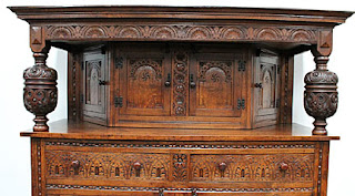
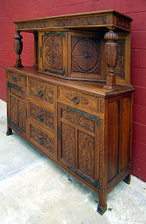
QUESTION: I’m interested in buying a court cabinet which has lovely carvings and was bought as an antique, but the owner says it’s made of “pitch pine.” I've Googled this and have discovered it's a North American conifer. I've seen an almost identical cabinet advertised as being from the time of Henry II. It’s made from walnut and has slightly more detailed carvings, although the hardware looks identical. I wondered whether the pitch pine cabinet might be a later copy, perhaps still antique, but maybe a Victorian reproduction. The cabinets started out at the same price, but the pitch pine one has been discounted and is now about two-thirds the cost of the walnut one. Is the walnut one more valuable simply because of the quality of the timber?

ANSWER: Whew, that’s a lot of questions. So let’s take them one at a time. Before we start, it’s important to clarify just what a court cabinet is.

According to its antique definition, a court cabinet, more commonly referred to as a court cupboard, is an English sideboard that was fashionable from 1550 to 1675, that has three open tiers, the middle of which sometimes has a small closed cabinet with oblique sides. The word "court" is the French word for "short" and has nothing to do with the royal household.

People used these cupboards to display pewter and silver items. In Elizabethan and Jacobean households, the court cupboard was one of the three most important pieces of furniture—the others were the tester bed and the great chair. It usually sat on the dias, the highest area of the hall, which was the main room in a Tudor house. As with later sideboards, they also held cups and glasses, spoons (forks weren’t used back then), a sugar box, and containers for vinegar, oil, and mustard.

Besides holding items used in serving and eating meals, the court cupboard served as a display cabinet for the owner’s wealth. Back then there weren’t any banks or stock exchanges, so wealthy persons put their money into pewter, silver, and gold vessels. Not only did these plates and cups make their wealth usable and socially visible, they could be reconverted into coins should the need arise.

The two or three open shelves of the court cupboard were for the display of cups. Owners of these early cupboards often covered the shelves with a “cupboard cloth” to enhance the display of their valuable wares. The court cupboard showed off the prosperity and status of the owner of the house. It’s no wonder that they were such impressive and beautifully decorated pieces of furniture.

There were two forms of court cupboard—one in which the shelves were open, the other with one shelf, usually the upper, enclosed. Decorative arts professionals sometimes call the latter one a “standing livery cupboard,” believing that the owner used the enclosed portion to store and serve food and drink, also formerly known as "livery." The enclosed portion is usually set back a few inches from the front, and may be either straight-fronted or canted, in which case the central door is parallel to the front, and the two sides slant backwards. The early canted cupboards retain the carved supports in their front corners, later ones replace them with a turned drop-finial hanging from the top corners.

Cabinetmakers decorated the cupboard’s front and door with carved motifs and figures, but sometimes to make them extra luxurious, they inlaid them with light-colored holly wood and darker, almost black, bog oak in geometric, architectural or floral designs.

When the Pilgrims came to America in the first half of the 17th century, court cupboard were all the rage back home. After much struggling, they finally were able to sustain a colony on the shores of what’s today Cape Cod. But it wasn’t until a more robust colony came into being on the site of present-day Boston that people turned to local cabinetmakers for their furniture needs. This is where the pitch pine comes in.

Pitch pine can be found along the northeast coast of the United States from Maine to New Jersey, including all of Massachusetts, Connecticut, and Rhode Island, and inland across Pennsylvania to southern Ohio, and south through western Maryland, all of West Virginia, western Virginia, eastern Kentucky and Tennessee.

New England cabinetmakers used better woods, such as walnut, for their more expensive pieces. Court cupboards appeared in both types of wood, often with exactly the same carvings. The difference was that they often painted the pine cupboards in red and black to make them look better than they were.

The two court cupboards in question, however, are not as old as you might think. Both are what’s known as Jacobean or Tudor Revival pieces, dating from the last quarter of the 19th century. They’re a prime example of the use of the same carving style and design that cabinetmakers employed in order to produce pieces at different prices. And while they look identical, the walnut one will appreciate in value more than the pine one.

Wednesday, October 21, 2015

Tear and Paste


QUESTION: I just purchased a beautiful antique papier-mâché tray at a large antique show. I’ve never seen anything like it before. In fact, I never knew that furnishings and accessories were made of papier-mâché. I still remember making things out of papier-mâché as a kid in school. Is this the same process? If so, it must have taken a long time to make this tray. What can you tell me about it?

ANSWER: Yes, for nearly 100 years papier-mâché furnishings and accessories were all the rage. And, no, the process is a bit different from the sculptures you made in art class when you were a kid.

People don’t often think of papier-mâché when they think of furniture and accessories. But, in fact, it was very popular, especially at the beginning of the 19th century. Papier-mâché is quintessentially Victorian.

Its origins date back to 17th-century England when craftsmen first used a compound of plaster mixed with organic matter such as straw, bark, or nettles to create molded architectural ornaments. The idea was for the frugal decorator to use these prefabricated cornices and rosettes instead of hiring a plaster craftsman.

By the early 18th century, cabinetmakers began using papier-mâché to decorate the frames of looking glasses, chairs, tables. But its main application remained architectural.
               
Beginning in the last quarter of the 18th century, manufacturers began turning out a range of accessories. Trays were popular through the early decades of the 19th century,  Makers produced tea trays, in particular, in great numbers, in response to the spread of tea drinking among the English middle class.

From the beginning, makers japanned papier-mâché housewares by covering them with a hard varnish imitation of Asian lacquer. At first, they kept the decoration simple, with a black or red ground embellished with a guilt border. But in the 1790's they covered the entire surface. Not surprisingly, Chinese scenes were popular. A typical example of this fanciful Oriental taste are the gilt and black trays featuring a painting of a Chinese couple standing by a pagoda. Trays like this have sold for over $6000.

Collectors highly value Regency papier-mâché. One of the finest pieces to come on the market in recent years was a Chinoiserie tray that sold at auction for $24,000. However, this tray didn’t have the black faux-lacquer ground, but instead it had a brightly painted landscape—a rocky topography shaded by willow trees, pagoda-like structures, and men wearing pointy hats. In this case, the artist went overboard with cliches of Oriental life. This decoration form is attributed to Henry Clay, who was the most prominent papier-mâché manufacturer at the time.

Clay promoted papier-mâché as a new material on which to paint. Another tray bearing Clay’s stamp had an overall floral design on a black ground. The lush realism of this tray showed the high level of skill of the industry’s painters. It sold for nearly $3500.
                               
Clay was also a pioneer in manufacturing papier-mâché furniture.  He undertook a series of experiments in durability that resulted in a much stronger material. His experiments enabled papier-mache to be sewn and dovetailed, just like wood.

The firm of Jennens and Bettridge, which took over Clays business in 1816, continued to find new uses for papier-mâché. They expanded the traditional repertoire of salvers and snuff boxes to include the whole suites of chairs, and even piano casings.  Even though papier-mâché was sturdy, manufacturers still thought it prudent to build the seating furniture around a wooden frame.

Jennens and Bettridge developed the use of mother-of-pearl in the decoration of papier-mâché.  Since they patented their technique in 1825, the date makes a useful dividing line in trying to date.

It can be a challenge to find papier-mâché pieces in good condition. But they’re easy to recognize, with their japanned surface and painted floral motifs, highlighted by mother-of-pearl inlay. Though a piece may appear in a high-end antique shop from time to time, collectors find most at middle to high-end antique shows.

Tuesday, January 27, 2015

The Other Arts and Crafts Designer


QUESTION: I have a Mission chair that has been in my family for decades. I never paid much attention to it. But recently when I was cleaning it, I turned it over and noticed a label under the arm of the chair which reads, "Limberts Arts and Crafts Furniture/Trademark/Made in Grand Rapids and Holland.” I know that Grand Rapids is in Michigan, but did this company also make furniture in the Netherlands? And just who is Limbert?

ANSWER: Charles Limbert made what you call “Mission” furniture in Grand Rapids and Holland, Michigan. In fact, his furniture wasn’t constructed in the Mission Oak style, which actually was a style of Arts and Crafts furniture that developed just before the turn-of-the-20th century.  This wasn’t as much of a style as what manufacturers called furniture made of oak that featured simple horizontal and vertical lines and flat panels that accentuate the grain of the wood. It was supposed to emulate furniture of the Spanish missions in California and Texas. What Charles Limbert made was furniture in the pure Arts and Crafts style.

The Arts and Crafts Movement in America originated in mid-19th-century England where the teachings of John Ruskin and William Morris popularized social reform. The movement began as a revolt against the Industrial Revolution and the dehumanization of the workers being replaced by machines. Americans learned about this movement through Gustav Stickley's magazine The Craftsman. Hand craftsmanship and a return to simplicity became hallmarks of the movement. These ideals applied not only to the lifestyle of the follower, but also to furniture and accessories in the home.

Hailed as the beginning of Modernism in the United States, Arts and Crafts interiors were in direct contrast to the preceding Victorian period of ornate decorative arts. Rectilinear forms of quartersawn oak replaced ornately carved rosewood and mahogany Victorian furniture. Mortise and tenon joints, butterfly keys, and the grain of the wood, itself, became the ornamentation on Arts and Crafts pieces.

While Gustav Stickley is best known as the leader of Arts and Crafts Movement in America, other designers also achieved recognition for their contribution to Arts and Crafts design. One of them was Charles Limbert. His company produced high quality Arts and Crafts furniture, but didn’t attempt to influence consumers about the idealized harmony of the Arts and Crafts lifestyle.

In the early 1880s, Charles Linbert began his furniture manufacturing career at the John A. Colby and Co.. in Chicago. He learned all sides of the furniture business— design, production, and marketing. An 1889 partnership with Philip Klingman established the Limbert and Klingman Chair in Grand Rapids, Michigan. Limbert and Klingman manufactured period reproduction chairs for only two years. In 1894, Limbert formed the C.P. Limbert and Company to produce Arts and Crafts furniture.

By 1906, the company had grown and moved to Holland, Michigan. Limbert called his line of furniture "Holland Dutch Arts and Crafts," most likely in reference to the local Dutch population.

Limbert's early furniture shows influences ranging from Japanese to Gothic. Some of his early china cabinets and bookcases have doors with stained glass in an Art Nouveau style.

His peak of design achievement came during 1904 to 1906 when he introduced many of his cut-out designs. Many of his de-signs were internationally inspired by the Vienna Secessionist School and designers such as Scotsman Charles Rennie Mackintosh and Austrian Josef Hoffmann. Limbert employed designers such as Hungarian architect Paul Horti and father and son Austrian designers, Louis and William J. Gohlke.

Limbert promoted his furniture as being "essentially the result of hand labor, with machinery being used where it can be employed to the advantage of the finished article." Like Stickley, he didn’t let machinery control production and emphasized the contribution of skilled craftsmen in his furniture promotions.

He constructed his furniture of quartersawn white oak, with well-executed doweled joints, keyed tenons and splined tabletops. Long, tapering corbels under arms characterize Limbert chairs. Unfortunately, Limbert didn’t extend his wood working quality to the hardware used on his pieces, most of which came from the Grand Rapids Brass Company.

Compared with Stickley's work, Limbert's designs were typically less severe and more visually interesting, usually achieved through the use of cut-outs and other elements inspired by the as English Arts and Crafts Movement and Dutch folk furniture.

His pieces were among the original furnishings of the Old Faithful Inn in Yellowstone National Park. Today, several wash stands remain in the Old House section of the Inn.

Monday, June 9, 2014

And All That Chintz

QUESTION: My grandmother left me quite a few beautiful pieces of china, decorated with floral patterns. What seems like the pattern name appears with the mark on the bottom of the pieces. Names like Summertime, Royalty, Florida, and such are common among them. Can you tell me anything about this china? I really like its bright, happy decoration and would like to collect more of it.

ANSWER: The pieces that you have, which are actually pottery not china, are known as chintz. Made from earthenware, they’ve become one of today’s most popular collectibles.

Chintz dates back to the 18th century when English merchants imported exotic fabrics with elaborate floral patterns from India. By the early 19th century, Staffordshire potteries began to emulate these patterns on the decorations of their wares, using large flowers and exotic birds. By the 1820s many potteries in the Staffordshire area manufactured chintz for everyday use. Although they produced many Victorian patterns, today's collectors prefer the chintz made from the 1930s to the 1950s.

The four major companies making chintz back then—Grimwades Royal Winton, James Kent, Crown Ducal, and Lord Nelson—needed a product that was cheap to produce so that their chief market, the English middle class, could afford it. Since they made chintz from earthenware and decorated it with lithograph transfers, it filled the need nicely. All together, there are over 200 different patterns of chintz.

The decoration of chintz required an amazing amount of handwork and skill since women transferred the designs by hand from lithographs on to the individual pieces. The process, which was similar to applying a  decal, required meticulous cutting and matching to ensure that the junctures of each piece were practically invisible. Other workers gilded each piece by hand before firing.

During the 1930s, the companies producing chintz, in ever-increasing competition, introduced fresh new patterns and shapes at the British Industries Fair. In order to come up with these new patterns, some  reversed the foreground and background colors. One of the leading manufacturers, Grimwades Royal Winton, changed their Welbeck with yellow background into Hazel with black ground and their Spring background into white. Companies often often named their patterns for the flowers in them and incorporated them into the backstamp or mark.

When World War II broke out, the British Government forbade all unnecessary manufacturing, so chintz production halted. After the war, people became starved for color and the chintz produced in the 1950s had a different look, with flowers larger and farther apart. Makers also changed background colors to  black, burgundy and navy.

But in the late 1950s tastes changed, and housewives’ preferences turned to modern Scandinavian design in furniture and accessories. The fussy chintz patterns clashed with the new decorating tastes, and most chintz production came to an end. It wasn't until the 1990s that interest in cozy, comfortable chintz returned.

Of all the chintz manufacturers, collectors deem Grimwades the “Cadillac of Chintz.” It produced over 60 different patterns from 1929 through the early 1960s.

In 1885 Leonard Grimwades founded the pottery with his brother at Winton Pottery, Stoke-on-Trent. They started production in a simple shed and expanded rapidly, taking over the Stoke Pottery in 1900. They introduced the first modern chintz pattern, called Marguerite, in 1928. In 1932, they came out with their Summertime pattern which immediately became immensely popular. Grimwades applied this pattern to many different articles, including clocks, invalid feeders, and jardinieres, and shipped large quantities of it to the U.S. The company awarded Wright, Tyndale and Van Roden Inc., a luxury store in Philadelphia, exclusive rights to Floral Feast, Somerset and Summertime. However, many of these pieces bear only the store’s stamp. The cup and saucer in your photo bears this pattern. Throughout its history, Grimwades produced nine chintz patterns, more than any other company.

In 1915, Albert Goodwin Richardson bought the Gordon Pottery in Tunistall, England and renamed it the A.G. Richardson Ltd. He wanted to produce good quality earthenware under the name Crown Ducal. In 1919 he sold his interest to Harry Taylor who owned a lithograph company. Crown Ducal wares also appealed to Americans during the late1920s through the 1950s.

Richardson developed a deep ivory glaze base color in 1931, and a number of chintz patterns employed it, including Pansy, Peony, Primrose, and Priscilla. In 1980, the Wedgewood Group purchased the  company and renamed it Unicorn Pottery.

James Kent took over the Old Foley Pottery at Longton. in 1897 and renamed it James Kent Ltd. to produce earthenware for the English middle class. He first produced the chintz pattern DuBarry in 1934, and it remained in production until 1980. The most popular Kent pattern is Hydrangea with a white background. The quality of James Kent wares is inferior to Grimwades, and prices are somewhat lower.  M.R. Hadida Fine Bone China Ltd. Bought the company in the 1980s.

Another factory turning out great quantities of chintz was Elijah Cotton's Lord Nelson ware. The firm Elijah Cotton Ltd. operated at the Nelson Pottery in Hanley from 1889, making mostly kitchen and hospital ware. Their chintz earthenware is chunky in shape and poorly decorated. To avoid having to hire skilled decorators, they purposely didn’t decorate the spouts and handles of their teapots and jugs. Black Beauty and Green Tulip are their most popular patterns.

Today’s collectors include tea and coffee pots, whole tea sets, bud vases, and serving pieces in their collections. Some focus their collections on a single pattern while others mix and match designs. Still others collect only tea cups in as many patterns as possible.

Monday, February 11, 2013

Drinking With Both Hands


QUESTION: I recently purchased a lovely handleless cup and saucer at an antique show. The dealer couldn’t tell me much about it except that it’s called a tea bowl. It has a beautiful landscape scene on it in a sort of lavender color. What can you tell me about this piece?

ANSWER: What you have is indeed a transferware tea bowl, made in the Staffordshire area of England in the early to mid-19th century.

Before the development of the handled teacup, the British upper classes drank their tea from expensive imported Chinese porcelain tea bowls and saucers. Owning a porcelain cup became a mark of high social status. In fact, many members of British nobility posed for portraits holding their favorite cup and saucer. The teacup or bowl was so important that most people usually carried their own to parties in special leather and satin carrying cases.

The cup, as it's known today, with a handle on the side, wasn't introduced until the 18th century.
Prior to that, hostesses and servants poured tea into a cup with no handles. The person drinking the hot tea then poured it, in small amounts, into a deep saucer and sipped from the saucer. Pouring a small amount into the saucer allowed it to cool just the bit. Also, on cold winter days, the handless tea bowl acted as a hand warmer.

It wasn’t until Josiah Wedgwood and Josiah Spode perfected the mass production of earthenware and porcelain did handled teacups become popular.

At about the same time, English pottery makers in the Staffordshire region introduced a new decorative method, known as  "decalcomania," in which workers applied printed decals or transfers onto  pottery and porcelain wares. This enabled potteries to produce cups and saucers carrying social, political,  and advertising slogans.

The process starts with an engraved copper plate similar to those used for making paper engravings.  The engraver traced the outline onto thin tissue paper and then reproduced it on a sheet of copper using homemade carbon paper. He engraved over this outline with a V-shaped groove and added the details and areas of shading using lines or dots. The idea of using dots, or stipple punching, rather than lines came later in the 18th century. The engraver found the right depth by trial and error, so he took a first print or proof before he reworked the lines and dots to deepen them if necessary. The deeper the engraving, the deeper the deposits of color, thus the darker the result. Engravers created early designs with lines and in uniform dark blue, but as the technique of engraving improved so engravers achieved different tonal qualities and printed in pink, green, lavender, brown, and black inks.

Workers, using inked copper plates would print the pattern onto tissue paper, which then transferred the wet ink to the white ceramic surface. They then fired the ceramic piece in a low temperature kiln to fix the pattern. This could be done over or under the glaze, but the underprinting method was more durable. The process produced fine lines similar to the engraved prints in old books. Before transfer printing, pottery workers handpainted the ceramics, a laborious and costly process.

During the printing process, the printer kept the plate warm by placing it on a circular iron plate or backstone. He then applied the ink to the copper plate, making sure to rub the ink into every dot and line. After scraping off the surplus color, he removed any film of color by rubbing the surface with a corduroy-faced pad. When the  copper plate was clean, he laid the tissue paper coated with a mixture of soft soap and water and passed it through the press's rollers. He then passed the printed image, now in reverse—unlike regular engravings that begin in reverse and appear correct on printing—on to the transfer team, consisting of the transferrer, apprentice, and cutter.

The cutter removed the excess paper leaving only the design pieces. The transferrer laid these pieces, colored by cobalt oxide, on to the ware after its first or biscuit firing, then dipped it in glaze and refired it. A design with an overall pattern would have the center applied first and the border around the rim afterwards. The tackiness of the oily print held it in place while the apprentice rubbed it down vigorously with a stiff-bristled brush using a little soft soap as lubricant.

The apprentice then soaked the earthenware in a tub of water to soften the paper, which he removed by sponging, the oil-based color being unaffected by the water. After drying, an assistant placed the ware into the hardening kiln to fire at 1,250-1,290 F. to remove the oils and secure the color. Afterwards, another worker glazed the piece and placed it into the kiln to be   refired at 1,940-2,010° F.

Engraving for transfer printing reached its peak by 1816. And by 1805, lighter shades of royal blue as well as ultramarine came into use. Though each factory developed its own potting and decorative techniques, considerable copying took place between factories. In addition, each factory experimented with different styles and products changed dramatically over a short time.
Not only did the paste and tone of the underglaze blue vary from factory to factory, but they also varied according to the stage of each factory's development.

To complicate matters, makers constantly introduced new patterns, while shapes of plates, dishes, tureens varied from time to time according to the prevailing trends. When the Chinese-inspired designs lost favor, manufacturers replaced them with European scenes, which they copied from engravings in books. Floral borders resembled each other in general appearance, although most differed in detail.

Today, transfer tea bowls are going for astronomical prices. One is excellent condition, with a perfectly matched design, can fetch upwards of $150-200 in an antique show or shop.

Tuesday, November 27, 2012

‘Tis the Season for Cranberry


QUESTION: Every year at Thanksgiving, I bring out a set of eight sparkling pink glasses that used to be belong to my great-grandmother. They seem so festive and add a holiday note to our dining table. Can you tell me anything about these glasses?

ANSWER: Your glasses are made of cranberry glass, a very special type of glass favored by Victorian hostesses, especially around the holidays. Not only is this glass appropriate for the Thanksgiving and Christmas holidays, but it’s also a popular collectible. In fact, some pieces are worth too much to be used for fear of breakage.

Although glassblowers had been making colored glass since ancient Egypt, it was Johann Kunckel, a 17th-century German chemist from Potsdam, who came up with the red color by adding gold chloride to the clear crystal. During the 19th century, English and American glassblowers experimented with adding less gold choride, resulting in a pink glass which the Americans called “cranberry.”

And thanks to the virtuosity of these glassblowers there seems to be an endless variety of shapes and patterns of this glass on the market. In addition to tumblers and water pitchers, there are salt cellars, sugar shakers, cruets, jars, jugs, decanters, celery vases and finger bowls. Among the widely used patterns are "Swirl," "Coin Dot," and "Daisy & Fern." Some of the most rare and expensive items found from this time period are beautiful lamps and other lighting fixtures.
           
As with any collectible, cranberry glass can also be an investment. Pieces that sold for less than ten dollars a generation ago are now worth hundreds of dollars. Because of the natural fragility of glass, antique cranberry glass has become relatively scarce, though it does turn up in thrift and antique shops,  flea markets, and auctions.           

Although cranberry glass had peaked in popularity by the end of the 19th century, manufacturers produced it in quantity through the 1930s. The last two companies to make this unique glass—The Pilgrim Glass Corporation and Fenton Art Glass —went out of business early this century. Pilgrim Glass Company produced beautiful blown cranberry glass ranging from various vases and baskets to candle holders and sold them in department stores and gift shops around the country until 2001. At the time if the company's closing, cranberry was its most popular type of glass. Fenton Art Glass marketed new cranberry glass, featuring opalescent decoration with coin dots, daisy patterns and numerous other styles, through retailers around the country until it closed in 2011.

Cranberry glass has always been made in craft production rather than in large quantities, due to the high cost of the gold and the delicate mixing process required. Glassmakers dissolve the gold chloride in a solution of nitric acid and hydrochloric acid, known as “aqua regia.” Gold in the batch reacts with intense heat to create the beautiful cranberry color. A glassworker called a “caser” attaches a “bud” of this glass mixture to a blowpipe. Then the glassblower stands on a platform with the mold below his feet and blows the molten glass into the mold to create the desired shape. Afterwards, another glassworker places the piece in a “lehr” or annealing oven where it slowly cools to room temperature. Most cranberry pieces are hand blown or molded and often contain small bubbles and striations.


Tuesday, August 28, 2012

A Pitcher Full of Beauty


QUESTION: I’m trying to learn more about a pitcher that I have. Through Internet research, I h/ave learned the story of Paul & Virginia, the decorative relief on the pitcher, but I’m trying to identify when and where my piece was made. The only marking on the bottom is a hand inscribed “BS.” Can you tell me anything about it?

ANSWER: You have what’s known as a Parian ware pitcher, most likely made after 1850 in the United States. While pottery factories produced thousands of Parian pieces, most of them were sculptures. However, here in the U.S., pitchers like this gained popular use as water pitchers.

English potters developed the formula for Parian ware porcelain in the 1840s, at the start of the Industrial Revolution. With the advent of steam power, it became possible to produce molds with which to make duplicate copies of ceramic products. Named after the Parian marble quarried in Greece that its originators intended to replicate using the same ingredients as porcelain—white china clay, feldspar, kaolin, and flint, Parian became popular with middle and upper middle class Victorian women who desired to own the marble statuary and china of the upper classes but couldn’t afford them. That’s where Parian came in. It filled this need at an affordable price.

Because Parian had a higher proportion of feldspar than porcelain, makers fired it at a lower temperature. The increased amount of feldspar caused the finished body to be more highly vitrified, thus possessing an ivory color and having a marble-like texture that’s smoother than that of biscuit, or unglazed, porcelain. Potters either made relief ornamentation by hand or in a mold. They left most Parian in its natural, creamy white state, but applied background colors, usually shades of blue, to contrast with the relief motifs.

Since the matte surface of Parian ware attracted dirt, which was difficult to remove, makers protected  much of the Parian made here and abroad with a smear glaze, which they achieved by adding chemicals to the kiln in much the same way that they would add salt to a kiln of stoneware. The matt or satin sheen of the smear glaze also preserved the Parian’s crisply molded details, which would have blurred under a glossy glaze finish. However, potters fully glazed the interiors of vases and pitchers intended to hold liquids.

In its Victorian heyday, potteries produced hundreds of thousands of pieces of Parian ware annually. Though it soon went out of popularity in England, American firms, notably one run by Christopher Fenton, which produced Parian from 1847 to 1849 as Fenton Works of Bennington, Vermont, and then from 1849 to 1858 as the United States Pottery Company, began making all sorts of items, but especially water pitchers. These potteries produced Parian ware using British manufacturing techniques brought over to America by English potters. Fenton’s companies made  at least 16 different pitchers.

Christopher Webber Fenton and his brother-in-law Julius Norton first made Parian in America at their pottery in Bennington, Vermont. Bennington had been a center for the production of utilitarian salt-glazed stoneware since the early part of the century. After Norton left the company in 1849, Fenton used the mark "Fenton's Works; Bennington, Vermont." When he acquired a new partner, a local businessman named Alanson Potter Lyman, also in 1849, Fenton changed the factory's name to the United States Pottery Company.

Daniel Greatbach, a Staffordshire potter who arrived in Bennington after beginning his American career in Jersey City, New Jersey, did much of the firm’s designing. Consistent with English counterparts of the mid-1840s through the 1850s, relief molding on Bennington pitchers usually consisted of the naturalistically rendered plant forms of the Rococo-revival style. Unfortunately, the factory closed in the Spring of 1858 due to the high cost of labor, the high losses by breakage, and the rough competition posed by cheaper imported articles. 

While the English potters marked their pieces, the Bennington firm for the most part did not, leaving nearly 80 percent unmarked which makes identifying Bennington pieces difficult without expert assistance. There’s a misconception that any unmarked Parian pieces from New England had to have been made by the United States Potter Company of Bennington. This myth seems to have originated in the 1920s with Dr. Charles Green, a New York physician and ceramics enthusiast, who amassed a large collection of Parian trinket boxes and vases during his antiquing forays throughout New England. Without knowledge of imported English ceramics into New England, he reasoned that anything found there must have been manufactured there. Since the Bennington pottery was known to have made some Parian, Green reasoned that all his unmarked Parian must have been made there as well. 

"Fenton's Works/Bennington,/Vermont," the mark used by Fenton’s Bennington firm,  clearly identifies the pitchers made prior to 1853, the year in which the pottery changed its name to the United States Pottery Company. The earlier of the two is a raised or applied mark impressed "UNITED STATES/ POTTERY CO./ BENNINGTON, VT.," which appears on four of their pitcher patterns–Cascade, Climbing Ivy, Tulip and Sunflower, and Paul and Virginia. A raised ribbon mark with the initials "U.S.P." was the last mark used on Parian by this firm. The ribbon also features two numbers denoting the pattern number and the capacity of the pitcher.

Victorians liked pitchers and vases of various sizes and shapes, including those shaped like hands holding receptacles for flowers or ears of corn or shells. Some had white relief decoration of grapes and vines, oak leaves, or climbing roses against a blue stippled background while others had relief illustrations from a novel called Paul & Virginia.

Jacques-Henri Bernardin de St. Pierre wrote the story of Paul and Virginia and first published it in 1788. The novel of naive love became an instant world-wide best seller, captivating audiences with the tale of two youngsters who grow up on a paradise island according to nature's law. In adolescence, the pair fall in love, but a shipwreck leads to their untimely deaths.

It’s a known fact that English immigrant potters brought with them a supply of English plaster casts and design molds to use in America. A pitcher can resemble an English one so closely as to suggest that it was cast in a mold made from the original piece. Therefore, it can be extremely hard for a beginning collector to tell the difference between unmarked English and American Parian ware.

Though Bennington Parian is considered the best Parian produced in America, other factories in Cincinnati, New York City, and Baltimore had begun production by the 1870s. So this pitcher could have been produced by one of those potteries.  Similar pitchers are selling for as much as $365 online.


Monday, July 30, 2012

A Taste for Eastlake


QUESTION: I recently discovered two chairs and a settee at my grandmother’s house. Unfortunately, there are no markings of any kind as she apparently planned to refinish them and sanded everything off! What can you tell me about them? After hours and hours of searching on Google, the best I could come up with is that they're possibly Victorian.

ANSWER: You’re half way there as far as your chairs and settee are concerned. Yes, they are Victorian—Eastlake Victorian, as a matter of fact. This style was popular from 1870 to 1885 and is one of seven different furniture styles popular during the Victorian Age.

Charles Locke Eastlake, an English critic of taste, did more to affect a change in American taste in the late 19th Century than anyone before or since. More than any other individual, he was responsible for introducing the principles of the English design reform movement to the American public.

Eastlake considered simplicity the key to beauty. He thought the objects in people's homes should be attractive and well made by workers who took pride in their work. He published a book, Hints on Household Taste in Furniture, Upholstery and Other Details, a runaway bestseller from 1870 and 1890. The book became the decorating bible for upper middle class American housewives.

Though Eastlake included some of his own sketches among the illustrations of well-designed furniture chosen for his book, he was primarily a critic of taste, not a furniture designer. The furniture illustrated in Hints had ornamental features including shallow carving, marquetry, incised or pierced geometric designs, rows of turned spindles, chamfered edges, brass strap hinges, bail handles, and keyhole hardware inspired by Gothic forms. Every decorative device, according to Eastlake, also had to fulfill a useful function.

To relieve the simplicity of rectilinear forms, Eastlake advised using turned legs or spindle supports. When a homeowner desired an "effect of richness,” he suggested restrained, conventionalized carving, inlay, and sometimes even veneer. Ornament, he felt, should be stylized rather than naturalistic, for it’s "this difference between artistic abstraction and pseudo-realism which separates good and noble design from that which is commonplace and bad." A functionalist, Eastlake cautioned that carved decoration should always be shallow and never "inconveniently" located, as were the "knotted lumps" of grapes or roses decorating rococo-revival chairs that often stabbed the sitter between his or her shoulder blades. His book further suggested that furniture be made of such solid, strongly grained woods as oak, walnut, or mahogany. He preferred oil-rubbed finishes to "French-polished" ones, and varnish was taboo.

By 1876, homeowners of the nation's most elegant homes decorated them in subdued "artistic" tones, set off by rectilinear furniture of rich bird's eye maple or elegantly ebonized cherry wood. Critics broadly categorized the new designs as "art furniture," but also called them "modern Gothic," "Queen Anne Revival," or "Eastlake" in honor of the man who brought a sense of taste to America.

To the modern eye, such furniture with its intricately stylized marquetry, gilded incised designs, spindled galleries, inset tiles, richly grained woods, and decorative turned elements hardly seems "simple." But in contrast to the heavily carved furniture of preceding decades, embellished with naturalistic roses and bunches of grapes imposed on the elaborate rococo shapes that we now regard as the embodiment of Victorian design, Eastlake-inspired furniture was remarkably functional and clean-lined.

The Eastlake style was quickly taken up by the manufacturers of cheaper furniture, who until then had given very little attention to artistic form. The furniture produced in these factories ranged from excellent to shoddy, depending on the grade of lumber used, how well it was seasoned in the drying kilns appended to the larger factories, and upon the skill of each machine operator throughout the manufacturing process. At its worst, factory furniture was poorly designed and rickety. However, there was a middle range of
moderately priced but well-constructed factory furniture produced in the Midwest for wholesale shipment to Eastern retail outlets. These chairs and settee fit into this group.

Eastlake-style furniture often featured tables and chests with marble tops, some the traditional white, others in rich Italian pinks and browns. Tables and chairs had aprons and legs incised with horizontal or vertical lines called reeding and chamfered corners. Round legs on chairs also featured ring-like annulets. Quatrefoils were another popular addition, since flat cutouts often graced the more elegant pieces. Lastly, acanthus-leaf designs could be found incised into even the cheapest versions.

Pieces of furniture in this style had low relief carvings, moldings, incised lines, geometric ornaments, and flat surfaces that were easy to keep clean. Also called Cottage Furniture, the mass-produced pieces were much more affordable than the fancy revival pieces. Unfortunately, while Eastlake-style furniture may have looked refined, most chairs and sofas weren’t very comfortable and were meant to be used in formal parlors for guests only.


Tuesday, October 11, 2011

Taking the Mystery Out of Identifying Antiques


QUESTION: I have what I believe to be an English ceramic plate with a mark that looks like a diamond with a bunch of letters and numbers in it. Can you tell me what that means?

ANSWER: The stamp on the back of your plate is known as a mark. Manufacturers of English pottery used this particular design between 1842 and 1883. The letters and numbers indicate the dates of the plate’s design registration with the British patent office. You can easily decipher this alpha-numeric code by checking the chart found on the Phoenix Masonry Web site or in Kovels' New Dictionary of Marks--Pottery & Porcelain: 1850 to the Present by Ralph and Terry Kovel (Crown Publishers, New York).

Pottery makers replaced this diamond-shaped registry mark with a sequential numbering system prefaced by the abbreviation Rd. No.  in 1884. Over the years, they modified the arrangement of the numbers several times, so it can be confusing. If you need specific information, you can contact the British Designs Registry Patent Office for dates registered in and after 1909 and the British Public Record Office for dates registered prior to 1909.

Sometimes, pottery and porcelain makers used word indications that spelled out the date. If the mark shows the country of origin, this means the piece dates after 1891, according to the U.S.  McKinley Tariff Law.

Often manufacturers worldwide employed words to describe their wares. These usually had start and end dates, making it easy to figure out the approximate date of a piece. For instance, the term "Nippon,” the Japanese name for Japan, indicates that piece of Japanese porcelain dates from 1891 to 1921while "Made in Occupied Japan" shows that the piece dates from  1945 to 1952. "Semi-vitreous" means the piece appeared on the market after 1901 while "bone china" indicates that the piece dates generally from the 20th century.  The phrase "oven-proof' appeared on pottery and china after 1933, but "dishwasher proof ” didn’t appear until after 1955. Sometimes a location, such as "East Germany" can indicate a time period, which in this case extends from 1949 to1990.

If a piece of pottery or porcelain has a mark showing a design and/or maker’s name, this information may also help to date it. You’ll find loads of resources, both in print and online, to help you identify early English, European, and Asian pottery and porcelain marks.

In the United States, makers stamped patent numbers on the backs and bottoms of their pottery pieces. A patent number represents the very earliest an article could have been produced. For example, a patent number of 16,388 indicates the piece appeared after Jan. 1, 1857 but prior to Jan. 1, 1858. Therefore, it dates from 1857, the year of its patent registration. Should you discover several sequential patent number sets on one piece, you should look up the final set on a patent date chart to date the piece.

Marks on furniture, glass, and silver are another story. When a maker uses his name or logo, you may have enough information to track the date of manufacture. Often during the course of the run of a piece, the maker will use different names. This is true of Tiffany glass. On some pieces, Tiffany signed, that is incised, his name “Louis C. Tiffany.” On later pieces, “Tiffany Studios” appears on the piece, and yet others show no mark at all.

Early furniture makers often scratched their name on the bottom of a piece, such as under the seat of a chair. But by the early 20th century, almost all manufacturers used labels affixed to the backs or bottoms of their pieces. If a piece of furniture has a label, it surely indicates that the piece is modern. Gustav Stickley employed a red decal featuring his logo, a joiner's compass, from 1902 to 1903 as compared to the revised decals Stickley used between 1903 and 1912.


Monday, June 21, 2010

Mooovelous!


QUESTION: My great aunt gave me a funny little pitcher shaped like a cow. It has no markings on it. Can you tell me anything about it?

ANSWER: What this person has is a cow creamer. Originally made in England, then in Scotland and America, these unique creamers were the pride and joy of many late 18th and early 19th-century English housewives. They kept these spotted bovines sitting on top of their dining room dressers, ready to use on special occasions.

These pottery cow creamers are usually about six inches long and four to five inches high. Housewives would pour fresh cream through a hole in the cow’s back, then seal up the whole with a cover. Unfortunately, many a cow creamer today is missing its cover. The cow’s curved tail served as the handle while its mouth served as the spout.

The first cow creamer came from the Whieldon Pottery, which imitated the silver cow jugs made in 1755 by John Schuppe. The most well-known of these had a mottled brown tortoise shell-type glaze. Others had brown and yellow spots, black with a criscrossed yellow pattern, and even light blue with yellow circles.

It seems every potter added his touch of whimsy. In fact, there are almost as many different decorations as there are creamers.

Staffordshire potters also crafted these unique little jugs, essentially copying from the earlier Whieldon design. None of these have markings on the bottom. The Welsh potters added their own creative touches to their cow creamers. Many decorated them freehand or applied transfer designs of rustic farm scenes. After 1850, the Scots developed a love affair with the cow creamer. Scottish potters experimented with sponged decoration and brightly colored glazes.

After the American Revolution and into the early 19th century, imported English pottery became too expensive, so the United States Pottery in Bennington, Vermont, began making its own version of the cow creamer. Each cow had crescent-shaped nostrils, open eyes, folds in the neck, and visible ribs. I guess the American cows weren’t as well fed as their English, Scottish, and Welsh cousins. After Bennington closed in 1858, its potters sought work at potteries in Ohio, Maryland, and New Jersey, taking their skill at making cow creamers with them.

Tuesday, March 2, 2010

What’s All the Confusion About American Parian?


QUESTION: Can you tell me if the cream pitcher and sugar bowl I have are authentic pieces of Parian ware? Someone told me they might be American.

ANSWER: Parian ware is a type of salt-glazed pottery made in England beginning in the 1840s. The English pottery that originally developed it, W.T. Copeland, named it after Greek Parian marble since they intended to duplicate expensive marble sculptures for the growing merchant class who wanted to emulate decorative pieces owned by the wealthy. While it has the same ingredients as porcelain–white clay and feldspar–the proportions are two of clay to one of feldspar, instead of equal ones as in porcelain.

Victorians who were climbing up the social and economic ladder loved the statues of classical figures and such, made to resemble those of ancient Greece and Rome. After Copeland, the most famous maker of Parian, perfected the process, other English potters, including Boote, Minton, and even Wedgewood began producing it.

British potters, who immigrated to America in the 19th century, brought with them the skills to make Parian and established potteries from Vermont to South Carolina where they made Parian ware using English techniques. Just as their British counterparts, American women loved it because it resembled expensive marble at a fraction of the price. Most pieces are a dull, gray-white and unglazed.

Parian really took off in the United States after the 1876 Centennial Exhibition in Philadelphia where several American potteries set up exhibits of their works. Potteries such as Ott & Brewer of Trenton, New Jersey and Union Porcelain Works of Brooklyn, New York created Parian statuary with truly American themes. Since the Civil War had ended a little over 10 years before, many of them celebrated the heros of it. The game of baseball had also gained national popularity, so Ott & Brewer produced a statue called “The Baseball Pitcher,” sculpted by Isaac Isaac Broome for their exhibit at the Centennial Exhibition.

What gets many collectors confused is that the Bennington Pottery, founded by Christopher W. Fenton, operated under the name Fenton’s Works from 1847 to 1849, and then as the United States Pottery Company from 1849 until 1858. It produced not only Parian statuary but also 16 different styles of pitchers to hold everything from water to ice tea and milk.

While the potters back in England marked their pieces, many in America did not. The United States Pottery in Bennington, Vermont, one of the most noted American Parian makers, marked only about 20 percent of their pieces and then mostly pitchers with either “Fenton's Works,” “U.S.P.,” or “UNITED STATES/ POTTERY CO."

So the creamer and pitcher above would most likely have come from one of the American Parian makers rather than one in England.

For more information on Parian ware, read Parian Ware–Affordable Art for the Masses.

Tuesday, February 9, 2010

The Often Confusing World of Antiques


QUESTION: Every time I go into an antique mall or visit a show, I become overwhelmed by all the items.  How can I make sense of it all?

ANSWER: If you’re like this person, perhaps you’re mind and senses have gone into antiques overload. So many items–furniture, ceramics, pictures, jewelry, old Coca-Cola signs and things that look like the cat dragged them in. So where’s the good stuff?

It all seems so confusing. And the prices for some products seem ridiculous , especially if you’re a beginning collector. But don’t despair. There’s a method to all that antique madness. Believe it or not, there are some main categories.
When most people think of antiques, they think of furniture. And though it makes up a good percentage of antiques out there, smaller items, known as “smalls” in the antiques business--ceramics, glassware, silverware, toys, and commemorative items–all play important roles.
All in all, there are about 15 major categories and 75 sub-categories. Within these there are other, more specialized areas, such as antique maps and posters, two very specialized categories.

Even though antiques can be categorized generally, dealers and serious collectors use historical periods–Victorian, Roman, Gothic, Civil War, Western and even the1950s–to sort things out.
Often, these terms also indicate different styles.

For instance, in the world of furniture, you’ll probably see examples of English, French, American, and Chinese styles at most antique malls, shows, or auctions. Most English furniture falls into the pre-Victorian or Victorian category while American furniture tends to fall into different types: Pennsylvania, Shaker, New York, etc..

Porcelain or pottery pieces fall into categories associated with the country in which they were made–England, Germany, France, American, Chinese and Japanese are just a few. The four you’ll see most are English, German and Japanese, and American. You’ll soon become familiar with names such as Royal Doulton, Staffordshire, and Meissen, Blue Willow, Limoge, Belleek and Sevres, especially if you frequent the better antiques venues.

Glassware is the third most popular category. You’ll see all types, including Depression, Venetian, English, and Czech glass. Most glassware collectors specialize in a particular produce line–bowls, tumblers, decanters, etc. There’s also a refined category known as art glass in which you’ll find all those pretty vases blown in amberina, peach blow, and ruby.

These are just some of the many categories of antiques that you can begin to collect. While some tend to be higher priced, you’ll find plenty of small pieces of furniture, ceramic, and glassware to get you on your way.