Showing posts with label engraving. Show all posts

Friday, September 25, 2026

Smokem If You Gotem


QUESTION: My mother used to smoke, and she assembled a collection of antique cigarette cases. She began with one she found at a flea market, but after a while she added one, then another, and another. Over time, she amassed quite a collection. Sadly, she died from lung cancer. I inherited her collection. I don’t smoke but find the design of these cases fascinating. Considering the attitude towards smoking, are cigarette cases collectible, and if so, what can you tell me about their history?

ANSWER: Antique cigarette cases first appeared in the late 19th century, coinciding with the industrialization of cigarette manufacturing, and became symbols of status among wealthy Victorian society. They were originally designed to protect delicate cigarettes but evolved into fashionable accessories reflecting the artistic styles of the time.

The primary function for a cigarette case is to keep the fragile tubes of tobacco from being crushed. But smoking cigarettes has long been associated with style and fashion, which is why cigarette cases quickly became highly decorative personal accessories.

During the peak of smoking popularity during the first half of the 20th century, cigarette cases were a common accessory for both sexes. Additionally, they had monograms, enamel, and rhinestone decoration. Some featured engraved or hammered scenes. They became an essential part of a woman’s look, as important as a scarf or hat. 

Cigarette cases first appeared during the Victorian era when smokers were primarily men. Cases were usually made of silver- or gold-toned metal in a slim rectangular shape, which opened like a book to display cigarettes on both sides. These cases not only provided easy access but protected the cigarettes.

Manufacturers have made cigarette cases from brass, sterling silver, silverplate, vinyl, Bakelite, wood, enamel, leather/animal skin, mother-of-pearl, 9k and 14k gold, gold-tone metal, and mesh. Common embellishments and designs include engravings, monograms, filigree, guilloché, peacocks/birds, flowers, fruits, cabochons, gemstones, animals, and cityscapes.

Silver was one of the most common materials used to make antique and vintage cigarette cases. Designers and jewelers would emboss and chase their cases to create everything from delicate floral or geometric patterns to bold designs, such as a coat of arms. The interiors of better cases were gilded, sometimes bearing a tender or congratulatory inscription. The surfaces of other cases were hammered, to give them an Arts and Crafts look. There were also silver cases whose flat surfaces were interrupted and punctuated by inlaid bands of gold.

After World War I, when cigarette smoking was extremely popular and chic, Paris became a center for cigarette-case design. Originally simple in appearance, cigarette cases grew increasingly ornate by the 1920s. During the Art Nouveau period, makers produced intricate designs on cases, including engraved or inlaid wild birds or flowers. Some men’s cases featured scantily clad women or their initials.

One Parisian designer from the 1920s, Raymond Templier, created lacquered cases as well as silver-and-enamel cases, both sporting brightly colored geometric designs. Other Art Deco designers produced enamel cases with bold, graphic imagery. Cigarette boxes first appeared with polished panels of sterling silver, with stepped covers that recalled the shapes of Mayan temples.

From the 1930s through the 1950s, cigarette cases were at their peak, as was the pastime of smoking cigarettes. Art Deco engravings, delicate fillagree, and cabochon or rhinestone designs often covered the casings.

Because people believed that gold was opulent enough to be unadorned, cases made of gold  often had engravings, while those made of silver were often decorated with enamels and rhinestones.

Bakelite became a common material for cigarette cases in the 1940s. While the typical case was a slim tin for carrying, others were designed as boxes for home use. Luxury French  retailers such as Cartier and Van Cleef & Arpels offered their own cases covered in diamonds and other gemstones. 

Also, cigarette makers, such as Camel, Chesterfield, Players, Lucky Strikes, produced their own cases, nicknamed “flat fifties” due to their ability to contain 50 cigarettes. By the 1970s, decorative cigarette cases had declined in favor, replaced by snap-top pouches made of vinyl or nylon.

To read more articles on antiques, please visit the Antiques Articles section of my Web site.  And to stay up to the minute on antiques and collectibles, please join the over 50,000 readers by following my free online magazine, #TheAntiquesAlmanac. Learn more about "Victorian America" in the 2026 Summer Edition, online now. And to read daily posts about unique objects from the past and their histories, like the #Antiques and More Collection on Facebook.


Tuesday, April 1, 2025

A Little Box Named After the Roman Goddess of Fire


QUESTION: A few months ago, I was out antiquing and came across several little silver boxes in an antique shop. They didn’t seem to have an obvious use, as they were too small to fit much in. The owner of the shop told me they were vesta cases and that they used to hold matches back in the 19th century. One had been decorated in repousse while the other two were rather plain. What can you tell me about these little boxes? Are they worth collecting?

ANSWER: Vesta cases were small portable boxes, made from precious and non-precious metals,  used to keep matches dry and to prevent them from igniting. Usually the base of the vesta case had a serrated edge, known as the striker. The user dragged the matches, called vestas, across the striker to ignite them. And, yes, they’re highly collectible.

Vesta cases first appeared in 1832 when an Englishman named William Newton patented a match he called the wax “vesta.” The vesta, also called a “strike anywhere match,” had a tip of phosphorus and a wax stem over cotton threads. As the name suggests, these matches would ignite when struck on different surfaces, making them prone to accidental combustion. So they needed to be enclosed in a metal case. 

Named for Vesta, the Roman goddess of fire, home, hearth and family, vesta cases often depicted her as the fire in her temple. In the United States, vesta cases became known as match safes because they kept matches safe in a non-flammable case. 

Before the invention of safety matches, matches were often struck on rough surfaces, but they were also highly susceptible to moisture. Vesta cases protected matches from both dampness and damage.

There were three main types of vesta cases—portable pocket vestas, table or mounted vestas, and “go to bed” vestas. Men often hung a pocket vesta from their watch fob chain. People kept a larger table vestas near fireplaces around their homes, as well as by the kitchen stove. And they used a “go to bed” vesta, attached to a chamberstick, to light their way to their bedroom at night. .


Manufacturers made vesta cases from a variety of materials, including silver, brass, tin, gunmetal, nickel silver,  ivory, bone, tortoiseshell, gold, pewter, and enamel. The more unusual materials included leather, wood, horn, and ceramics for table vestas. Wealthy individuals often commissioned custom cases with intricate designs, engravings, or even gemstone embellishments, transforming a practical item into a work of art.

Although most manufacturers produced vesta cases of less expensive materials, most often brass or nickel silver, thus making them more affordable, sterling silver was perhaps the most common material, especially in England. Wealthier users often carried vestas made of  gold or decorated with enamel. More expensive vestas often had a gold wash interior to prevent corrosion by the chemically active match heads.

Silver vesta cases, often hallmarked and intricately engraved, featured repoussé work, , adding texture and visual interest. People could also purchase enameled vesta cases,  adorned with miniature paintings, floral motifs, or whimsical scenes.

Besides being rectangular, vesta cases came in many different shapes and decorations. As well as plain and decorated square, oblong and round cases, many came in novelty shapes. Silver, brass, or white metal pigs with hinged heads were popular, as were vesta cases in the form of Mr Punch, hearts, skulls, books, musical instruments, owls, boots and shoes, bottles, suitcases, birds, ladies' legs, and so on. Sporting decorations were also common, especially for golf and cricket, as were hunting scenes and armorial decorations.

Jewelers often engraved decorations into metal vestas, with floreate patterns the most common, though they sometimes used other techniques, including repoussé and chasing, guilloché, engine turning, cloisonné, cold-painting, enameling and niello for more expensive cases.

Wealthier people commissioned or purchased hallmarked gold or silver vesta cases which a jeweler would often personalize by inscribing their initials in a cartouche on the front. 

As well as being status symbols, vesta case were an excellent form of advertising.  Prestigious companies engaged master silversmiths to craft vesta cases from precious metals to promote their famous brands.

During the late 19th and early 20th centuries, manufacturers created vesta cases to celebrate special events such as commemorating Queen Victoria’s Jubilee Anniversary or promoting companies, serving as a form of advertising. Vesta cases also promoted  cigar and tobacco brands, as well as commemorated moments in history. Many vesta cases were miniature works of art, with beautiful craftsmanship. 

Manufacturers worldwide, including those in the United Kingdom, in the U.S.A., continental Europe, Japan and Australia, produced vesta cases. Noted English goldsmiths such as Charles Murat, Asprey, Mappin & Webb, and William Neale & Sons and Sampson Mordan, also crafted sterling silver vesta cases for discerning clients.

To read more articles on antiques, please visit the Antiques Articles section of my Web site.  And to stay up to the minute on antiques and collectibles, please join the over 30,000 readers by following my free online magazine, #TheAntiquesAlmanac. Learn more about "Roman Arts and Culture" in the 2025 Winter Edition, online now. And to read daily posts about unique objects from the past and their histories, like the #Antiques and More Collection on Facebook.


Friday, July 2, 2021

It's All About the Patterns


QUESTION: When I was a little girl, I used to sleep over at my grandmother’s house. While there, I used to stand in front of her china cabinet looking at all the beautiful china. Each piece had some sort of scene, usually a landscape with people. Most of the dishes were blue but some were pink and one or two were lavender. After my grandmother passed, I got her china collection. I just love it but don’t know much as these beautiful pieces. The name Spode is either stamped or impressed on the bottom of most of the pieces. Can you tell me who made them and where they got the ideas for the scenes on them?

ANSWER: What your grandmother collected and you now have is Spode china. All those with scenes and borders are what’s known as transferware, a technique for transferring prints to pottery.

During the early years of the 18th century, Spode achieved success because of  his mastery of transfer printing.  An Irish engraver named Brooks invented the process. It involved first, engraving a copper plate, then inking it and applying to it to thin tissue paper. The impression on the paper could then be transferred to wares of any shape.

Spode produced a variety of pottery wares, often imitating those of Wedgwood, including creamwares, basalts, stonewares, redwares, Jasperwares, and of course blue-printed pearlwares and early experimental porcelains.

In 1784, Spode began printing under the final glaze in blue on earthenware. He copied the early patterns from Chinese porcelain imported wares. By that time, London customers who had originally purchased Chinese porcelain dishes needed replacements. The engraver Thomas Lucas brought with him to Spode’s pottery the knowledge of designs from his previous employer, Thomas Turner at Caughley. 

Most of the early blue transfer-printed patterns were Chinese in style.  As Spode's production advanced and its customers' tastes evolved, the variety of patterns grew. Interest in Chinoiserie patterns later gave way to patterns that depicted rural scenes, exotic places, literary themes, as well as floral and botanical examples.

The earliest pattern produced by Spode around1790, was “Willow,” now known as “Blue Willow,” printed examples of the Willow pattern, commissioned by Josiah Spode and made around 1790, and its copperplate, engraved for Spode by Thomas Minton. 

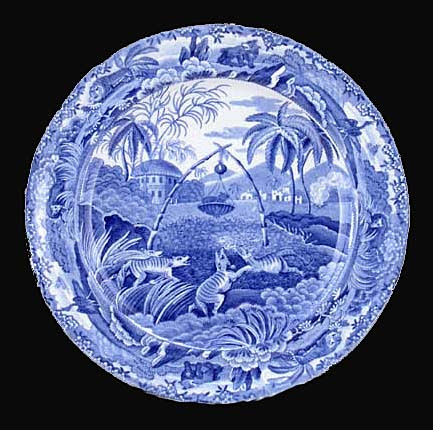
In June 1805, there appeared the first of 20 monthly issues of a publication called Oriental Held Sports, Wild Spurts of the East, published by Edward Orme of Bond Street, London.  Each issue included a printed story and two large aquatint prints engraved from drawings by Samuel Howitt, a distinguished animal painter. Spode adapted the prints to his dinnerware depicting various hunting scenes with animals and birds. Some views show mounted hunters carrying spears with native bearers on foot. The ’Indian Sporting’ series alone had 21 different hunting scenes.

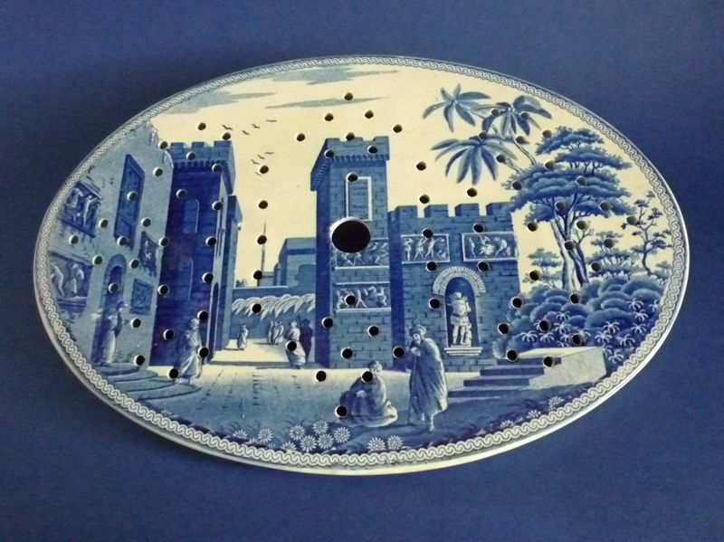
Another popular series formed a travelogue of views in the Eastern Mediterranean. Spode based these on engravings in Mayer's Views in Asia Minor, Mainly in Caramania, published in 1803. "The Castle of Boudron;" The City of Corinth" and “Antique Fragments at Lissimo” were all part of this series. 

From around 1800, most of the patterns painted by Spode's artists were recorded in Pattern books.  These books contained watercolor paintings of tens of thousands of patterns made from about 1800 up to the end of production. Many are beautiful works of art in their own right, but they also acted as a historic document of changing design styles over two centuries. Georgian simplicity, Regency opulence, Victorian Naturalism, sentimentality, Pre-Raphaelite styles, Japanese Revival, Arts and Crafts, Art Deco, and 1950s Modernism.

Spode introduced his more famous pattern, “Blue Italian,” around 1816. It became immediately popular and remained a best seller. Over the years, the company produced it on a wide variety of earthenware shapes. One Spode catalog from the 1920s and 1930s records over 700 different shapes available. 

Unlike many of the other classical scene patterns on Spode wares of the early 19th century, the origin of the view for the Italian pattern isn’t certain. Some experts believe Italian artist G.P. Pannini, well known for his painting style, inspired pictures of ruins and quiet pastoral Italian scenery fpor Spode pieces. The Spode engravers derived many of their pictorial subjects from scenes which had appeared as prints. Publications of prints of scenes associated with the Grand Tour became the inspiration for many patterns. Merigot's Views Of Rome and Its Vicinity, published in 1798, was the source for several Spode patterns, including Tower and Castle, but experts agree that none of these views inspired the Italian pattern.

Furthermore, there is no one location in Italy that seems to correspond to all the features included in the original “Blue Italian” scene. It seems to be a composition made up of several elements. The ruin on the left, although architecturally incorrect, might have been based on the Great Bath at Tivoli, near Rome. The row of houses along the left bank of the river is similar to those of the Latium area near Umbria, north of Rome. The castle in the distance is of a type which occurs only in Northern Italy in the regions of Piedmont and Lombardy.

Could it be that a traveling artist from Northern Europe made sketches of the scenes he encountered as he made his way through Italy? Upon returning home, did he combine his sketches into an attractive scene which, later, Spode used and chose to call the Italian Pattern? Unfortunately, there is no proof of this. The inspiration for the Italian scene may have even come from a print of a painting and then another painting taken from the print by a different artist.

In the early 19th century, most of the pieces Spode produced in the “Blue Italian” pattern were on dinnerware items used by the rich---asparagus servers, huge meat dishes, enormous soup tureens with ladles, cruet sets, foot baths, and more. Wealthy households set their dinner tables with Spode’s Italian. And there were many variations of the pattern. 

“Blue Italian” was an immediate success from its introduction. Though it’s impossible to say what created this strong appeal, it’s perhaps due to the unique combination of a classical scene with a Chinese border which had been directly copied from pieces of Chinese export porcelain, dating from around 1785.

By 1822, Spode had developed other colors, in addition to blue, that could withstand high-temperature firing.  The production of these additional printed colors enabled Spode to expand his line of wares.  While not nearly as popular as Spode's various blues, these new colors included green, brown, manganese purple, Payne's grey, and black.  

Soon afterwards,  in 1824, two-color underglaze printing began.  Spode also employed other methods to add color.  One method was to transfer print outline patterns and then paint in or between the lines of the pattern in other colors. Other methods included enameling with additional colors and gilded decoration over the glaze to further expand the variety of offerings.  Near the end of the early Spode period, the pottery also began producing wares in pink.

Spode introduced about 150 patterns a year.  By 1833 Spode, they numbered nearly 4,000. Most Spode wares bear a pattern number, as well as the name Spode printed, painted, or impressed on the bottom or reverse side.

Some Spode collectors collect just the “Blue Italian” pattern while others specialize in collecting only the oldest pieces dating from 1816 to 1833. Since Spode china continues to be made, newer pieces are often passed off as older ones. It’s important to check the provenance if possible. 

To read more articles on antiques, please visit the Antiques Articles section of my Web site.  And to stay up to the minute on antiques and collectibles, please join the over 30,000 readers by following my free online magazine, #TheAntiquesAlmanac. Learn more about "The Ancients" in the 2021 Spring Edition, online now. And to read daily posts about unique objects from the past and their histories, like the #Antiques and More Collection on Facebook.

Thursday, September 3, 2020

Just Who Was Josiah Spode?


QUESTION: My mother collected English Staffordshire transferware dinnerware. She passed away recently and now I have her collection which consists of plates, cups and saucers, gravy boats, sugars and creamers, and assorted other items. On the bottoms of some of these are marks saying “Spode and a number,” “Spode Stone-China,” and “Copeland Spode England.” I realize they refer to the pottery that made them, but who was Spode and what did he have to do with Copeland?

Spode Stone China

ANSWER: The name Spode on your pottery pieces refers to English potter Josiah Spode while the name Copeland refers to William Copeland, who was in the tea trade.

Josiah Spode
While English transferware is a common antique/collectible, coming in a wide variety of forms and styles, it was Josiah Spode who started it all by perfecting two techniques that made this form of pottery such a worldwide success—the technique of transfer printing in 1783 and the formula for fine bone china around 1790.

At the beginning of the 18th century, the cluster of towns in North Staffordshire, now know as the Potteries, was a series of villages, hamlets and farms. Forty or so potteries, concentrated around Burslem produced all the Staffordshire wares.

On April 9, 1749, Thomas Whieldon, a potter who was already producing early Staffordshire wares, including agate wares in variegated colors, tortoiseshell table-wares, creamwares, black basaltes and black-glazed wares, hired Josiah Spode at age 16. Spode stayed with Whieldon as a journeyman potter until about 1762, when he took the job of manager of a pottery at Stoke which produced mostly creamware and white stoneware.

Spode Creamware
By 1776 Spode had purchased his own pottery works. His first produced pottery, then porcelain, and finally a superior kind of ironstone china which was almost porcelain, which Spode invented in 1805. After some early trials, he perfected a stoneware that came closer to porcelain than any previously and introduced his "Stone-China" in 1813. It was light in body, greyish-white and gritty where it wasnt glazed and approached translucence in the early wares. Later stoneware became opaque.

Spode plate from Indian Sporting Series
By 1785 Spode had a London warehouse and showroom_He met William Copeland who was in the tea trade. Copeland opened a warehouse where the Spode wares could be displayed and offered for sale to the London "China men."

Spode’s mastery of the transfer printing process contributed to the firm’s success in the early years of the 19th century. The process, which appears to have been invented by an Irish engraver named Brooks, involved first, engraving a copper plate, then inking it and applying to it a thin tissue of paper, the impression on the paper could then he transferred to articles of any shape.

Spode Oriental Field Sports Wolf Trap
Contemporary book illustrations often inspired the decorations Spode used on his pottery. China experts consider one of Spode’s  most interesting patterns, the Indian Sporting Series, to be one of the most original in its use as a design for tableware.

In June 1805, there appeared the first of 20 monthly issues of a publication called Oriental Field Sports, Wild Sports of the East. Each included a printed story and two large aquatint prints engraved from drawings by Samuel Howitt, a distinguished animal painter. Spode adapted the engravings to his dinnerware, which depicted hunting scenes with animals and birds. Some views showed mounted hunters carrying spears with native bearers on foot.

Another popular series formed a travelogue of views in the Eastern Mediterranean. Spode based these on engravings in Mayer’s Views in Asia Minor; Mainly in Caramania, published in 1803.

Spode platter "City of Corinth" from Eastern Mediterranean Series

Spode also used illustrations from “The Castle of Boudron;" "The City of Corinth" and "Antique fragments at Lissima" in this series. He based another series on views in Italy, usually of ruins or classical landscapes, from Merigot's Views of Rome and its Vicinity,  published in 1798.

Spode's most popular series, Blue Italian
The most famous pattern was the "Blue Italian," described as Spode's masterpiece in his Blue and White series. Spode took his inspiration for this from the painting of ruins and quiet pastoral scenery by 18th-century Italian artist H.P. Pannini.

From 1800 to 1827 the mark consisted of the name Spode in printed letters, impressed, and the name of the pattern in blue, purple or red. On the stoneware the mark was "Spode, Feldspar Porcelain" or "Spode, Stone China." After this date, if the name Spode was used, it appeared as "Late Spode."

In addition to tea wares, Spode produced a variety of useful and ornamental pieces in bone china, from miniature ewers and basins and toy tea sets to richly decorated, sometimes flower-encrusted vases.

Early Spode blue and white serving platter

The factory pattern books which still exist show that Spode introduced new patterns at the average rate of about 150 year. By 1833 the pottery’s patterns numbered in the 4,000 range. Over its lifetime, the Spode Pottery produced about 75,000 patterns. Most Spode wares carry a pattern number along with the name Spode.

To read more articles on antiques, please visit the Antiques Articles section of my Web site.  And to stay up to the minute on antiques and collectibles, please join the over 30,000 readers by following my free online magazine, #TheAntiquesAlmanac. Learn more about  world's fairs in the 2020 Summer Edition, online now. And to read daily posts about unique objects from the past and their histories, like the #Antiques and More Collection on Facebook.


Wednesday, November 28, 2018

Jewelry for the Dinner Table


QUESTION: I’ve been collecting napkin rings for quite a while. To date, I have about 50 or 60. I’ve always been intrigued by the multitude of designs and materials from which they’re made. Recently, I was thinking that I don’t really know how they got started. Can you tell me the origin of napkin rings? To they go back a long time or are they a relatively recent invention?


ANSWER: While most people today use napkin rings for special holiday dinners or special dinner parties, in fact, they had a totally different use when they first appeared.

People use napkin rings, sometimes called christening bangles, to hold table napkins neatly on a dining table. Historians believe they were originally handmade from strips of fabric and used to identify the napkin of each user between weekly wash days so each person could continue using the exact same one as a way of keeping illnesses at bay.

The Chinese invented paper in the 2nd century BCE and soon after created paper napkins. People used paper folded in squares, known as chih pha, when serving tea.

Around 1800, members of the French bourgeoisie originally gave single silver napkin rings engraved with the name of the owner as christening gifts and pairs of them as wedding gifts. Soon, they became available in numbered sets of 4, 6, 8, 10, or 12 in all countries of the western world. Most 19th century napkin ring makers made them of silver or silver plate, as well as bone, wood, pearl embroidery, porcelain, glass, and other materials. In the 20th century, bakelite and other new materials were used.

Napkin rings appear as single items with the name or initials of the owner, notably given as christening presents, or pairs often given as gifts at weddings and silver weddings. In the English speaking countries, numbered sets of 4, 6, 8, 10 or 12 napkin rings are found. Napkin rings are an invention of the European bourgeoisie, first appearing in France about 1800 and soon spreading to all countries in the western world. Most 19th century napkin rings were made of silver or silver plate, but others were made in bone, wood, pearl embroidery, porcelain, glass, and other materials. In the 20th century, they used Bakelite and other plastics.

Almost every silversmith in Europe and in the United States made sterling silver and plated napkin rings. Even the basic rings sometimes had fluted borders, scrolled patterns, and sections of satin finish.

Americans loved figural napkin rings—a simple napkin ring part of which was a small figure or sculpture that could take any shape and show any motif. Special rings made for children with little chicks, dogs, and cats were a favorite gift for christenings and Christmas. But beautifully designed rings with floral motifs, monograms and other design elements were just as popular.

Upper middle and upper class Victorian families used napkin rings for fashionable and refined dining from shortly after the Civil War to shortly before World War I. During this time, napkin rings were especially elaborate and artistic. Many makers created napkin rings set on a platform base along with an ornate figure of a bird, flower, or cherub.

People considered napkin rings personal items, so they had them engraved with an individual's name, initials, or family designation such as Mother and Father.

Sculptured fruit such as cherries and gooseberries, flowers including lilies and roses, a snail and shell, a frog and lily pad, a dog house with a dog at the door, butterflies and fans, are only a few of the Victorian fancies now available to the collector as a result of the variety which were manufactured.

The Meriden Britannia Company Probably was the largest and most prolific of the silver plated napkin ring manufacturers. Their catalogs sometimes included a half dozen pages of just rings.

Other sterling silver napkin rings came from Reed and Barton, William Rogers, Gorham, Tufts, Unger Brothers, Wilcox and even the legendary Tiffany. By 1893 Marshal Field Company of Chicago was proudly offering napkin rings of "engraved satin” or of 'bright silver and gold lined."

 To read more articles on antiques, please visit the Antiques Article section of my Web site.  And to stay up to the minute on antiques and collectibles, please join the other 18,000 readers by following my free online magazine, #TheAntiquesAlmanac. Learn more about the early 20th century in the Fall 2018 Edition, "20th Century Ltd.," online now.