Showing posts with label England. Show all posts

Thursday, September 2, 2021

Stuck on Beauty


18th-century paper 

QUESTION: While touring some historic houses, I’ve often marveled at the beautiful wallpapers on their interior walls. I’ve always loved wallpaper. In fact, every room in the house I grew up in had wallpaper on the walls. But getting it off was such a chore that many people turned to painted walls instead. I’d love to know how wallpaper originated and some of the history behind its use. Can you help me?

ANSWER: People have adorned their walls for centuries. During the Middle Ages, the wealthy hung woolen tapestries to help keep out the cold. Later, painted cloths came into fashion. And through the evolution of interior decoration—wallpaper. 

Early on, makers of wallpaper used the same wooden printing blocks used on textiles on heavy paper. Most likely its introduction to Europe occurred in the 16th century, following the Dutch trade with China and Japan. Dutch ships returned from the Far East with exotic decorated papers when they then exported to England and France. 

Hanging wallpaper sheet

The first wallpapers to appear in Europe were small, approximately 12 to 18 inches square and very expensive. Merchants used the earliest wallpapers to decorate the insides of cupboards and smaller rooms in their houses. 

Up until the late 18th century, creators of these small squares of wallpaper hand painted them. That made hanging the paper difficult because many times those smaller pieces didn’t join together very well. As a result, there were gaps, and designs and patterns didn’t meld together that well.

Others attached pieces to frames and let them hang freely. The dark, damp halls of chateaus and manor houses were usually drafty, so people placed these hanging papers where they might cut down on drafts that blew through the large open areas and hallways.

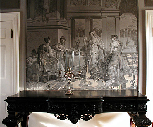
Ancient Roman scene in frame

Many early wallpapers featured stylized floral motifs and simple pictorial scenes copied from contemporary embroideries and other textiles. Makers printed them in monochrome, in black ink on small sheets of paper. It wasn’t until the mid-17th century that wallpaper makers joined the single sheets together to form long rolls, a development that also encouraged the production of larger repeats and the introduction of block-printing. In this process, printers engraved onto the surface of a rectangular wooden block. Then they inked the block with paint and placed it face down on the paper for printing. Polychrome patterns required the use of several blocks----one for every color. They printed each color separately along the length of the roll, which they then hung up to dry before the next color could be applied. “Pitch” pins on the corners of the blocks helped the printer to line up the design. The process was laborious and required considerable skill.

French wallpapers

A number of fine French wallpapers offered different themes than those of the classic English papers. Often, the French papers displayed floral patterns, and many rendered figures from history and literature, whereas the English wallpapers favored landscape and bucolic compositions.

When wallpaper arrived in Colonial America, it was much too expensive for many to afford. Rather than pay the expensive costs for the wallpaper, many continued to paint or stencil their walls. However, some people found the imitation French papers affordable and applied them to their walls in small pieces instead.

Out of proportion design

The floral designs and landscape scenes commonly found were sometimes primitive, with houses and trees out of proportion. The skill of the artist or paperhanger directly affected the appearance of wallpaper. The progression leading to those long rolls of wallpaper allowed people to decorate large expanses of wall space without dividing the areas into those small panels.

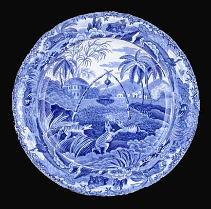
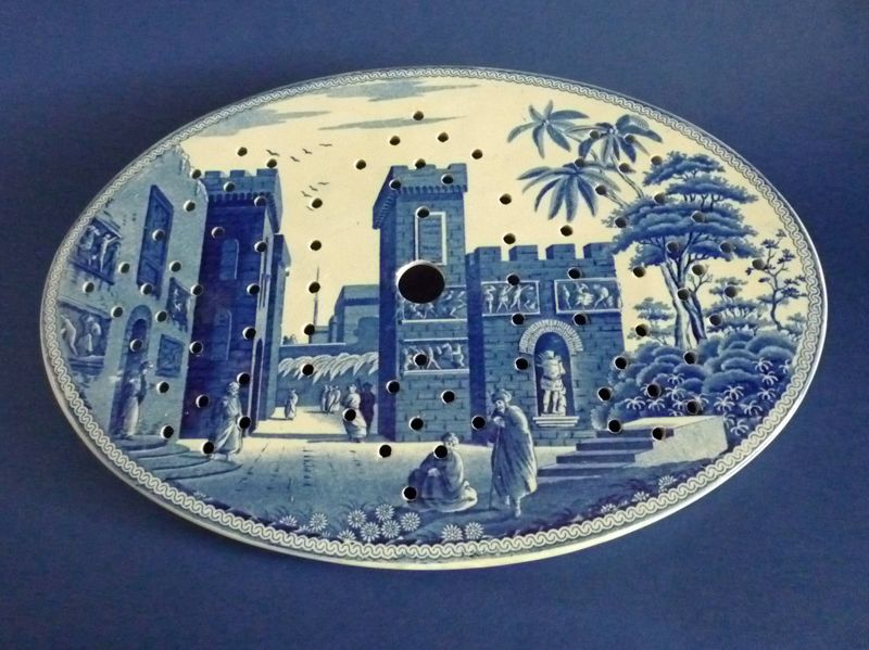
By the early 19th century, expensive, imported wallpapers decorated the walls of prominent New England homes. Those papers were of various designs and patterns, and some of them depicted scenes from Greek and Roman mythology. American historical scenes were also popular.

Block printing wallpaper

Up until 1840 all wallpaper makers employed the slow, labor intensive block printing process. So manufacturers wanted to find ways to speed up production. Potters & Ross, a cotton printing firm based in Darwen, Lancashire, England, patented the first wallpaper printing machine in 1839. Adapting the methods used in the printing of calico fabric, the paper passed over the surface of a large cylindrical drum and received an impression of the pattern from a number of rollers arranged around its base. Troughs beneath each one simultaneously inked the rollers with colors. The first machine-printed papers appeared thin and colorless beside the richer and more complex effects of block-printing and most had simple floral and geometric designs with small repeats.

Wallpaper evolved into an art form. One example depicted the Scottish Highlands, complete with sportsmen stalking deer. Another showed a scene of Italian peasants dancing and harvesting grapes. And yet another depicted riders leaping fences.

Historic panorama scene wallpaper
Victorian wallpaper floral

The frieze-filling-dado wallpaper scheme highlights the popularity of wallpaper in Victorian homes. In 1868 as a way of breaking up the monotony of a single pattern on the wall, and by 1880 it was a standard feature in many fashionable interiors. The dado paper covered the lower part of the wall, between the skirting board and chair rail; above this hung the filling, and above this the frieze. And as if three different wallpapers weren’t enough decoration for any room, the scheme was often combined with ceiling papers to complete the densely-patterned effects. Ideally, the frieze should have been light and lively, the filling, a retiring, all-over pattern, and the dado should be darker to withstand dirt and wear and tear. Co-ordinating papers, printed in muted greens, reds, yellows and golds, could be extremely attractive but the frieze-filling-dado-ceiling combination often led to visual overload. Hallways and stairs benefitted best from this wallpaper treatment. But by 1900 ceiling papers had disappeared and, in artistic interiors, wide friezes hung above plain or simple paneled walls.

Antique wallpapers are of interest to several kinds of collectors. Some might be interested in specific themes or designs, such as papers depicting historical scenes, or those displaying floral patterns; wallpapers from England or France or some other country might engage the attention of others; still, some individuals like to collect papers produced by certain manufacturers, such as Cole & Son or William Morris. And some of  those assembling a collection might be interested in a certain time period such as wallpapers manufactured in the 17th or 18th century.

To read more articles on antiques, please visit the Antiques Articles section of my Web site.  And to stay up to the minute on antiques and collectibles, please join the over 30,000 readers by following my free online magazine, #TheAntiquesAlmanac. Learn more about railroad antiques in "All Aboard!" in the 2021 Summer Edition, online now. And to read daily posts about unique objects from the past and their histories, like the #Antiques and More Collection on Facebook.


Friday, July 2, 2021

It's All About the Patterns


QUESTION: When I was a little girl, I used to sleep over at my grandmother’s house. While there, I used to stand in front of her china cabinet looking at all the beautiful china. Each piece had some sort of scene, usually a landscape with people. Most of the dishes were blue but some were pink and one or two were lavender. After my grandmother passed, I got her china collection. I just love it but don’t know much as these beautiful pieces. The name Spode is either stamped or impressed on the bottom of most of the pieces. Can you tell me who made them and where they got the ideas for the scenes on them?

ANSWER: What your grandmother collected and you now have is Spode china. All those with scenes and borders are what’s known as transferware, a technique for transferring prints to pottery.

During the early years of the 18th century, Spode achieved success because of  his mastery of transfer printing.  An Irish engraver named Brooks invented the process. It involved first, engraving a copper plate, then inking it and applying to it to thin tissue paper. The impression on the paper could then be transferred to wares of any shape.

Spode produced a variety of pottery wares, often imitating those of Wedgwood, including creamwares, basalts, stonewares, redwares, Jasperwares, and of course blue-printed pearlwares and early experimental porcelains.

In 1784, Spode began printing under the final glaze in blue on earthenware. He copied the early patterns from Chinese porcelain imported wares. By that time, London customers who had originally purchased Chinese porcelain dishes needed replacements. The engraver Thomas Lucas brought with him to Spode’s pottery the knowledge of designs from his previous employer, Thomas Turner at Caughley. 

Most of the early blue transfer-printed patterns were Chinese in style.  As Spode's production advanced and its customers' tastes evolved, the variety of patterns grew. Interest in Chinoiserie patterns later gave way to patterns that depicted rural scenes, exotic places, literary themes, as well as floral and botanical examples.

The earliest pattern produced by Spode around1790, was “Willow,” now known as “Blue Willow,” printed examples of the Willow pattern, commissioned by Josiah Spode and made around 1790, and its copperplate, engraved for Spode by Thomas Minton. 

In June 1805, there appeared the first of 20 monthly issues of a publication called Oriental Held Sports, Wild Spurts of the East, published by Edward Orme of Bond Street, London.  Each issue included a printed story and two large aquatint prints engraved from drawings by Samuel Howitt, a distinguished animal painter. Spode adapted the prints to his dinnerware depicting various hunting scenes with animals and birds. Some views show mounted hunters carrying spears with native bearers on foot. The ’Indian Sporting’ series alone had 21 different hunting scenes.

Another popular series formed a travelogue of views in the Eastern Mediterranean. Spode based these on engravings in Mayer's Views in Asia Minor, Mainly in Caramania, published in 1803. "The Castle of Boudron;" The City of Corinth" and “Antique Fragments at Lissimo” were all part of this series. 

From around 1800, most of the patterns painted by Spode's artists were recorded in Pattern books.  These books contained watercolor paintings of tens of thousands of patterns made from about 1800 up to the end of production. Many are beautiful works of art in their own right, but they also acted as a historic document of changing design styles over two centuries. Georgian simplicity, Regency opulence, Victorian Naturalism, sentimentality, Pre-Raphaelite styles, Japanese Revival, Arts and Crafts, Art Deco, and 1950s Modernism.

Spode introduced his more famous pattern, “Blue Italian,” around 1816. It became immediately popular and remained a best seller. Over the years, the company produced it on a wide variety of earthenware shapes. One Spode catalog from the 1920s and 1930s records over 700 different shapes available. 

Unlike many of the other classical scene patterns on Spode wares of the early 19th century, the origin of the view for the Italian pattern isn’t certain. Some experts believe Italian artist G.P. Pannini, well known for his painting style, inspired pictures of ruins and quiet pastoral Italian scenery fpor Spode pieces. The Spode engravers derived many of their pictorial subjects from scenes which had appeared as prints. Publications of prints of scenes associated with the Grand Tour became the inspiration for many patterns. Merigot's Views Of Rome and Its Vicinity, published in 1798, was the source for several Spode patterns, including Tower and Castle, but experts agree that none of these views inspired the Italian pattern.

Furthermore, there is no one location in Italy that seems to correspond to all the features included in the original “Blue Italian” scene. It seems to be a composition made up of several elements. The ruin on the left, although architecturally incorrect, might have been based on the Great Bath at Tivoli, near Rome. The row of houses along the left bank of the river is similar to those of the Latium area near Umbria, north of Rome. The castle in the distance is of a type which occurs only in Northern Italy in the regions of Piedmont and Lombardy.

Could it be that a traveling artist from Northern Europe made sketches of the scenes he encountered as he made his way through Italy? Upon returning home, did he combine his sketches into an attractive scene which, later, Spode used and chose to call the Italian Pattern? Unfortunately, there is no proof of this. The inspiration for the Italian scene may have even come from a print of a painting and then another painting taken from the print by a different artist.

In the early 19th century, most of the pieces Spode produced in the “Blue Italian” pattern were on dinnerware items used by the rich---asparagus servers, huge meat dishes, enormous soup tureens with ladles, cruet sets, foot baths, and more. Wealthy households set their dinner tables with Spode’s Italian. And there were many variations of the pattern. 

“Blue Italian” was an immediate success from its introduction. Though it’s impossible to say what created this strong appeal, it’s perhaps due to the unique combination of a classical scene with a Chinese border which had been directly copied from pieces of Chinese export porcelain, dating from around 1785.

By 1822, Spode had developed other colors, in addition to blue, that could withstand high-temperature firing.  The production of these additional printed colors enabled Spode to expand his line of wares.  While not nearly as popular as Spode's various blues, these new colors included green, brown, manganese purple, Payne's grey, and black.  

Soon afterwards,  in 1824, two-color underglaze printing began.  Spode also employed other methods to add color.  One method was to transfer print outline patterns and then paint in or between the lines of the pattern in other colors. Other methods included enameling with additional colors and gilded decoration over the glaze to further expand the variety of offerings.  Near the end of the early Spode period, the pottery also began producing wares in pink.

Spode introduced about 150 patterns a year.  By 1833 Spode, they numbered nearly 4,000. Most Spode wares bear a pattern number, as well as the name Spode printed, painted, or impressed on the bottom or reverse side.

Some Spode collectors collect just the “Blue Italian” pattern while others specialize in collecting only the oldest pieces dating from 1816 to 1833. Since Spode china continues to be made, newer pieces are often passed off as older ones. It’s important to check the provenance if possible. 

To read more articles on antiques, please visit the Antiques Articles section of my Web site.  And to stay up to the minute on antiques and collectibles, please join the over 30,000 readers by following my free online magazine, #TheAntiquesAlmanac. Learn more about "The Ancients" in the 2021 Spring Edition, online now. And to read daily posts about unique objects from the past and their histories, like the #Antiques and More Collection on Facebook.

Wednesday, May 12, 2021

The Delight of Bristol Blue


QUESTION: I recently purchased a piece of what was described as “Bristol Blue” glass through an online antiques auction. I collect antique glass but this vase struck me as something unique. Although it looked like Victorian enameled glass, it resembled porcelain and the description said it was made in England in the late 18th century. I would really like to know more about this piece. I didn’t think glassmakers produced enameled glass that early Was it produced in Bristol, England, and thus the name, and who made it? And just how far back does Bristol Blue glass go?

ANSWER: Those are all very good questions. Let’s begin with the name. Even though this type of glass has Bristol in its name, glassmakers throughout most of England produced it. The blue in the name refers to the coloring used in the glass.

In the first half of the 18th century, near Redcliffel Backs, Temple Meads, Bedminster and other suburbs of Bristol, England, the squat chimneys of glasshouses and potteries silhouetted the landscape like giant beehives. But it was the age of porcelain, and anyone who could afford to buy it did so. Porcelain factories enjoyed the protection of kings, and European elite emptied their purses for priceless porcelain treasures. The arrival of an affordable substitute in decorated rnilch glass from Germany delighted Bristol glassmakers. For the first time, they had a perfect porcelain substitute  within their reach. 

The Venetians first made glass as an imitation of porcelain prior to 1500. Experts believe they used tin oxide as the agent to produce the white opacity in their glass. Eighteenth-century English white glass, called enamel glass in advertisements of the 1760s, was an intensely white, brittle material, generally a potash-lead mix, rendered opaque by the addition of lead arsenate. The porcelain-like, opaque glass  produced by the glassmakers of Bristol, was soft and smooth to the touch yet retained the fine heaviness of English crystal. It was an instant success, forcing the Bristol glassmen to borrow decorators from neigh-boring potteries to keep up with the public's demand.

England's glass excise tax of 1746 raised the duty on clear glass but didn’t tax opaque and colored glass because there was so little of it being made. This offered an excellent economic incentive for its increased production.

Chemists long knew that a powdered coloring could be premixed and supplied to glassmakers for addition to clear glass of their own making. But it was 18th-century German chemists from Saxony, who refined impure oxide of cobalt to produce a blue powder of unparalleled purity and uniform consistency. They exported their product, called “smalt,” to England, where a British merchant distributed it under the name "Bristol Blue."

The Bristol glassmakers quickly added the new deep-blue color to their already successful line of opaque white glass. Vigor & Stevens, of Thomas Street and Lazarus Jacobs, and later his son Isaac, of Temple Street, produced pieces primarily in deep Bristol Blue.

By the end of the 18th century the manufacture of blue glass became fairly common throughout England and continued to be marketed under the name of Bristol Blue. This makes it difficult, if not impossible, to identify glass made in Bristol from a piece manufactured elsewhere. The original term “Bristol Blue" referred simply to the coloring agent sold to glassmakers rather than to their finished products.

The early shapes, manufactured around 1770, emulated Chinese and English porcelain—pear-shaped covered vases, trumpet-mouthed beakers, and cruets—all   produced in sets. Glassmakers also produced scent or smelling bottles and snuff boxes, often facet-cut, with enameling and gilding, in both white and blue glass.

Early Chinese porcelain painters greatly influenced the 18th-century Bristol designs. The Chinese artists working at the Imperial Porcelain Factory excelled in delicate miniature enameled decoration on their opaque white glass. They often employed motifs of figures, birds, and European flowers much admired by the Emperor Chi’en Lung, who ruled from 1736 to 1795. Since most English glasshouses made their opaque white glass in competition with porcelain, most used the same styles and even the same artists to decorate both.

Glass decorator Michael Edkins linked the white and blue glass under the mutual name of "Bristol." At first, he apprenticed to an enameling firm in Birmingham, England, but at the age of 20, he took up residence in Bristol and settled down to decorate pottery dishes and tiles. At that time, artists painted the pieces with pencils made of bristles from the noses and eyelids of oxen. Graduating to glass, Edkins began decorating "enamel and blue glassware." He worked both independently and for Isaac Jacobs, Little & Longman, and Williams, Dunbar & Company from 1782 onwards. Instead of using enamel paints that needed to be fired, Edkins used standard oil colors, or plain gold gilt motifs, applied with unfired varnish, which he called "cold" decoration. 

Generally, artists decorated Bristol Blue ware with unfired or lightly fired gold varnish. Cruets and decanters often sported the name of their contents as well as intricate garlands and wreaths of plain gold. 

To read more articles on antiques, please visit the Antiques Articles section of my Web site.  And to stay up to the minute on antiques and collectibles, please join the over 30,000 readers by following my free online magazine, #TheAntiquesAlmanac. Learn more about "The Ancients" in the 2021 Spring Edition, online now. And to read daily posts about unique objects from the past and their histories, like the #Antiques and More Collection on Facebook.


Thursday, November 5, 2020

The Origin of American Studio Pottery


QUESTION: I’ve always loved handmade pottery. And looking back over history, it seems to have existed since ancient times. Recently, a friend told me that Charles Binns was the father of American studio pottery. Exactly what does that mean? Isn’t all handmade pottery made in a studio?

ANSWER: While pottery, itself, has existed for eons, what’s referred to as “studio pottery” is a relatively recent phenomenon, dating to the very late 19th century and early 20th. 

Although now nearly forgotten, Charles Fergus Binns, a studio potter and instructor, enjoyed a national reputation during the early years of the 20th century for his classic stoneware pots. Binns' made many of his legendary stoneware vases, bottles, bowls and jars during the height of the Arts and Crafts Movement in the U.S.

Born in England in 1857, Binns left school at age 14 to become an apprentice at the Royal Worcester Porcelain Works, where his father was a co-managing director. Eventually, he occupied an administrative position at the Royal Worcester factory and  became a recognized scholar and lecturer concerning world ceramics. In Paris, in 1878, he exhibited his early experiments with clay bodies and glazes. Binns accompanied the Royal Worcester exhibit of 1,400 pieces to the Chicago World's Fair in 1893 and made the United States his home in 1897. 


Binns's ceramic technique focused on his pots as utilitarian objects. His work included vases, urns, and bowls. He threw each piece in three forms on a wheel, turning them on a lathe and piecing them together afterwards. One of the concepts Binns taught was “dead ground,” in which the parts of making pottery that couldn’t be precisely controlled, such as firing temperature or glaze calculations, were mitigated by control over glaze placement.

In 1899, Binns helped found the American Ceramics Society. His role in this organization led to the directorship of the newly formed ceramics department of Alfred University, the first United States college to combine programs in ceramic art and science. In the years that followed, Binns shared once-secret clay recipes and glaze formulas with his students, including Arthur Eugene Baggs, William Victor Bragdon, R. Guy Cowan, Maija Grotell and Elizabeth Overbeck, who were largely responsible for fostering the idea of the artist-potter in America.  

Binns is commonly referred to as the "father of American studio ceramics." This title reflects not only his creation of unique stoneware pots in the Arts & Crafts style, but additionally acknowledges his accomplishment of bringing vital information about ceramic clay bodies and glaze recipes to ordinary people, thus laying the foundation of the flourishing studio ceramics movement in the United States that began in the early 1900's.

In 1900, New York Governor Teddy Roosevelt signed a bill establishing the New York State School of Clay-Working and Ceramics—now the New York State College of Ceramics at Alfred University. Appointed as the founding director at that time, Binns held the position for over 30 years until his retirement in 1931, during which time he became known for his classic pots with rich monochrome glazes.

Before Binns' arrival at Alfred University, it was customary for one
person to throw art pottery on the wheel and another person to glaze or decorate surfaces mar reflected his respect for the natural materials he used. He admired Oriental forms and glazes. and sometimes signed his pieces by putting his initials, “CFB" inside a circle closely resembling Chinese marks. His signed pieces ;following Asian tradition, Include his initials along with the year in which he made them.

Binns' work was widely exhibited during his lifetime, including his earliest documented stoneware vase, signed and dated 1905, and his final creation, a fragile bisque vase that he

signed and dated 1934, which he left unglazed and unfired at the time of his death. A memorial exhibition Of Binns’ works drew admiring crowds at the Metropolitan Museum of Art in New York in 1935.

American studio ceramics really began with Charles Fergus Binns, who introduced the principles of chemistry and materials science into the ceramic arts. 

To read more articles on antiques, please visit the Antiques Articles section of my Web site.  And to stay up to the minute on antiques and collectibles, please join the over 30,000 readers by following my free online magazine, #TheAntiquesAlmanac. Learn more about the Retro style in the Fall 2020 Edition, online now. And to read daily posts about unique objects from the past and their histories, like the #Antiques and More Collection on Facebook.


Thursday, September 3, 2020

Just Who Was Josiah Spode?


QUESTION: My mother collected English Staffordshire transferware dinnerware. She passed away recently and now I have her collection which consists of plates, cups and saucers, gravy boats, sugars and creamers, and assorted other items. On the bottoms of some of these are marks saying “Spode and a number,” “Spode Stone-China,” and “Copeland Spode England.” I realize they refer to the pottery that made them, but who was Spode and what did he have to do with Copeland?

Spode Stone China

ANSWER: The name Spode on your pottery pieces refers to English potter Josiah Spode while the name Copeland refers to William Copeland, who was in the tea trade.

Josiah Spode
While English transferware is a common antique/collectible, coming in a wide variety of forms and styles, it was Josiah Spode who started it all by perfecting two techniques that made this form of pottery such a worldwide success—the technique of transfer printing in 1783 and the formula for fine bone china around 1790.

At the beginning of the 18th century, the cluster of towns in North Staffordshire, now know as the Potteries, was a series of villages, hamlets and farms. Forty or so potteries, concentrated around Burslem produced all the Staffordshire wares.

On April 9, 1749, Thomas Whieldon, a potter who was already producing early Staffordshire wares, including agate wares in variegated colors, tortoiseshell table-wares, creamwares, black basaltes and black-glazed wares, hired Josiah Spode at age 16. Spode stayed with Whieldon as a journeyman potter until about 1762, when he took the job of manager of a pottery at Stoke which produced mostly creamware and white stoneware.

Spode Creamware
By 1776 Spode had purchased his own pottery works. His first produced pottery, then porcelain, and finally a superior kind of ironstone china which was almost porcelain, which Spode invented in 1805. After some early trials, he perfected a stoneware that came closer to porcelain than any previously and introduced his "Stone-China" in 1813. It was light in body, greyish-white and gritty where it wasnt glazed and approached translucence in the early wares. Later stoneware became opaque.

Spode plate from Indian Sporting Series
By 1785 Spode had a London warehouse and showroom_He met William Copeland who was in the tea trade. Copeland opened a warehouse where the Spode wares could be displayed and offered for sale to the London "China men."

Spode’s mastery of the transfer printing process contributed to the firm’s success in the early years of the 19th century. The process, which appears to have been invented by an Irish engraver named Brooks, involved first, engraving a copper plate, then inking it and applying to it a thin tissue of paper, the impression on the paper could then he transferred to articles of any shape.

Spode Oriental Field Sports Wolf Trap
Contemporary book illustrations often inspired the decorations Spode used on his pottery. China experts consider one of Spode’s  most interesting patterns, the Indian Sporting Series, to be one of the most original in its use as a design for tableware.

In June 1805, there appeared the first of 20 monthly issues of a publication called Oriental Field Sports, Wild Sports of the East. Each included a printed story and two large aquatint prints engraved from drawings by Samuel Howitt, a distinguished animal painter. Spode adapted the engravings to his dinnerware, which depicted hunting scenes with animals and birds. Some views showed mounted hunters carrying spears with native bearers on foot.

Another popular series formed a travelogue of views in the Eastern Mediterranean. Spode based these on engravings in Mayer’s Views in Asia Minor; Mainly in Caramania, published in 1803.

Spode platter "City of Corinth" from Eastern Mediterranean Series

Spode also used illustrations from “The Castle of Boudron;" "The City of Corinth" and "Antique fragments at Lissima" in this series. He based another series on views in Italy, usually of ruins or classical landscapes, from Merigot's Views of Rome and its Vicinity,  published in 1798.

Spode's most popular series, Blue Italian
The most famous pattern was the "Blue Italian," described as Spode's masterpiece in his Blue and White series. Spode took his inspiration for this from the painting of ruins and quiet pastoral scenery by 18th-century Italian artist H.P. Pannini.

From 1800 to 1827 the mark consisted of the name Spode in printed letters, impressed, and the name of the pattern in blue, purple or red. On the stoneware the mark was "Spode, Feldspar Porcelain" or "Spode, Stone China." After this date, if the name Spode was used, it appeared as "Late Spode."

In addition to tea wares, Spode produced a variety of useful and ornamental pieces in bone china, from miniature ewers and basins and toy tea sets to richly decorated, sometimes flower-encrusted vases.

Early Spode blue and white serving platter

The factory pattern books which still exist show that Spode introduced new patterns at the average rate of about 150 year. By 1833 the pottery’s patterns numbered in the 4,000 range. Over its lifetime, the Spode Pottery produced about 75,000 patterns. Most Spode wares carry a pattern number along with the name Spode.

To read more articles on antiques, please visit the Antiques Articles section of my Web site.  And to stay up to the minute on antiques and collectibles, please join the over 30,000 readers by following my free online magazine, #TheAntiquesAlmanac. Learn more about  world's fairs in the 2020 Summer Edition, online now. And to read daily posts about unique objects from the past and their histories, like the #Antiques and More Collection on Facebook.


Thursday, July 16, 2020

The Cream of the Crop


QUESTION: Last year I went antiquing in the English Cotswolds. In nearly every shop I went into, I saw at least one or more little cow creamers waiting for new homes. How did these little ceramic accessories come about and why did they choose to make them in the shape of a cow?

ANSWER: Originally made in England, then in Scotland and America, these unique creamers were the pride and joy of many late 18th and early 19th-century English housewives, both rich and poor. They kept these spotted bovines sitting on top of their dining room dressers, ready to use on special occasions.

These pottery cow creamers are little jugs standing firm on all four legs. They’re  usually about six inches long and four to five inches high. Housewives would pour fresh cream through a hole in the cow’s back, then seal up the whole with a cover. Unfortunately, many a cow creamer today is missing its cover. The cow’s curved tail served as the handle while its mouth served as the spout.

Cow creamers are among the oldest forms of decorative tableware still in existence today. Their ancestry can be traced back  to a decorative European jug used for washing the hands before and during a meal called an “aquamanile.” These jugs were very fancy and often doubled as a centerpiece. Ironically, an aquamanile had many of the same features as a cow creamer—a body in the shape of an animal standing square on its legs, a tail arched to meet its back that served as a handle, a hole in its back by which the jug could be filled, and a gaping mouth from which to pour the water.

Made from gold, silver, bronze, or pewter, the aquamaniles were most commonly shaped like lions, sometimes encrusted with precious stones.

It was the Dutch that chose the cow as the shape for the cow creamer which became a luxury accessory.

During the 18th century, coffee drinking became popular among the social elite of Europe. The new coffee ritual demanded novelty jugs to hold the cream. Those depicting a cow with a bee perched on its back were the most popular.

Initially, silversmiths created cow creamers in different sizes but using the same freestanding cow. There were all sorts of whimsical variations—some had garlands around their necks, hinged lids, or handles shaped like flies, bees, or flowers. But when the Dutch began making the creamers in tin-glazed Delftware, the fencegates opened and a whole herd of creamers rushed out.

The first cow creamer came from the Whieldon Pottery, which imitated the silver cow jugs made in 1755 by John Schuppe. The most well-known of these had a mottled brown tortoise shell-type glaze. Others had brown and yellow spots, black with a criscrossed yellow pattern, and even light blue with yellow circles.

But the clay was more difficult to control and sculpt than metal, so the potters introduced a few changes to the design to make it conform more to the different material. While a silver cow could stand directly on its legs, a pottery cow could not. This necessitated the addition of a base to help stabilize and strengthen the clay.

It seems every potter added his touch of whimsy. In fact, there are almost as many different decorations as there are creamers.

 potters also crafted these unique little jugs, essentially copying from the earlier Whieldon design. None of these have markings on the bottom. The Welsh potters added their own creative touches to their cow creamers. Many decorated them freehand or applied transfer designs of rustic farm scenes. After 1850, the Scots developed a love affair with the cow creamer. Scottish potters experimented with sponged decoration and brightly colored glazes.

After the American Revolution and into the early 19th century, imported English pottery became too expensive, so the United States Pottery in Bennington, Vermont, began making its own version of the cow creamer. Each cow had crescent-shaped nostrils, open eyes, folds in the neck, and visible ribs. I guess the American cows weren’t as well fed as their English, Scottish, and Welsh cousins. After Bennington closed in 1858, its potters sought work at potteries in Ohio, Maryland, and New Jersey, taking their skill at making cow creamers with them.

To read more articles on antiques, please visit the Antiques Articles section of my Web site.  And to stay up to the minute on antiques and collectibles, please join the over 30,000 readers by following my free online magazine, #TheAntiquesAlmanac. Learn more about  La Belle Epoque in the 2020 Spring Edition, online now. And to read daily posts about unique objects from the past and their histories, like the #Antiques and More Collection on Facebook.


Wednesday, March 11, 2020

Marriages Made in Hell


QUESTION: I have inherited a cookie jar from my mother's estate, our family home outside Philadelphia. The cookie jar is marked on the bottom “Goldilocks #405 Patent Pending.” I see on the Internet that there are plenty of these jars in the marketplace. However, my cookie jar doesn't look like the one's I found with this mark. The design I have is slightly different. After a bit of research, I wondered if my version is a 'blank' that was simply uniquely printed or perhaps its just a rip off reproduction.  I have no clue. Can you help me solve this mystery?

ANSWER: What you have is the bottom of a Goldilocks cookie jar and the top of a Little Red Riding Hood cookie jar. The former was made by the Regal China Company and the latter by the Hull Pottery. Goldilocks has a blue hood and a little bear while Little Red Riding Hood has a red hood and a basket of flowers. The tops and bottoms of these cookie jars, though different in design, are interchangeable. What must have happened is that the top of the Goldilocks jar got broken and someone replaced it with the top of a Little Red Riding Hood jar. In antiques, we call this a marriage.

As in real life marriages where both people must work together to form a perfect union, antiques marriages can be either really good or terribly bad.

In the world of antiques, marriages are somewhat of a curse, especially when it comes to furniture. Here, a dealer joins together two different pieces of furniture worth significantly less than the original to form one piece that could be worth much more than the original. Novice antiques collectors could easily be fooled into spending more for a married piece than it’s actually worth.


Some unscrupulous antique dealers would no doubt try to pass off a married piece as an original while others marry parts together and literally make antiques. This is especially prevalent in the middle market where profit margins aren’t as high in the fine antiques one. This is especially true of antique furniture from the 17th to the 19th century. However, pieces made during this time often came in sections.

Back then, transporting large pieces of furniture was difficult. Pieces had to be transported in carts, and they had to be light enough that a small team of horses could pull them and two men could lift and carry them. So cabinetmakers produced furniture in pieces so that it could be easily transported and then assembled on site.

Of course, furniture that can be easily assembled is just as easy to disassemble. This meant that the end user could easily replace a broken or worn-out part of a piece of furniture without having to buy a new one. For example, if the table top splintered, the owner could simply keep the base and have a new top made. These combinations of old and new became the first married pieces of furniture.
But how does a novice collector know when a piece is a marriage? The more knowledgeable a collector is, the less chance he or she will have of getting taken.

Marriages are often easy to spot. First, look for any clash of styles. Cabinetmakers would not have combined furniture styles since most used style books to help them fashion their pieces. Second, check to see if there are any unusual proportions. Does one part seem larger than it should be? Third, does the wood used to make the piece match. While some cabinetmakers used less expensive wood for the frames, most used better wood for the exterior. Fourth, is the overall finish even. If not, this means parts of the piece have been finished at different times, such as a new table top. And finally, does the hardware match. Unless the owner couldn’t replace drawer and cabinet pulls with the same style, all the hardware on a piece should match.

Unfortunately, antiques marriages are contrived to deceive the buyer. A lot of this goes on in England where the market for antiques is always hot. Visitors especially usually have no idea what they’re buying and usually fall for marriage or even fake antiques.

One of the most common marriages is in 17th and 18th-century secretaries. The bottom desk is often married to a bookcase top from a different secretary. These two pieces may be orphans and when matched often look fairly good together. With the price of 18th-century secretaries in the six figure or more range, it’s no wonder that dealers try this. The easiest way to spot a marriage of this sort is to check the backboards. Those on the top and bottom must match, including nails. The quality of the wood must also be the same.

For chests and highboys, comparing a drawer from the top with one from the bottom should reveal the same dovetailing—all of which cabinetmakers did by hand—as well as linings.

Another popular marriage is an antique wrought iron sewing machine base that’s married to an antique table top. While this may look quite fine, it has little value.

But antiques marriages aren’t limited to furniture, although that’s where most of them occur. As with this cookie jar, like fitting pieces of ceramics or glassware can be married together. This usually falls into tops for bottoms as well as lids to jars and other containers.

Not so honest antiques dealers can deceive customers in many ways. A newer painting of a scene done in an old style can be mounted in an antique frame, for example, then sold as an antique.

But the most common marriages occur in higher end furniture where a piece that may not have sold for much or not at all is married to one that together forms a different piece that can sell for a whole lot. Don’t be fooled. Do your homework. And ask plenty of questions. The more you ask, the better chance of tripping up an unscrupulous dealer.

To read more articles on antiques, please visit the Antiques Articles section of my Web site.  And to stay up to the minute on antiques and collectibles, please join the over 30,000 readers by following my free online magazine, #TheAntiquesAlmanac. Learn more about  the Industrial Age n the 2020 Winter Edition, "The Wonders of the Industrial Age," online now. And to read daily posts about unique objects from the past and their histories, like the #Antiques and More Collection on Facebook.